The QStyle 類是封裝 GUI 外觀和感覺的抽象基類。 更多...
| 頭: | #include <QStyle> |
| qmake: | QT += widgets |
| 繼承: | QObject |
| 繼承者: | QCommonStyle |
| enum | ComplexControl { CC_SpinBox, CC_ComboBox, CC_ScrollBar, CC_Slider, ..., CC_CustomBase } |
| enum | ContentsType { CT_CheckBox, CT_ComboBox, CT_HeaderSection, CT_LineEdit, ..., CT_MdiControls } |
| enum | ControlElement { CE_PushButton, CE_PushButtonBevel, CE_PushButtonLabel, CE_DockWidgetTitle, ..., CE_ShapedFrame } |
| enum | PixelMetric { PM_ButtonMargin, PM_DockWidgetTitleBarButtonMargin, PM_ButtonDefaultIndicator, PM_MenuButtonIndicator, ..., PM_DefaultLayoutSpacing } |
| enum | PrimitiveElement { PE_FrameStatusBar, PE_PanelButtonCommand, PE_FrameDefaultButton, PE_PanelButtonBevel, ..., PE_PanelMenu } |
| enum | RequestSoftwareInputPanel { RSIP_OnMouseClickAndAlreadyFocused, RSIP_OnMouseClick } |
| enum | StandardPixmap { SP_TitleBarMinButton, SP_TitleBarMenuButton, SP_TitleBarMaxButton, SP_TitleBarCloseButton, ..., SP_CustomBase } |
| flags | State |
| enum | StateFlag { State_None, State_Active, State_AutoRaise, State_Children, ..., State_Small } |
| enum | StyleHint { SH_EtchDisabledText, SH_DitherDisabledText, SH_ScrollBar_ContextMenu, SH_ScrollBar_MiddleClickAbsolutePosition, ..., SH_SpinBox_StepModifier } |
| enum | SubControl { SC_None, SC_ScrollBarAddLine, SC_ScrollBarSubLine, SC_ScrollBarAddPage, ..., SC_All } |
| flags | SubControls |
| enum | SubElement { SE_PushButtonContents, SE_PushButtonFocusRect, SE_PushButtonLayoutItem, SE_CheckBoxIndicator, ..., SE_ToolBarHandle } |
| QStyle () | |
| virtual | ~QStyle () |
| int | combinedLayoutSpacing (QSizePolicy::ControlTypes controls1 , QSizePolicy::ControlTypes controls2 , Qt::Orientation orientation , QStyleOption * option = nullptr, QWidget * widget = nullptr) const |
| virtual void | drawComplexControl (QStyle::ComplexControl control , const QStyleOptionComplex * option , QPainter * painter , const QWidget * widget = nullptr) const = 0 |
| virtual void | drawControl (QStyle::ControlElement element , const QStyleOption * option , QPainter * painter , const QWidget * widget = nullptr) const = 0 |
| virtual void | drawItemPixmap (QPainter * painter , const QRect & rectangle , int alignment , const QPixmap & pixmap ) const |
| virtual void | drawItemText (QPainter * painter , const QRect & rectangle , int alignment , const QPalette & palette , bool enabled , const QString & text , QPalette::ColorRole textRole = QPalette::NoRole) const |
| virtual void | drawPrimitive (QStyle::PrimitiveElement element , const QStyleOption * option , QPainter * painter , const QWidget * widget = nullptr) const = 0 |
| virtual QPixmap | generatedIconPixmap (QIcon::Mode iconMode , const QPixmap & pixmap , const QStyleOption * option ) const = 0 |
| virtual QStyle::SubControl | hitTestComplexControl (QStyle::ComplexControl control , const QStyleOptionComplex * option , const QPoint & position , const QWidget * widget = nullptr) const = 0 |
| virtual QRect | itemPixmapRect (const QRect & rectangle , int alignment , const QPixmap & pixmap ) const |
| virtual QRect | itemTextRect (const QFontMetrics & metrics , const QRect & rectangle , int alignment , bool enabled , const QString & text ) const |
| virtual int | layoutSpacing (QSizePolicy::ControlType control1 , QSizePolicy::ControlType control2 , Qt::Orientation orientation , const QStyleOption * option = ..., const QWidget * widget = ...) const = 0 |
| virtual int | pixelMetric (QStyle::PixelMetric metric , const QStyleOption * option = nullptr, const QWidget * widget = nullptr) const = 0 |
| virtual void | polish (QWidget * widget ) |
| virtual void | polish (QApplication * application ) |
| virtual void | polish (QPalette & palette ) |
| const QStyle * | proxy () const |
| virtual QSize | sizeFromContents (QStyle::ContentsType type , const QStyleOption * option , const QSize & contentsSize , const QWidget * widget = nullptr) const = 0 |
| virtual QIcon | standardIcon (QStyle::StandardPixmap standardIcon , const QStyleOption * option = ..., const QWidget * widget = ...) const = 0 |
| virtual QPalette | standardPalette () const |
| virtual int | styleHint (QStyle::StyleHint hint , const QStyleOption * option = nullptr, const QWidget * widget = nullptr, QStyleHintReturn * returnData = nullptr) const = 0 |
| virtual QRect | subControlRect (QStyle::ComplexControl control , const QStyleOptionComplex * option , QStyle::SubControl subControl , const QWidget * widget = nullptr) const = 0 |
| virtual QRect | subElementRect (QStyle::SubElement element , const QStyleOption * option , const QWidget * widget = nullptr) const = 0 |
| virtual void | unpolish (QWidget * widget ) |
| virtual void | unpolish (QApplication * application ) |
| QRect | alignedRect (Qt::LayoutDirection direction , Qt::Alignment alignment , const QSize & size , const QRect & rectangle ) |
| int | sliderPositionFromValue (int min , int max , int logicalValue , int span , bool upsideDown = false) |
| int | sliderValueFromPosition (int min , int max , int position , int span , bool upsideDown = false) |
| const QMetaObject | staticMetaObject |
| Qt::Alignment | visualAlignment (Qt::LayoutDirection direction , Qt::Alignment alignment ) |
| QPoint | visualPos (Qt::LayoutDirection direction , const QRect & boundingRectangle , const QPoint & logicalPosition ) |
| QRect | visualRect (Qt::LayoutDirection direction , const QRect & boundingRectangle , const QRect & logicalRectangle ) |
The QStyle 類是封裝 GUI 外觀和感覺的抽象基類。
Qt contains a set of QStyle subclasses that emulate the styles of the different platforms supported by Qt (QWindowsStyle, QMacStyle etc.). By default, these styles are built into the Qt GUI module. Styles can also be made available as plugins.
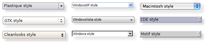
Qt's built-in widgets use QStyle to perform nearly all of their drawing, ensuring that they look exactly like the equivalent native widgets. The diagram below shows a QComboBox 按 9 種不同風格。
話題:
可以設置整個應用程序的樣式使用
QApplication::setStyle
() 函數。它也可以由應用程序用戶指定,使用
-style
命令行選項:
./myapplication -style windows
若未指定樣式,Qt 會為用戶平颱或桌麵環境選取最閤適樣式。
還可以為個彆小部件設置樣式使用 QWidget::setStyle () 函數。
If you are developing custom widgets and want them to look good on all platforms, you can use QStyle functions to perform parts of the widget drawing, such as drawItemText (), drawItemPixmap (), drawPrimitive (), drawControl (),和 drawComplexControl ().
Most QStyle draw functions take four arguments:
例如,若希望在 Widget 中繪製聚焦矩形,可以編寫:
void MyWidget::paintEvent(QPaintEvent * /* event */)
{
    QPainter painter(this);
    QStyleOptionFocusRect option;
    option.initFrom(this);
    option.backgroundColor = palette().color(QPalette::Background);
    style()->drawPrimitive(QStyle::PE_FrameFocusRect, &option, &painter, this);
}
QStyle gets all the information it needs to render the graphical element from QStyleOption . The widget is passed as the last argument in case the style needs it to perform special effects (such as animated default buttons on macOS ), but it isn't mandatory. In fact, you can use QStyle to draw on any paint device, not just widgets, by setting the QPainter 正確。
QStyleOption has various subclasses for the various types of graphical elements that can be drawn. For example, PE_FrameFocusRect 期望 QStyleOptionFocusRect 自變量。
To ensure that drawing operations are as fast as possible, QStyleOption and its subclasses have public data members. See the QStyleOption class documentation for details on how to use it.
為方便起見,Qt 提供 QStylePainter class, which combines a QStyle , QPainter ,和 QWidget 。這使之可能編寫
    QStylePainter painter(this);
    ...
    painter.drawPrimitive(QStyle::PE_FrameFocusRect, option);
而不是
    QPainter painter(this);
    ...
    style()->drawPrimitive(QStyle::PE_FrameFocusRect, &option, &painter, this);
You can create a custom look and feel for your application by creating a custom style. There are two approaches to creating a custom style. In the static approach, you either choose an existing QStyle class, subclass it, and reimplement virtual functions to provide the custom behavior, or you create an entire QStyle class from scratch. In the dynamic approach, you modify the behavior of your system style at runtime. The static approach is described below. The dynamic approach is described in QProxyStyle .
The first step in the static approach is to pick one of the styles provided by Qt from which you will build your custom style. Your choice of QStyle class will depend on which style resembles your desired style the most. The most general class that you can use as a base is QCommonStyle (not QStyle ). This is because Qt requires its styles to be QCommonStyle 。
Depending on which parts of the base style you want to change, you must reimplement the functions that are used to draw those parts of the interface. To illustrate this, we will modify the look of the spin box arrows drawn by QWindowsStyle. The arrows are primitive elements that are drawn by the drawPrimitive () function, so we need to reimplement that function. We need the following class declaration:
class CustomStyle : public QProxyStyle
{
    Q_OBJECT
public:
    CustomStyle();
    ~CustomStyle() {}
    void drawPrimitive(PrimitiveElement element, const QStyleOption *option,
                       QPainter *painter, const QWidget *widget) const override;
};
要繪製它的嚮上 嚮下箭頭, QSpinBox 使用 PE_IndicatorSpinUp and PE_IndicatorSpinDown 圖元元素。這裏是如何重實現 drawPrimitive () 函數以不同方式繪製它們:
void CustomStyle::drawPrimitive(PrimitiveElement element, const QStyleOption *option,
                                QPainter *painter, const QWidget *widget) const
{
    if (element == PE_IndicatorSpinUp || element == PE_IndicatorSpinDown) {
        QPolygon points(3);
        int x = option->rect.x();
        int y = option->rect.y();
        int w = option->rect.width() / 2;
        int h = option->rect.height() / 2;
        x += (option->rect.width() - w) / 2;
        y += (option->rect.height() - h) / 2;
        if (element == PE_IndicatorSpinUp) {
            points[0] = QPoint(x, y + h);
            points[1] = QPoint(x + w, y + h);
            points[2] = QPoint(x + w / 2, y);
        } else { // PE_SpinBoxDown
            points[0] = QPoint(x, y);
            points[1] = QPoint(x + w, y);
            points[2] = QPoint(x + w / 2, y + h);
        }
        if (option->state & State_Enabled) {
            painter->setPen(option->palette.mid().color());
            painter->setBrush(option->palette.buttonText());
        } else {
            painter->setPen(option->palette.buttonText().color());
            painter->setBrush(option->palette.mid());
        }
        painter->drawPolygon(points);
    } else {
    QProxyStyle::drawPrimitive(element, option, painter, widget);
    }
}
注意,我們不使用
widget
argument, except to pass it on to the QWindowStyle::drawPrimitive() function. As mentioned earlier, the information about what is to be drawn and how it should be drawn is specified by a
QStyleOption
object, so there is no need to ask the widget.
若需要使用
widget
argument to obtain additional information, be careful to ensure that it isn't 0 and that it is of the correct type before using it. For example:
    const QSpinBox *spinBox = qobject_cast<const QSpinBox *>(widget);
    if (spinBox) {
    ...
    }
When implementing a custom style, you cannot assume that the widget is a QSpinBox just because the enum value is called PE_IndicatorSpinUp or PE_IndicatorSpinDown .
The documentation for the 樣式 example covers this topic in more detail.
警告: Qt 樣式錶目前不支持自定義 QStyle 子類。計劃在某些未來發行中解決此問題。
There are several ways of using a custom style in a Qt application. The simplest way is to pass the custom style to the QApplication::setStyle () 靜態函數先於創建 QApplication 對象:
#include <QtWidgets>
#include "customstyle.h"
int main(int argc, char *argv[])
{
    QApplication::setStyle(new CustomStyle);
    QApplication app(argc, argv);
    QSpinBox spinBox;
    spinBox.show();
    return app.exec();
}
可以調用
QApplication::setStyle
() at any time, but by calling it before the constructor, you ensure that the user's preference, set using the
-style
command-line option, is respected.
You may want to make your custom style available for use in other applications, which may not be yours and hence not available for you to recompile. The Qt Plugin system makes it possible to create styles as plugins. Styles created as plugins are loaded as shared objects at runtime by Qt itself. Please refer to the Qt Plugin documentation for more information on how to go about creating a style plugin.
編譯插件並將其放入 Qt
plugins/styles
directory. We now have a pluggable style that Qt can load automatically. To use your new style with existing applications, simply start the application with the following argument:
./myapplication -style custom
The application will use the look and feel from the custom style you implemented.
Languages written from right to left (such as Arabic and Hebrew) usually also mirror the whole layout of widgets, and require the light to come from the screen's top-right corner instead of top-left.
If you create a custom style, you should take special care when drawing asymmetric elements to make sure that they also look correct in a mirrored layout. An easy way to test your styles is to run applications with the
-reverse
命令行選項或調用
QApplication::setLayoutDirection
() 在您的
main()
函數。
Here are some things to keep in mind when making a style work well in a right-to-left environment:
The painting of items in views is performed by a delegate. Qt's default delegate, QStyledItemDelegate , is also used for calculating bounding rectangles of items, and their sub-elements for the various kind of item data roles QStyledItemDelegate supports. See the QStyledItemDelegate class description to find out which datatypes and roles are supported. You can read more about item data roles in 模型/視圖編程 .
當 QStyledItemDelegate paints its items, it draws CE_ItemViewItem , and calculates their size with CT_ItemViewItem . Note also that it uses SE_ItemViewItemText to set the size of editors. When implementing a style to customize drawing of item views, you need to check the implementation of QCommonStyle (and any other subclasses from which your style inherits). This way, you find out which and how other style elements are painted, and you can then reimplement the painting of elements that should be drawn differently.
We include a small example where we customize the drawing of item backgrounds.
    switch (element) {
        case (PE_PanelItemViewItem): {
            painter->save();
            QPoint topLeft = option->rect.topLeft();
            QPoint bottomRight = option->rect.topRight();
            QLinearGradient backgroundGradient(topLeft, bottomRight);
            backgroundGradient.setColorAt(0.0, QColor(Qt::yellow).lighter(190));
            backgroundGradient.setColorAt(1.0, Qt::white);
            painter->fillRect(option->rect, QBrush(backgroundGradient));
            painter->restore();
        break;
        }
        default:
            QProxyStyle::drawPrimitive(element, option, painter, widget);
    }
圖元元素 PE_PanelItemViewItem is responsible for painting the background of items, and is called from QCommonStyle 's implementation of CE_ItemViewItem .
To add support for drawing of new datatypes and item data roles, it is necessary to create a custom delegate. But if you only need to support the datatypes implemented by the default delegate, a custom style does not need an accompanying delegate. The QStyledItemDelegate class description gives more information on custom delegates.
The drawing of item view headers is also done by the style, giving control over size of header items and row and column sizes.
另請參閱 QStyleOption , QStylePainter , 樣式範例 , 樣式和樣式感知 Widget , QStyledItemDelegate ,和 Styling .
This enum describes the available complex controls. Complex controls have different behavior depending upon where the user clicks on them or which keys are pressed.
| 常量 | 值 | 描述 |
|---|---|---|
QStyle::CC_SpinBox
|
0
|
自鏇框,像 QSpinBox . |
QStyle::CC_ComboBox
|
1
|
組閤框,像 QComboBox . |
QStyle::CC_ScrollBar
|
2
|
滾動條,像 QScrollBar . |
QStyle::CC_Slider
|
3
|
滑塊,像 QSlider . |
QStyle::CC_ToolButton
|
4
|
工具按鈕,像 QToolButton . |
QStyle::CC_TitleBar
|
5
|
標題欄,像那些使用在 QMdiSubWindow . |
QStyle::CC_GroupBox
|
7
|
組框,像 QGroupBox . |
QStyle::CC_Dial
|
6
|
錶盤,像 QDial . |
QStyle::CC_MdiControls
|
8
|
The minimize, close, and normal button in the menu bar for a maximized MDI subwindow. |
QStyle::CC_CustomBase
|
0xf0000000
|
Base value for custom complex controls. Custom values must be greater than this value. |
另請參閱 SubControl and drawComplexControl ().
This enum describes the available contents types. These are used to calculate sizes for the contents of various widgets.
| 常量 | 值 | 描述 |
|---|---|---|
QStyle::CT_CheckBox
|
1
|
復選框,像 QCheckBox . |
QStyle::CT_ComboBox
|
4
|
組閤框,像 QComboBox . |
QStyle::CT_HeaderSection
|
19
|
頭部區間,像 QHeader。 |
QStyle::CT_LineEdit
|
14
|
行編輯,像 QLineEdit . |
QStyle::CT_Menu
|
10
|
菜單,像 QMenu . |
QStyle::CT_MenuBar
|
9
|
菜單欄,像 QMenuBar . |
QStyle::CT_MenuBarItem
|
8
|
菜單欄項,像按鈕在 QMenuBar . |
QStyle::CT_MenuItem
|
7
|
菜單項,像 QMenuItem。 |
QStyle::CT_ProgressBar
|
6
|
進度條,像 QProgressBar . |
QStyle::CT_PushButton
|
0
|
按鈕,像 QPushButton . |
QStyle::CT_RadioButton
|
2
|
單選按鈕,像 QRadioButton . |
QStyle::CT_SizeGrip
|
16
|
大小握把,像 QSizeGrip . |
QStyle::CT_Slider
|
12
|
滑塊,像 QSlider . |
QStyle::CT_ScrollBar
|
13
|
滾動條,像 QScrollBar . |
QStyle::CT_SpinBox
|
15
|
自鏇框,像 QSpinBox . |
QStyle::CT_Splitter
|
5
|
分割器,像 QSplitter . |
QStyle::CT_TabBarTab
|
11
|
選項卡欄中的選項卡,像 QTabBar . |
QStyle::CT_TabWidget
|
17
|
選項卡小部件,像 QTabWidget . |
QStyle::CT_ToolButton
|
3
|
工具按鈕,像 QToolButton . |
QStyle::CT_GroupBox
|
20
|
組框,像 QGroupBox . |
QStyle::CT_ItemViewItem
|
22
|
在項視圖內的項。 |
QStyle::CT_CustomBase
|
0xf0000000
|
Base value for custom contents types. Custom values must be greater than this value. |
QStyle::CT_MdiControls
|
21
|
The minimize, normal, and close button in the menu bar for a maximized MDI subwindow. |
另請參閱 sizeFromContents ().
此枚舉錶示控件元素。控件元素是履行某些動作 (或嚮用戶顯示信息) 的 Widget 的一部分。
| 常量 | 值 | 描述 |
|---|---|---|
QStyle::CE_PushButton
|
0
|
A QPushButton 、繪製 CE_PushButtonBevel、CE_PushButtonLabel 及 PE_FrameFocusRect . |
QStyle::CE_PushButtonBevel
|
1
|
斜角和默認指示器對於 QPushButton . |
QStyle::CE_PushButtonLabel
|
2
|
標簽 (具有文本或像素圖的圖標) 對於 QPushButton . |
QStyle::CE_DockWidgetTitle
|
30
|
停放窗口標題。 |
QStyle::CE_Splitter
|
28
|
分割器手柄;另請參閱 QSplitter . |
QStyle::CE_CheckBox
|
3
|
A QCheckBox ,繪製 PE_IndicatorCheckBox ,CE_CheckBoxLabel 和 PE_FrameFocusRect . |
QStyle::CE_CheckBoxLabel
|
4
|
標簽 (文本或像素圖) 對於 QCheckBox . |
QStyle::CE_RadioButton
|
5
|
A QRadioButton ,繪製 PE_IndicatorRadioButton ,CE_RadioButtonLabel 和 PE_FrameFocusRect . |
QStyle::CE_RadioButtonLabel
|
6
|
標簽 (文本或像素圖) 對於 QRadioButton . |
QStyle::CE_TabBarTab
|
7
|
選項卡和標簽在 QTabBar . |
QStyle::CE_TabBarTabShape
|
8
|
選項卡欄內的選項卡形狀。 |
QStyle::CE_TabBarTabLabel
|
9
|
選項卡內標簽。 |
QStyle::CE_ProgressBar
|
10
|
A QProgressBar 、繪製 CE_ProgressBarGroove、CE_ProgressBarContents 及 CE_ProgressBarLabel。 |
QStyle::CE_ProgressBarGroove
|
11
|
The groove where the progress indicator is drawn in a QProgressBar . |
QStyle::CE_ProgressBarContents
|
12
|
進度指示器對於 QProgressBar . |
QStyle::CE_ProgressBarLabel
|
13
|
文本標簽對於 QProgressBar . |
QStyle::CE_ToolButtonLabel
|
22
|
工具按鈕標簽。 |
QStyle::CE_MenuBarItem
|
20
|
菜單項在 QMenuBar . |
QStyle::CE_MenuBarEmptyArea
|
21
|
空區域對於 QMenuBar . |
QStyle::CE_MenuItem
|
14
|
菜單項在 QMenu . |
QStyle::CE_MenuScroller
|
15
|
Scrolling areas in a QMenu when the style supports scrolling. |
QStyle::CE_MenuTearoff
|
18
|
A menu item representing the tear off section of a QMenu . |
QStyle::CE_MenuEmptyArea
|
19
|
The area in a menu without menu items. |
QStyle::CE_MenuHMargin
|
17
|
The horizontal extra space on the left/right of a menu. |
QStyle::CE_MenuVMargin
|
16
|
The vertical extra space on the top/bottom of a menu. |
QStyle::CE_ToolBoxTab
|
26
|
The toolbox's tab and label within a QToolBox . |
QStyle::CE_SizeGrip
|
27
|
窗口重置大小手柄;另請參閱 QSizeGrip . |
QStyle::CE_Header
|
23
|
Header (頭部)。 |
QStyle::CE_HeaderSection
|
24
|
Header (頭部) 區間。 |
QStyle::CE_HeaderLabel
|
25
|
頭部標簽。 |
QStyle::CE_ScrollBarAddLine
|
31
|
Scroll bar line increase indicator. (i.e., scroll down); see also QScrollBar . |
QStyle::CE_ScrollBarSubLine
|
32
|
Scroll bar line decrease indicator (i.e., scroll up). |
QStyle::CE_ScrollBarAddPage
|
33
|
Scolllbar page increase indicator (i.e., page down). |
QStyle::CE_ScrollBarSubPage
|
34
|
Scroll bar page decrease indicator (i.e., page up). |
QStyle::CE_ScrollBarSlider
|
35
|
滾動條滑塊。 |
QStyle::CE_ScrollBarFirst
|
36
|
Scroll bar first line indicator (i.e., home). |
QStyle::CE_ScrollBarLast
|
37
|
Scroll bar last line indicator (i.e., end). |
QStyle::CE_RubberBand
|
29
|
Rubber band used in for example an icon view. |
QStyle::CE_FocusFrame
|
38
|
Focus frame that is style controlled. |
QStyle::CE_ItemViewItem
|
45
|
在項視圖內的項。 |
QStyle::CE_CustomBase
|
0xf0000000
|
Base value for custom control elements; custom values must be greater than this value. |
QStyle::CE_ComboBoxLabel
|
39
|
標簽對於不可編輯 QComboBox . |
QStyle::CE_ToolBar
|
40
|
工具欄像 QToolBar . |
QStyle::CE_ToolBoxTabShape
|
41
|
工具框的選項卡形狀。 |
QStyle::CE_ToolBoxTabLabel
|
42
|
工具框選項卡標簽。 |
QStyle::CE_HeaderEmptyArea
|
43
|
The area of a header view where there are no header sections. |
QStyle::CE_ShapedFrame
|
46
|
The frame with the shape specified in the QStyleOptionFrame ;見 QFrame . |
另請參閱 drawControl ().
This enum describes the various available pixel metrics. A pixel metric is a style dependent size represented by a single pixel value.
| 常量 | 值 | 描述 |
|---|---|---|
QStyle::PM_ButtonMargin
|
0
|
Amount of whitespace between push button labels and the frame. |
QStyle::PM_DockWidgetTitleBarButtonMargin
|
76
|
Amount of whitespace between dock widget's title bar button labels and the frame. |
QStyle::PM_ButtonDefaultIndicator
|
1
|
Width of the default-button indicator frame. |
QStyle::PM_MenuButtonIndicator
|
2
|
Width of the menu button indicator proportional to the widget height. |
QStyle::PM_ButtonShiftHorizontal
|
3
|
Horizontal contents shift of a button when the button is down. |
QStyle::PM_ButtonShiftVertical
|
4
|
Vertical contents shift of a button when the button is down. |
QStyle::PM_DefaultFrameWidth
|
5
|
默認框架寬度 (通常為 2)。 |
QStyle::PM_SpinBoxFrameWidth
|
6
|
Frame width of a spin box, defaults to PM_DefaultFrameWidth. |
QStyle::PM_ComboBoxFrameWidth
|
7
|
Frame width of a combo box, defaults to PM_DefaultFrameWidth. |
QStyle::PM_MDIFrameWidth
|
PM_MdiSubWindowFrameWidth
|
Obsolete. Use PM_MdiSubWindowFrameWidth instead. |
QStyle::PM_MdiSubWindowFrameWidth
|
44
|
Frame width of an MDI window. |
QStyle::PM_MDIMinimizedWidth
|
PM_MdiSubWindowMinimizedWidth
|
Obsolete. Use PM_MdiSubWindowMinimizedWidth instead. |
QStyle::PM_MdiSubWindowMinimizedWidth
|
45
|
Width of a minimized MDI window. |
QStyle::PM_LayoutLeftMargin
|
78
|
默認 left margin 對於 QLayout . |
QStyle::PM_LayoutTopMargin
|
79
|
默認 top margin 對於 QLayout . |
QStyle::PM_LayoutRightMargin
|
80
|
默認 right margin 對於 QLayout . |
QStyle::PM_LayoutBottomMargin
|
81
|
默認 bottom margin 對於 QLayout . |
QStyle::PM_LayoutHorizontalSpacing
|
82
|
默認 horizontal spacing 對於 QLayout . |
QStyle::PM_LayoutVerticalSpacing
|
83
|
默認 vertical spacing 對於 QLayout . |
QStyle::PM_MaximumDragDistance
|
8
|
The maximum allowed distance between the mouse and a scrollbar when dragging. Exceeding the specified distance will cause the slider to jump back to the original position; a value of -1 disables this behavior. |
QStyle::PM_ScrollBarExtent
|
9
|
Width of a vertical scroll bar and the height of a horizontal scroll bar. |
QStyle::PM_ScrollBarSliderMin
|
10
|
The minimum height of a vertical scroll bar's slider and the minimum width of a horizontal scroll bar's slider. |
QStyle::PM_SliderThickness
|
11
|
Total slider thickness. |
QStyle::PM_SliderControlThickness
|
12
|
Thickness of the slider handle. |
QStyle::PM_SliderLength
|
13
|
滑塊的長度。 |
QStyle::PM_SliderTickmarkOffset
|
14
|
The offset between the tickmarks and the slider. |
QStyle::PM_SliderSpaceAvailable
|
15
|
The available space for the slider to move. |
QStyle::PM_DockWidgetSeparatorExtent
|
16
|
Width of a separator in a horizontal dock window and the height of a separator in a vertical dock window. |
QStyle::PM_DockWidgetHandleExtent
|
17
|
Width of the handle in a horizontal dock window and the height of the handle in a vertical dock window. |
QStyle::PM_DockWidgetFrameWidth
|
18
|
Frame width of a dock window. |
QStyle::PM_DockWidgetTitleMargin
|
73
|
Margin of the dock window title. |
QStyle::PM_MenuBarPanelWidth
|
33
|
Frame width of a menu bar, defaults to PM_DefaultFrameWidth. |
QStyle::PM_MenuBarItemSpacing
|
34
|
Spacing between menu bar items. |
QStyle::PM_MenuBarHMargin
|
36
|
Spacing between menu bar items and left/right of bar. |
QStyle::PM_MenuBarVMargin
|
35
|
Spacing between menu bar items and top/bottom of bar. |
QStyle::PM_ToolBarFrameWidth
|
52
|
Width of the frame around toolbars. |
QStyle::PM_ToolBarHandleExtent
|
53
|
Width of a toolbar handle in a horizontal toolbar and the height of the handle in a vertical toolbar. |
QStyle::PM_ToolBarItemMargin
|
55
|
Spacing between the toolbar frame and the items. |
QStyle::PM_ToolBarItemSpacing
|
54
|
Spacing between toolbar items. |
QStyle::PM_ToolBarSeparatorExtent
|
56
|
Width of a toolbar separator in a horizontal toolbar and the height of a separator in a vertical toolbar. |
QStyle::PM_ToolBarExtensionExtent
|
57
|
Width of a toolbar extension button in a horizontal toolbar and the height of the button in a vertical toolbar. |
QStyle::PM_TabBarTabOverlap
|
19
|
Number of pixels the tabs should overlap. (Currently only used in styles, not inside of QTabBar ) |
QStyle::PM_TabBarTabHSpace
|
20
|
Extra space added to the tab width. |
QStyle::PM_TabBarTabVSpace
|
21
|
Extra space added to the tab height. |
QStyle::PM_TabBarBaseHeight
|
22
|
Height of the area between the tab bar and the tab pages. |
QStyle::PM_TabBarBaseOverlap
|
23
|
Number of pixels the tab bar overlaps the tab bar base. |
QStyle::PM_TabBarScrollButtonWidth
|
51
|
|
QStyle::PM_TabBarTabShiftHorizontal
|
49
|
Horizontal pixel shift when a tab is selected. |
QStyle::PM_TabBarTabShiftVertical
|
50
|
Vertical pixel shift when a tab is selected. |
QStyle::PM_ProgressBarChunkWidth
|
24
|
Width of a chunk in a progress bar indicator. |
QStyle::PM_SplitterWidth
|
25
|
分割器的寬度。 |
QStyle::PM_TitleBarHeight
|
26
|
Height of the title bar. |
QStyle::PM_IndicatorWidth
|
37
|
Width of a check box indicator. |
QStyle::PM_IndicatorHeight
|
38
|
Height of a checkbox indicator. |
QStyle::PM_ExclusiveIndicatorWidth
|
39
|
Width of a radio button indicator. |
QStyle::PM_ExclusiveIndicatorHeight
|
40
|
Height of a radio button indicator. |
QStyle::PM_MenuPanelWidth
|
30
|
Border width (applied on all sides) for a QMenu . |
QStyle::PM_MenuHMargin
|
28
|
Additional border (used on left and right) for a QMenu . |
QStyle::PM_MenuVMargin
|
29
|
Additional border (used for bottom and top) for a QMenu . |
QStyle::PM_MenuScrollerHeight
|
27
|
Height of the scroller area in a QMenu . |
QStyle::PM_MenuTearoffHeight
|
31
|
Height of a tear off area in a QMenu . |
QStyle::PM_MenuDesktopFrameWidth
|
32
|
The frame width for the menu on the desktop. |
QStyle::PM_HeaderMarkSize
|
47
|
The size of the sort indicator in a header. |
QStyle::PM_HeaderGripMargin
|
48
|
The size of the resize grip in a header. |
QStyle::PM_HeaderMargin
|
46
|
The size of the margin between the sort indicator and the text. |
QStyle::PM_SpinBoxSliderHeight
|
58
|
The height of the optional spin box slider. |
QStyle::PM_ToolBarIconSize
|
62
|
默認工具欄圖標尺寸 |
QStyle::PM_SmallIconSize
|
65
|
默認小圖標尺寸 |
QStyle::PM_LargeIconSize
|
66
|
默認大圖標尺寸 |
QStyle::PM_FocusFrameHMargin
|
68
|
Horizontal margin that the focus frame will outset the widget by. |
QStyle::PM_FocusFrameVMargin
|
67
|
Vertical margin that the focus frame will outset the widget by. |
QStyle::PM_IconViewIconSize
|
64
|
The default size for icons in an icon view. |
QStyle::PM_ListViewIconSize
|
63
|
The default size for icons in a list view. |
QStyle::PM_ToolTipLabelFrameWidth
|
69
|
The frame width for a tool tip label. |
QStyle::PM_CheckBoxLabelSpacing
|
70
|
The spacing between a check box indicator and its label. |
QStyle::PM_RadioButtonLabelSpacing
|
77
|
The spacing between a radio button indicator and its label. |
QStyle::PM_TabBarIconSize
|
71
|
The default icon size for a tab bar. |
QStyle::PM_SizeGripSize
|
72
|
大小握把的大小。 |
QStyle::PM_MessageBoxIconSize
|
74
|
The size of the standard icons in a message box |
QStyle::PM_ButtonIconSize
|
75
|
The default size of button icons |
QStyle::PM_TextCursorWidth
|
85
|
The width of the cursor in a line edit or text edit |
QStyle::PM_TabBar_ScrollButtonOverlap
|
84
|
The distance between the left and right buttons in a tab bar. |
QStyle::PM_TabCloseIndicatorWidth
|
86
|
The default width of a close button on a tab in a tab bar. |
QStyle::PM_TabCloseIndicatorHeight
|
87
|
The default height of a close button on a tab in a tab bar. |
QStyle::PM_ScrollView_ScrollBarSpacing
|
88
|
Distance between frame and scrollbar with SH_ScrollView_FrameOnlyAroundContents set. |
QStyle::PM_ScrollView_ScrollBarOverlap
|
89
|
Overlap between scroll bars and scroll content |
QStyle::PM_SubMenuOverlap
|
90
|
The horizontal overlap between a submenu and its parent. |
QStyle::PM_TreeViewIndentation
|
91
|
The indentation of items in a tree view. This enum value has been introduced in Qt 5.4. |
QStyle::PM_HeaderDefaultSectionSizeHorizontal
|
92
|
The default size of sections in a horizontal header. This enum value has been introduced in Qt 5.5. |
QStyle::PM_HeaderDefaultSectionSizeVertical
|
93
|
The default size of sections in a vertical header. This enum value has been introduced in Qt 5.5. |
QStyle::PM_TitleBarButtonIconSize
|
94
|
The size of button icons on a title bar. This enum value has been introduced in Qt 5.8. |
QStyle::PM_TitleBarButtonSize
|
95
|
The size of buttons on a title bar. This enum value has been introduced in Qt 5.8. |
QStyle::PM_CustomBase
|
0xf0000000
|
Base value for custom pixel metrics. Custom values must be greater than this value. |
以下值已過時:
| 常量 | 值 | 描述 |
|---|---|---|
QStyle::PM_DefaultTopLevelMargin
|
59
|
Use PM_LayoutLeftMargin, PM_LayoutTopMargin, PM_LayoutRightMargin, and PM_LayoutBottomMargin instead. |
QStyle::PM_DefaultChildMargin
|
60
|
Use PM_LayoutLeftMargin, PM_LayoutTopMargin, PM_LayoutRightMargin, and PM_LayoutBottomMargin instead. |
QStyle::PM_DefaultLayoutSpacing
|
61
|
Use PM_LayoutHorizontalSpacing and PM_LayoutVerticalSpacing instead. |
另請參閱 pixelMetric ().
This enum describes the various primitive elements. A primitive element is a common GUI element, such as a checkbox indicator or button bevel.
| 常量 | 值 | 描述 |
|---|---|---|
QStyle::PE_FrameStatusBar
|
7
|
Obsolete. Use PE_FrameStatusBarItem instead. |
QStyle::PE_PanelButtonCommand
|
13
|
Button used to initiate an action, for example, a QPushButton . |
QStyle::PE_FrameDefaultButton
|
1
|
This frame around a default button, e.g. in a dialog. |
QStyle::PE_PanelButtonBevel
|
14
|
Generic panel with a button bevel. |
QStyle::PE_PanelButtonTool
|
15
|
Panel for a Tool button, used with QToolButton . |
QStyle::PE_PanelLineEdit
|
18
|
Panel for a QLineEdit . |
QStyle::PE_IndicatorButtonDropDown
|
24
|
Indicator for a drop down button, for example, a tool button that displays a menu. |
QStyle::PE_FrameFocusRect
|
3
|
一般聚焦指示器。 |
QStyle::PE_IndicatorArrowUp
|
22
|
一般嚮上箭頭。 |
QStyle::PE_IndicatorArrowDown
|
19
|
一般嚮下箭頭。 |
QStyle::PE_IndicatorArrowRight
|
21
|
一般嚮右箭頭。 |
QStyle::PE_IndicatorArrowLeft
|
20
|
一般嚮左箭頭。 |
QStyle::PE_IndicatorSpinUp
|
35
|
Up symbol for a spin widget, for example a QSpinBox . |
QStyle::PE_IndicatorSpinDown
|
32
|
Down symbol for a spin widget. |
QStyle::PE_IndicatorSpinPlus
|
34
|
Increase symbol for a spin widget. |
QStyle::PE_IndicatorSpinMinus
|
33
|
Decrease symbol for a spin widget. |
QStyle::PE_IndicatorItemViewItemCheck
|
PE_IndicatorViewItemCheck
|
On/off indicator for a view item. |
QStyle::PE_IndicatorCheckBox
|
26
|
On/off indicator, for example, a QCheckBox . |
QStyle::PE_IndicatorRadioButton
|
31
|
Exclusive on/off indicator, for example, a QRadioButton . |
QStyle::PE_IndicatorDockWidgetResizeHandle
|
27
|
Resize handle for dock windows. |
QStyle::PE_Frame
|
0
|
Generic frame |
QStyle::PE_FrameMenu
|
6
|
Frame for popup windows/menus; see also QMenu . |
QStyle::PE_PanelMenuBar
|
16
|
Panel for menu bars. |
QStyle::PE_PanelScrollAreaCorner
|
40
|
Panel at the bottom-right (or bottom-left) corner of a scroll area. |
QStyle::PE_FrameDockWidget
|
2
|
Panel frame for dock windows and toolbars. |
QStyle::PE_FrameTabWidget
|
8
|
Frame for tab widgets. |
QStyle::PE_FrameLineEdit
|
5
|
Panel frame for line edits. |
QStyle::PE_FrameGroupBox
|
4
|
Panel frame around group boxes. |
QStyle::PE_FrameButtonBevel
|
10
|
Panel frame for a button bevel. |
QStyle::PE_FrameButtonTool
|
11
|
Panel frame for a tool button. |
QStyle::PE_IndicatorHeaderArrow
|
28
|
Arrow used to indicate sorting on a list or table header. |
QStyle::PE_FrameStatusBarItem
|
PE_FrameStatusBar
|
Frame for an item of a status bar; see also QStatusBar . |
QStyle::PE_FrameWindow
|
9
|
Frame around a MDI window or a docking window. |
QStyle::PE_IndicatorMenuCheckMark
|
29
|
Check mark used in a menu. |
QStyle::PE_IndicatorProgressChunk
|
30
|
Section of a progress bar indicator; see also QProgressBar . |
QStyle::PE_IndicatorBranch
|
23
|
Lines used to represent the branch of a tree in a tree view. |
QStyle::PE_IndicatorToolBarHandle
|
36
|
The handle of a toolbar. |
QStyle::PE_IndicatorToolBarSeparator
|
37
|
The separator in a toolbar. |
QStyle::PE_PanelToolBar
|
17
|
The panel for a toolbar. |
QStyle::PE_PanelTipLabel
|
38
|
The panel for a tip label. |
QStyle::PE_FrameTabBarBase
|
12
|
The frame that is drawn for a tab bar, ususally drawn for a tab bar that isn't part of a tab widget. |
QStyle::PE_IndicatorTabTear
|
39
|
Deprecated. Use PE_IndicatorTabTearLeft instead. |
QStyle::PE_IndicatorTabTearLeft
|
PE_IndicatorTabTear
|
An indicator that a tab is partially scrolled out on the left side of the visible tab bar when there are many tabs. |
QStyle::PE_IndicatorTabTearRight
|
49
|
An indicator that a tab is partially scrolled out on the right side of the visible tab bar when there are many tabs. |
QStyle::PE_IndicatorColumnViewArrow
|
42
|
An arrow in a QColumnView . |
QStyle::PE_Widget
|
41
|
A plain QWidget . |
QStyle::PE_CustomBase
|
0xf000000
|
Base value for custom primitive elements. All values above this are reserved for custom use. Custom values must be greater than this value. |
QStyle::PE_IndicatorItemViewItemDrop
|
43
|
An indicator that is drawn to show where an item in an item view is about to be dropped during a drag-and-drop operation in an item view. |
QStyle::PE_PanelItemViewItem
|
44
|
The background for an item in an item view. |
QStyle::PE_PanelItemViewRow
|
45
|
The background of a row in an item view. |
QStyle::PE_PanelStatusBar
|
46
|
The panel for a status bar. |
QStyle::PE_IndicatorTabClose
|
47
|
The close button on a tab bar. |
QStyle::PE_PanelMenu
|
48
|
The panel for a menu. |
另請參閱 drawPrimitive ().
This enum describes under what circumstances a software input panel will be requested by input capable widgets.
| 常量 | 值 | 描述 |
|---|---|---|
QStyle::RSIP_OnMouseClickAndAlreadyFocused
|
0
|
Requests an input panel if the user clicks on the widget, but only if it is already focused. |
QStyle::RSIP_OnMouseClick
|
1
|
Requests an input panel if the user clicks on the widget. |
另請參閱 QInputMethod .
This enum describes the available standard pixmaps. A standard pixmap is a pixmap that can follow some existing GUI style or guideline.
| 常量 | 值 | 描述 |
|---|---|---|
QStyle::SP_TitleBarMinButton
|
1
|
Minimize button on title bars (e.g., in QMdiSubWindow ). |
QStyle::SP_TitleBarMenuButton
|
0
|
Menu button on a title bar. |
QStyle::SP_TitleBarMaxButton
|
2
|
Maximize button on title bars. |
QStyle::SP_TitleBarCloseButton
|
3
|
Close button on title bars. |
QStyle::SP_TitleBarNormalButton
|
4
|
Normal (restore) button on title bars. |
QStyle::SP_TitleBarShadeButton
|
5
|
Shade button on title bars. |
QStyle::SP_TitleBarUnshadeButton
|
6
|
Unshade button on title bars. |
QStyle::SP_TitleBarContextHelpButton
|
7
|
The Context help button on title bars. |
QStyle::SP_MessageBoxInformation
|
9
|
The "information" icon. |
QStyle::SP_MessageBoxWarning
|
10
|
The "warning" icon. |
QStyle::SP_MessageBoxCritical
|
11
|
The "critical" icon. |
QStyle::SP_MessageBoxQuestion
|
12
|
The "question" icon. |
QStyle::SP_DesktopIcon
|
13
|
The "desktop" icon. |
QStyle::SP_TrashIcon
|
14
|
The "trash" icon. |
QStyle::SP_ComputerIcon
|
15
|
The "My computer" icon. |
QStyle::SP_DriveFDIcon
|
16
|
The floppy icon. |
QStyle::SP_DriveHDIcon
|
17
|
The harddrive icon. |
QStyle::SP_DriveCDIcon
|
18
|
The CD icon. |
QStyle::SP_DriveDVDIcon
|
19
|
The DVD icon. |
QStyle::SP_DriveNetIcon
|
20
|
The network icon. |
QStyle::SP_DirHomeIcon
|
56
|
The home directory icon. |
QStyle::SP_DirOpenIcon
|
21
|
打開目錄圖標。 |
QStyle::SP_DirClosedIcon
|
22
|
The closed directory icon. |
QStyle::SP_DirIcon
|
38
|
The directory icon. |
QStyle::SP_DirLinkIcon
|
23
|
The link to directory icon. |
QStyle::SP_DirLinkOpenIcon
|
24
|
The link to open directory icon. |
QStyle::SP_FileIcon
|
25
|
The file icon. |
QStyle::SP_FileLinkIcon
|
26
|
The link to file icon. |
QStyle::SP_FileDialogStart
|
29
|
The "start" icon in a file dialog. |
QStyle::SP_FileDialogEnd
|
30
|
The "end" icon in a file dialog. |
QStyle::SP_FileDialogToParent
|
31
|
The "parent directory" icon in a file dialog. |
QStyle::SP_FileDialogNewFolder
|
32
|
The "create new folder" icon in a file dialog. |
QStyle::SP_FileDialogDetailedView
|
33
|
The detailed view icon in a file dialog. |
QStyle::SP_FileDialogInfoView
|
34
|
The file info icon in a file dialog. |
QStyle::SP_FileDialogContentsView
|
35
|
The contents view icon in a file dialog. |
QStyle::SP_FileDialogListView
|
36
|
The list view icon in a file dialog. |
QStyle::SP_FileDialogBack
|
37
|
The back arrow in a file dialog. |
QStyle::SP_DockWidgetCloseButton
|
8
|
Close button on dock windows (see also QDockWidget ). |
QStyle::SP_ToolBarHorizontalExtensionButton
|
27
|
Extension button for horizontal toolbars. |
QStyle::SP_ToolBarVerticalExtensionButton
|
28
|
Extension button for vertical toolbars. |
QStyle::SP_DialogOkButton
|
39
|
Icon for a standard OK button in a QDialogButtonBox . |
QStyle::SP_DialogCancelButton
|
40
|
Icon for a standard Cancel button in a QDialogButtonBox . |
QStyle::SP_DialogHelpButton
|
41
|
Icon for a standard Help button in a QDialogButtonBox . |
QStyle::SP_DialogOpenButton
|
42
|
Icon for a standard Open button in a QDialogButtonBox . |
QStyle::SP_DialogSaveButton
|
43
|
Icon for a standard Save button in a QDialogButtonBox . |
QStyle::SP_DialogCloseButton
|
44
|
Icon for a standard Close button in a QDialogButtonBox . |
QStyle::SP_DialogApplyButton
|
45
|
Icon for a standard Apply button in a QDialogButtonBox . |
QStyle::SP_DialogResetButton
|
46
|
Icon for a standard Reset button in a QDialogButtonBox . |
QStyle::SP_DialogDiscardButton
|
47
|
Icon for a standard Discard button in a QDialogButtonBox . |
QStyle::SP_DialogYesButton
|
48
|
Icon for a standard Yes button in a QDialogButtonBox . |
QStyle::SP_DialogNoButton
|
49
|
Icon for a standard No button in a QDialogButtonBox . |
QStyle::SP_ArrowUp
|
50
|
Icon arrow pointing up. |
QStyle::SP_ArrowDown
|
51
|
Icon arrow pointing down. |
QStyle::SP_ArrowLeft
|
52
|
Icon arrow pointing left. |
QStyle::SP_ArrowRight
|
53
|
Icon arrow pointing right. |
QStyle::SP_ArrowBack
|
54
|
Equivalent to SP_ArrowLeft when the current layout direction is Qt::LeftToRight , otherwise SP_ArrowRight. |
QStyle::SP_ArrowForward
|
55
|
Equivalent to SP_ArrowRight when the current layout direction is Qt::LeftToRight , otherwise SP_ArrowLeft. |
QStyle::SP_CommandLink
|
57
|
Icon used to indicate a Vista style command link glyph. |
QStyle::SP_VistaShield
|
58
|
Icon used to indicate UAC prompts on Windows Vista. This will return a null pixmap or icon on all other platforms. |
QStyle::SP_BrowserReload
|
59
|
Icon indicating that the current page should be reloaded. |
QStyle::SP_BrowserStop
|
60
|
Icon indicating that the page loading should stop. |
QStyle::SP_MediaPlay
|
61
|
Icon indicating that media should begin playback. |
QStyle::SP_MediaStop
|
62
|
Icon indicating that media should stop playback. |
QStyle::SP_MediaPause
|
63
|
Icon indicating that media should pause playback. |
QStyle::SP_MediaSkipForward
|
64
|
Icon indicating that media should skip forward. |
QStyle::SP_MediaSkipBackward
|
65
|
Icon indicating that media should skip backward. |
QStyle::SP_MediaSeekForward
|
66
|
Icon indicating that media should seek forward. |
QStyle::SP_MediaSeekBackward
|
67
|
Icon indicating that media should seek backward. |
QStyle::SP_MediaVolume
|
68
|
Icon indicating a volume control. |
QStyle::SP_MediaVolumeMuted
|
69
|
Icon indicating a muted volume control. |
QStyle::SP_LineEditClearButton
|
70
|
Icon for a standard clear button in a QLineEdit . This enum value was added in Qt 5.2. |
QStyle::SP_CustomBase
|
0xf0000000
|
Base value for custom standard pixmaps; custom values must be greater than this value. |
另請參閱 standardIcon ().
This enum describes flags that are used when drawing primitive elements.
Note that not all primitives use all of these flags, and that the flags may mean different things to different items.
| 常量 | 值 | 描述 |
|---|---|---|
QStyle::State_None
|
0x00000000
|
Indicates that the widget does not have a state. |
QStyle::State_Active
|
0x00010000
|
Indicates that the widget is active. |
QStyle::State_AutoRaise
|
0x00001000
|
Used to indicate if auto-raise appearance should be used on a tool button. |
QStyle::State_Children
|
0x00080000
|
Used to indicate if an item view branch has children. |
QStyle::State_DownArrow
|
0x00000040
|
Used to indicate if a down arrow should be visible on the widget. |
QStyle::State_Editing
|
0x00400000
|
Used to indicate if an editor is opened on the widget. |
QStyle::State_Enabled
|
0x00000001
|
Used to indicate if the widget is enabled. |
QStyle::State_HasEditFocus
|
0x01000000
|
Used to indicate if the widget currently has edit focus. |
QStyle::State_HasFocus
|
0x00000100
|
Used to indicate if the widget has focus. |
QStyle::State_Horizontal
|
0x00000080
|
Used to indicate if the widget is laid out horizontally, for example. a tool bar. |
QStyle::State_KeyboardFocusChange
|
0x00800000
|
Used to indicate if the focus was changed with the keyboard, e.g., tab, backtab or shortcut. |
QStyle::State_MouseOver
|
0x00002000
|
Used to indicate if the widget is under the mouse. |
QStyle::State_NoChange
|
0x00000010
|
Used to indicate a tri-state checkbox. |
QStyle::State_Off
|
0x00000008
|
Used to indicate if the widget is not checked. |
QStyle::State_On
|
0x00000020
|
Used to indicate if the widget is checked. |
QStyle::State_Raised
|
0x00000002
|
Used to indicate if a button is raised. |
QStyle::State_ReadOnly
|
0x02000000
|
Used to indicate if a widget is read-only. |
QStyle::State_Selected
|
0x00008000
|
Used to indicate if a widget is selected. |
QStyle::State_Item
|
0x00100000
|
Used by item views to indicate if a horizontal branch should be drawn. |
QStyle::State_Open
|
0x00040000
|
Used by item views to indicate if the tree branch is open. |
QStyle::State_Sibling
|
0x00200000
|
Used by item views to indicate if a vertical line needs to be drawn (for siblings). |
QStyle::State_Sunken
|
0x00000004
|
Used to indicate if the widget is sunken or pressed. |
QStyle::State_UpArrow
|
0x00004000
|
Used to indicate if an up arrow should be visible on the widget. |
QStyle::State_Mini
|
0x08000000
|
Used to indicate a mini style Mac widget or button. |
QStyle::State_Small
|
0x04000000
|
Used to indicate a small style Mac widget or button. |
State 類型是 typedef 對於 QFlags <StateFlag>. It stores an OR combination of StateFlag values.
另請參閱 drawPrimitive ().
此枚舉描述可用樣式提示。樣式提示是一般外觀和/或感覺提示。
| 常量 | 值 | 描述 |
|---|---|---|
QStyle::SH_EtchDisabledText
|
0
|
禁用文本被蝕刻如同在 Windows。 |
QStyle::SH_DitherDisabledText
|
1
|
禁用文本抖動如同在 Motif。 |
QStyle::SH_ScrollBar_ContextMenu
|
62
|
滾動條是否擁有上下文菜單。 |
QStyle::SH_ScrollBar_MiddleClickAbsolutePosition
|
2
|
布爾值。若為 true,在滾動條上點擊中鍵導緻滑塊跳轉到該位置。若為 false,忽略中間點擊。 |
QStyle::SH_ScrollBar_LeftClickAbsolutePosition
|
39
|
布爾值。若為 true,在滾動條上點擊左鍵導緻滑塊跳轉到該位置。若為 false,點擊左鍵對每控件將做適當舉動。 |
QStyle::SH_ScrollBar_ScrollWhenPointerLeavesControl
|
3
|
布爾值。若 true,當點擊滾動條 SubControl ,按下鼠標按鈕且移到指針超齣 SubControl ,滾動條繼續捲動。若為 false,滾動條停止捲動當指針離開 SubControl . |
QStyle::SH_ScrollBar_RollBetweenButtons
|
63
|
布爾值。若 true,當點擊滾動條按鈕 ( SC_ScrollBarAddLine or SC_ScrollBarSubLine ) 和拖拽到相反按鈕 (捲動) 將按下新按鈕並釋放舊按鈕。當為 false 時,釋放原始按鈕且什麼都不發生 (就像按鈕)。 |
QStyle::SH_TabBar_Alignment
|
5
|
選項卡的對齊方式在 QTabWidget 。可能的值是 Qt::AlignLeft , Qt::AlignCenter and Qt::AlignRight . |
QStyle::SH_Header_ArrowAlignment
|
6
|
The placement of the sorting indicator may appear in list or table headers. Possible values are Qt::Alignment values (that is, an OR combination of Qt::AlignmentFlag 標誌)。 |
QStyle::SH_Slider_SnapToValue
|
7
|
Sliders snap to values while moving, as they do on Windows. |
QStyle::SH_Slider_SloppyKeyEvents
|
8
|
Key presses handled in a sloppy manner, i.e., left on a vertical slider subtracts a line. |
QStyle::SH_ProgressDialog_CenterCancelButton
|
9
|
Center button on progress dialogs, otherwise right aligned. |
QStyle::SH_ProgressDialog_TextLabelAlignment
|
10
|
The alignment for text labels in progress dialogs; Qt::AlignCenter 在 Windows, Qt::AlignVCenter 否則。 |
QStyle::SH_PrintDialog_RightAlignButtons
|
11
|
Right align buttons in the print dialog, as done on Windows. |
QStyle::SH_MainWindow_SpaceBelowMenuBar
|
12
|
One or two pixel space between the menu bar and the dockarea, as done on Windows. |
QStyle::SH_FontDialog_SelectAssociatedText
|
13
|
Select the text in the line edit, or when selecting an item from the listbox, or when the line edit receives focus, as done on Windows. |
QStyle::SH_Menu_KeyboardSearch
|
66
|
Typing causes a menu to be search for relevant items, otherwise only mnemnonic is considered. |
QStyle::SH_Menu_AllowActiveAndDisabled
|
14
|
允許禁用的菜單項是活動的。 |
QStyle::SH_Menu_SpaceActivatesItem
|
15
|
Pressing the space bar activates the item, as done on Motif. |
QStyle::SH_Menu_SubMenuPopupDelay
|
16
|
The number of milliseconds to wait before opening a submenu (256 on Windows, 96 on Motif). |
QStyle::SH_Menu_Scrollable
|
30
|
彈齣菜單是否必須支持捲動。 |
QStyle::SH_Menu_SloppySubMenus
|
33
|
Whether popup menus must support the user moving the mouse cursor to a submenu while crossing other items of the menu. This is supported on most modern desktop platforms. |
QStyle::SH_Menu_SubMenuUniDirection
|
106
|
Since Qt 5.5. If the cursor has to move towards the submenu (like it is on macOS ), or if the cursor can move in any direction as long as it reaches the submenu before the sloppy timeout. |
QStyle::SH_Menu_SubMenuUniDirectionFailCount
|
107
|
Since Qt 5.5. When SH_Menu_SubMenuUniDirection is defined this enum defines the number of failed mouse moves before the sloppy submenu is discarded. This can be used to control the "strictness" of the uni direction algorithm. |
QStyle::SH_Menu_SubMenuSloppySelectOtherActions
|
108
|
Since Qt 5.5. Should other action items be selected when the mouse moves towards a sloppy submenu. |
QStyle::SH_Menu_SubMenuSloppyCloseTimeout
|
109
|
Since Qt 5.5. The timeout used to close sloppy submenus. |
QStyle::SH_Menu_SubMenuResetWhenReenteringParent
|
110
|
Since Qt 5.5. When entering parent from child submenu, should the sloppy state be reset, effectively closing the child and making the current submenu active. |
QStyle::SH_Menu_SubMenuDontStartSloppyOnLeave
|
111
|
Since Qt 5.5. Do not start sloppy timers when the mouse leaves a sub-menu. |
QStyle::SH_ScrollView_FrameOnlyAroundContents
|
17
|
Whether scrollviews draw their frame only around contents (like Motif), or around contents, scroll bars and corner widgets (like Windows). |
QStyle::SH_MenuBar_AltKeyNavigation
|
18
|
Menu bars items are navigable by pressing Alt, followed by using the arrow keys to select the desired item. |
QStyle::SH_ComboBox_ListMouseTracking
|
19
|
Mouse tracking in combobox drop-down lists. |
QStyle::SH_Menu_MouseTracking
|
20
|
彈齣菜單中的鼠標追蹤。 |
QStyle::SH_MenuBar_MouseTracking
|
21
|
菜單欄中的鼠標追蹤。 |
QStyle::SH_Menu_FillScreenWithScroll
|
45
|
Whether scrolling popups should fill the screen as they are scrolled. |
QStyle::SH_Menu_SelectionWrap
|
74
|
Whether popups should allow the selections to wrap, that is when selection should the next item be the first item. |
QStyle::SH_ItemView_ChangeHighlightOnFocus
|
22
|
Gray out selected items when losing focus. |
QStyle::SH_Widget_ShareActivation
|
23
|
Turn on sharing activation with floating modeless dialogs. |
QStyle::SH_TabBar_SelectMouseType
|
4
|
Which type of mouse event should cause a tab to be selected. |
QStyle::SH_ListViewExpand_SelectMouseType
|
40
|
Which type of mouse event should cause a list view expansion to be selected. |
QStyle::SH_TabBar_PreferNoArrows
|
38
|
Whether a tab bar should suggest a size to prevent scoll arrows. |
QStyle::SH_ComboBox_Popup
|
25
|
Allows popups as a combobox drop-down menu. |
QStyle::SH_Workspace_FillSpaceOnMaximize
|
24
|
The workspace should maximize the client area. |
QStyle::SH_TitleBar_NoBorder
|
26
|
標題欄沒有邊框。 |
QStyle::SH_ScrollBar_StopMouseOverSlider
|
SH_Slider_StopMouseOverSlider
|
Obsolete. Use SH_Slider_StopMouseOverSlider instead. |
QStyle::SH_Slider_StopMouseOverSlider
|
27
|
Stops auto-repeat when the slider reaches the mouse position. |
QStyle::SH_BlinkCursorWhenTextSelected
|
28
|
Whether cursor should blink when text is selected. |
QStyle::SH_RichText_FullWidthSelection
|
29
|
Whether richtext selections should extend to the full width of the document. |
QStyle::SH_GroupBox_TextLabelVerticalAlignment
|
31
|
How to vertically align a group box's text label. |
QStyle::SH_GroupBox_TextLabelColor
|
32
|
How to paint a group box's text label. |
QStyle::SH_DialogButtons_DefaultButton
|
36
|
Which button gets the default status in a dialog's button widget. |
QStyle::SH_ToolBox_SelectedPageTitleBold
|
37
|
Boldness of the selected page title in a QToolBox . |
QStyle::SH_LineEdit_PasswordCharacter
|
35
|
The Unicode character to be used for passwords. |
QStyle::SH_LineEdit_PasswordMaskDelay
|
104
|
Determines the delay before visible character is masked with password character, in milliseconds. This enum value was added in Qt 5.4. |
QStyle::SH_Table_GridLineColor
|
34
|
The RGB value of the grid for a table. |
QStyle::SH_UnderlineShortcut
|
41
|
快捷方式是否加下劃綫。 |
QStyle::SH_SpellCheckUnderlineStyle
|
72
|
Obsolete. Use SpellCheckUnderlineStyle hint in QPlatformTheme instead. |
QStyle::SH_SpinBox_AnimateButton
|
42
|
Animate a click when up or down is pressed in a spin box. |
QStyle::SH_SpinBox_KeyPressAutoRepeatRate
|
43
|
Auto-repeat interval for spinbox key presses. |
QStyle::SH_SpinBox_ClickAutoRepeatRate
|
44
|
Auto-repeat interval for spinbox mouse clicks. |
QStyle::SH_SpinBox_ClickAutoRepeatThreshold
|
84
|
Auto-repeat threshold for spinbox mouse clicks. |
QStyle::SH_ToolTipLabel_Opacity
|
46
|
An integer indicating the opacity for the tip label, 0 is completely transparent, 255 is completely opaque. |
QStyle::SH_DrawMenuBarSeparator
|
47
|
Indicates whether or not the menu bar draws separators. |
QStyle::SH_TitleBar_ModifyNotification
|
48
|
Indicates if the title bar should show a '*' for windows that are modified. |
QStyle::SH_Button_FocusPolicy
|
49
|
用於按鈕的默認聚焦策略。 |
QStyle::SH_CustomBase
|
0xf0000000
|
Base value for custom style hints. Custom values must be greater than this value. |
QStyle::SH_MessageBox_UseBorderForButtonSpacing
|
50
|
A boolean indicating what the to use the border of the buttons (computed as half the button height) for the spacing of the button in a message box. |
QStyle::SH_MessageBox_CenterButtons
|
73
|
A boolean indicating whether the buttons in the message box should be centered or not (see QDialogButtonBox::setCentered()). |
QStyle::SH_MessageBox_TextInteractionFlags
|
70
|
A boolean indicating if the text in a message box should allow user interfactions (e.g. selection) or not. |
QStyle::SH_TitleBar_AutoRaise
|
51
|
A boolean indicating whether controls on a title bar ought to update when the mouse is over them. |
QStyle::SH_ToolButton_PopupDelay
|
52
|
An int indicating the popup delay in milliseconds for menus attached to tool buttons. |
QStyle::SH_FocusFrame_Mask
|
53
|
The mask of the focus frame. |
QStyle::SH_RubberBand_Mask
|
54
|
The mask of the rubber band. |
QStyle::SH_WindowFrame_Mask
|
55
|
The mask of the window frame. |
QStyle::SH_SpinControls_DisableOnBounds
|
56
|
Determines if the spin controls will shown as disabled when reaching the spin range boundary. |
QStyle::SH_Dial_BackgroundRole
|
57
|
Defines the style's preferred background role (as QPalette::ColorRole ) for a dial widget. |
QStyle::SH_ComboBox_LayoutDirection
|
58
|
The layout direction for the combo box. By default it should be the same as indicated by the QStyleOption::direction 變量。 |
QStyle::SH_ItemView_EllipsisLocation
|
59
|
The location where ellipses should be added for item text that is too long to fit in an view item. |
QStyle::SH_ItemView_ShowDecorationSelected
|
60
|
When an item in an item view is selected, also highlight the branch or other decoration. |
QStyle::SH_ItemView_ActivateItemOnSingleClick
|
61
|
發射激活信號當用戶單擊項視圖中的項的項時。否則,信號被發射當用戶雙擊項時。 |
QStyle::SH_Slider_AbsoluteSetButtons
|
64
|
Which mouse buttons cause a slider to set the value to the position clicked on. |
QStyle::SH_Slider_PageSetButtons
|
65
|
Which mouse buttons cause a slider to page step the value. |
QStyle::SH_TabBar_ElideMode
|
67
|
The default eliding style for a tab bar. |
QStyle::SH_DialogButtonLayout
|
68
|
Controls how buttons are laid out in a QDialogButtonBox , returns a QDialogButtonBox::ButtonLayout 枚舉。 |
QStyle::SH_WizardStyle
|
79
|
Controls the look and feel of a QWizard 。返迴 QWizard::WizardStyle 枚舉。 |
QStyle::SH_FormLayoutWrapPolicy
|
86
|
Provides a default for how rows are wrapped in a QFormLayout 。返迴 QFormLayout::RowWrapPolicy 枚舉。 |
QStyle::SH_FormLayoutFieldGrowthPolicy
|
89
|
Provides a default for how fields can grow in a QFormLayout 。返迴 QFormLayout::FieldGrowthPolicy 枚舉。 |
QStyle::SH_FormLayoutFormAlignment
|
90
|
Provides a default for how a QFormLayout aligns its contents within the available space. Returns a Qt::Alignment 枚舉。 |
QStyle::SH_FormLayoutLabelAlignment
|
91
|
Provides a default for how a QFormLayout aligns labels within the available space. Returns a Qt::Alignment 枚舉。 |
QStyle::SH_ItemView_ArrowKeysNavigateIntoChildren
|
80
|
Controls whether the tree view will select the first child when it is exapanded and the right arrow key is pressed. |
QStyle::SH_ComboBox_PopupFrameStyle
|
69
|
The frame style used when drawing a combobox popup menu. |
QStyle::SH_DialogButtonBox_ButtonsHaveIcons
|
71
|
Indicates whether or not StandardButtons in QDialogButtonBox should have icons or not. |
QStyle::SH_ItemView_MovementWithoutUpdatingSelection
|
75
|
The item view is able to indicate a current item without changing the selection. |
QStyle::SH_ToolTip_Mask
|
76
|
The mask of a tool tip. |
QStyle::SH_FocusFrame_AboveWidget
|
77
|
The FocusFrame is stacked above the widget that it is "focusing on". |
QStyle::SH_TextControl_FocusIndicatorTextCharFormat
|
78
|
Specifies the text format used to highlight focused anchors in rich text documents displayed for example in QTextBrowser . The format has to be a QTextCharFormat returned in the variant of the QStyleHintReturnVariant return value. The QTextFormat::OutlinePen property is used for the outline and QTextFormat::BackgroundBrush for the background of the highlighted area. |
QStyle::SH_Menu_FlashTriggeredItem
|
82
|
刷新觸發項。 |
QStyle::SH_Menu_FadeOutOnHide
|
83
|
Fade out the menu instead of hiding it immediately. |
QStyle::SH_TabWidget_DefaultTabPosition
|
87
|
選項卡欄在選項卡 Widget 中的默認位置。 |
QStyle::SH_ToolBar_Movable
|
88
|
Determines if the tool bar is movable by default. |
QStyle::SH_ItemView_PaintAlternatingRowColorsForEmptyArea
|
85
|
Whether QTreeView paints alternating row colors for the area that does not have any items. |
QStyle::SH_Menu_Mask
|
81
|
用於彈齣菜單的遮罩。 |
QStyle::SH_ItemView_DrawDelegateFrame
|
92
|
Determines if there should be a frame for a delegate widget. |
QStyle::SH_TabBar_CloseButtonPosition
|
93
|
Determines the position of the close button on a tab in a tab bar. |
QStyle::SH_DockWidget_ButtonsHaveFrame
|
94
|
Determines if dockwidget buttons should have frames. Default is true. |
QStyle::SH_ToolButtonStyle
|
95
|
Determines the default system style for tool buttons that uses Qt::ToolButtonFollowStyle . |
QStyle::SH_RequestSoftwareInputPanel
|
96
|
Determines when a software input panel should be requested by input widgets. Returns an enum of type QStyle::RequestSoftwareInputPanel . |
QStyle::SH_ScrollBar_Transient
|
97
|
Determines if the style supports transient scroll bars. Transient scroll bars appear when the content is scrolled and disappear when they are no longer needed. |
QStyle::SH_Menu_SupportsSections
|
98
|
Determines if the style displays sections in menus or treat them as plain separators. Sections are separators with a text and icon hint. |
QStyle::SH_ToolTip_WakeUpDelay
|
99
|
Determines the delay before a tooltip is shown, in milliseconds. |
QStyle::SH_ToolTip_FallAsleepDelay
|
100
|
Determines the delay (in milliseconds) before a new wake time is needed when a tooltip is shown (notice: shown, not hidden). When a new wake isn't needed, a user-requested tooltip will be shown nearly instantly. |
QStyle::SH_Widget_Animate
|
101
|
棄用。使用 SH_Widget_Animation_Duration 代替。 |
QStyle::SH_Splitter_OpaqueResize
|
102
|
Determines if widgets are resized dynamically (opaquely) while interactively moving the splitter. This enum value was introduced in Qt 5.2. |
QStyle::SH_TabBar_ChangeCurrentDelay
|
105
|
Determines the delay before the current tab is changed while dragging over the tabbar, in milliseconds. This enum value has been introduced in Qt 5.4 |
QStyle::SH_ItemView_ScrollMode
|
112
|
由樣式指定的默認垂直/水平捲動模式。可以被覆蓋采用 QAbstractItemView::setVerticalScrollMode () 和 QAbstractItemView::setHorizontalScrollMode ()。該枚舉值在 Qt 5.7 引入。 |
QStyle::SH_TitleBar_ShowToolTipsOnButtons
|
113
|
Determines if tool tips are shown on window title bar buttons. The Mac style, for example, sets this to false. This enum value has been introduced in Qt 5.10. |
QStyle::SH_Widget_Animation_Duration
|
114
|
Determines how much an animation should last (in ms). A value equal to zero means that the animations will be disabled. This enum value has been introduced in Qt 5.10. |
QStyle::SH_ComboBox_AllowWheelScrolling
|
115
|
Determines if the mouse wheel can be used to scroll inside a QComboBox . This is on by default in all styles except the Mac style. This enum value has been introduced in Qt 5.10. |
QStyle::SH_SpinBox_ButtonsInsideFrame
|
116
|
Determines if the spin box buttons are inside the line edit frame. This enum value has been introduced in Qt 5.11. |
QStyle::SH_SpinBox_StepModifier
|
117
|
Determines which Qt::KeyboardModifier increases the step rate of QAbstractSpinBox 。可能的值是 Qt::NoModifier , Qt::ControlModifier (默認) 或 Qt::ShiftModifier . Qt::NoModifier disables this feature. This enum value has been introduced in Qt 5.12. |
另請參閱 styleHint ().
此枚舉描述可用子控件。子控件是復雜控件中的控件元素 ( ComplexControl ).
| 常量 | 值 | 描述 |
|---|---|---|
QStyle::SC_None
|
0x00000000
|
Special value that matches no other sub control. |
QStyle::SC_ScrollBarAddLine
|
0x00000001
|
Scroll bar add line (i.e., down/right arrow); see also QScrollBar . |
QStyle::SC_ScrollBarSubLine
|
0x00000002
|
Scroll bar sub line (i.e., up/left arrow). |
QStyle::SC_ScrollBarAddPage
|
0x00000004
|
Scroll bar add page (i.e., page down). |
QStyle::SC_ScrollBarSubPage
|
0x00000008
|
Scroll bar sub page (i.e., page up). |
QStyle::SC_ScrollBarFirst
|
0x00000010
|
Scroll bar first line (i.e., home). |
QStyle::SC_ScrollBarLast
|
0x00000020
|
Scroll bar last line (i.e., end). |
QStyle::SC_ScrollBarSlider
|
0x00000040
|
Scroll bar slider handle. |
QStyle::SC_ScrollBarGroove
|
0x00000080
|
Special sub-control which contains the area in which the slider handle may move. |
QStyle::SC_SpinBoxUp
|
0x00000001
|
Spin widget up/increase; see also QSpinBox . |
QStyle::SC_SpinBoxDown
|
0x00000002
|
Spin widget down/decrease. |
QStyle::SC_SpinBoxFrame
|
0x00000004
|
Spin widget frame. |
QStyle::SC_SpinBoxEditField
|
0x00000008
|
Spin widget edit field. |
QStyle::SC_ComboBoxEditField
|
0x00000002
|
Combobox edit field; see also QComboBox . |
QStyle::SC_ComboBoxArrow
|
0x00000004
|
Combobox arrow button. |
QStyle::SC_ComboBoxFrame
|
0x00000001
|
Combobox frame. |
QStyle::SC_ComboBoxListBoxPopup
|
0x00000008
|
The reference rectangle for the combobox popup. Used to calculate the position of the popup. |
QStyle::SC_SliderGroove
|
0x00000001
|
Special sub-control which contains the area in which the slider handle may move. |
QStyle::SC_SliderHandle
|
0x00000002
|
滑塊處理。 |
QStyle::SC_SliderTickmarks
|
0x00000004
|
Slider tickmarks. |
QStyle::SC_ToolButton
|
0x00000001
|
Tool button (see also QToolButton ). |
QStyle::SC_ToolButtonMenu
|
0x00000002
|
Sub-control for opening a popup menu in a tool button. |
QStyle::SC_TitleBarSysMenu
|
0x00000001
|
System menu button (i.e., restore, close, etc.). |
QStyle::SC_TitleBarMinButton
|
0x00000002
|
最小化按鈕。 |
QStyle::SC_TitleBarMaxButton
|
0x00000004
|
最大化按鈕。 |
QStyle::SC_TitleBarCloseButton
|
0x00000008
|
關閉按鈕。 |
QStyle::SC_TitleBarLabel
|
0x00000100
|
窗口標題標簽。 |
QStyle::SC_TitleBarNormalButton
|
0x00000010
|
Normal (restore) button. |
QStyle::SC_TitleBarShadeButton
|
0x00000020
|
Shade button. |
QStyle::SC_TitleBarUnshadeButton
|
0x00000040
|
Unshade button. |
QStyle::SC_TitleBarContextHelpButton
|
0x00000080
|
上下文幫助按鈕。 |
QStyle::SC_DialHandle
|
0x00000002
|
The handle of the dial (i.e. what you use to control the dial). |
QStyle::SC_DialGroove
|
0x00000001
|
The groove for the dial. |
QStyle::SC_DialTickmarks
|
0x00000004
|
The tickmarks for the dial. |
QStyle::SC_GroupBoxFrame
|
0x00000008
|
The frame of a group box. |
QStyle::SC_GroupBoxLabel
|
0x00000002
|
The title of a group box. |
QStyle::SC_GroupBoxCheckBox
|
0x00000001
|
The optional check box of a group box. |
QStyle::SC_GroupBoxContents
|
0x00000004
|
The group box contents. |
QStyle::SC_MdiNormalButton
|
0x00000002
|
The normal button for a MDI subwindow in the menu bar. |
QStyle::SC_MdiMinButton
|
0x00000001
|
The minimize button for a MDI subwindow in the menu bar. |
QStyle::SC_MdiCloseButton
|
0x00000004
|
The close button for a MDI subwindow in the menu bar. |
QStyle::SC_All
|
0xffffffff
|
Special value that matches all sub-controls. |
SubControls 類型是 typedef 對於 QFlags <SubControl>。它存儲 SubControl 值的 OR 組閤。
另請參閱 ComplexControl .
This enum represents a sub-area of a widget. Style implementations use these areas to draw the different parts of a widget.
| 常量 | 值 | 描述 |
|---|---|---|
QStyle::SE_PushButtonContents
|
0
|
Area containing the label (icon with text or pixmap). |
QStyle::SE_PushButtonFocusRect
|
1
|
Area for the focus rect (usually larger than the contents rect). |
QStyle::SE_PushButtonLayoutItem
|
38
|
Area that counts for the parent layout. |
QStyle::SE_CheckBoxIndicator
|
2
|
Area for the state indicator (e.g., check mark). |
QStyle::SE_CheckBoxContents
|
3
|
Area for the label (text or pixmap). |
QStyle::SE_CheckBoxFocusRect
|
4
|
Area for the focus indicator. |
QStyle::SE_CheckBoxClickRect
|
5
|
Clickable area, defaults to SE_CheckBoxFocusRect. |
QStyle::SE_CheckBoxLayoutItem
|
32
|
Area that counts for the parent layout. |
QStyle::SE_DateTimeEditLayoutItem
|
34
|
Area that counts for the parent layout. |
QStyle::SE_RadioButtonIndicator
|
6
|
Area for the state indicator. |
QStyle::SE_RadioButtonContents
|
7
|
Area for the label. |
QStyle::SE_RadioButtonFocusRect
|
8
|
Area for the focus indicator. |
QStyle::SE_RadioButtonClickRect
|
9
|
Clickable area, defaults to SE_RadioButtonFocusRect. |
QStyle::SE_RadioButtonLayoutItem
|
39
|
Area that counts for the parent layout. |
QStyle::SE_ComboBoxFocusRect
|
10
|
Area for the focus indicator. |
QStyle::SE_SliderFocusRect
|
11
|
Area for the focus indicator. |
QStyle::SE_SliderLayoutItem
|
40
|
Area that counts for the parent layout. |
QStyle::SE_SpinBoxLayoutItem
|
41
|
Area that counts for the parent layout. |
QStyle::SE_ProgressBarGroove
|
12
|
Area for the groove. |
QStyle::SE_ProgressBarContents
|
13
|
Area for the progress indicator. |
QStyle::SE_ProgressBarLabel
|
14
|
Area for the text label. |
QStyle::SE_ProgressBarLayoutItem
|
37
|
Area that counts for the parent layout. |
QStyle::SE_FrameContents
|
27
|
Area for a frame's contents. |
QStyle::SE_ShapedFrameContents
|
52
|
Area for a frame's contents using the shape in QStyleOptionFrame ;見 QFrame |
QStyle::SE_FrameLayoutItem
|
43
|
Area that counts for the parent layout. |
QStyle::SE_HeaderArrow
|
17
|
Area for the sort indicator for a header. |
QStyle::SE_HeaderLabel
|
16
|
Area for the label in a header. |
QStyle::SE_LabelLayoutItem
|
36
|
Area that counts for the parent layout. |
QStyle::SE_LineEditContents
|
26
|
Area for a line edit's contents. |
QStyle::SE_TabWidgetLeftCorner
|
21
|
Area for the left corner widget in a tab widget. |
QStyle::SE_TabWidgetRightCorner
|
22
|
Area for the right corner widget in a tab widget. |
QStyle::SE_TabWidgetTabBar
|
18
|
Area for the tab bar widget in a tab widget. |
QStyle::SE_TabWidgetTabContents
|
20
|
Area for the contents of the tab widget. |
QStyle::SE_TabWidgetTabPane
|
19
|
Area for the pane of a tab widget. |
QStyle::SE_TabWidgetLayoutItem
|
45
|
Area that counts for the parent layout. |
QStyle::SE_ToolBoxTabContents
|
15
|
Area for a toolbox tab's icon and label. |
QStyle::SE_ToolButtonLayoutItem
|
42
|
Area that counts for the parent layout. |
QStyle::SE_ItemViewItemCheckIndicator
|
SE_ViewItemCheckIndicator
|
Area for a view item's check mark. |
QStyle::SE_TabBarTearIndicator
|
24
|
Deprecated. Use SE_TabBarTearIndicatorLeft instead. |
QStyle::SE_TabBarTearIndicatorLeft
|
SE_TabBarTearIndicator
|
Area for the tear indicator on the left side of a tab bar with scroll arrows. |
QStyle::SE_TabBarTearIndicatorRight
|
56
|
Area for the tear indicator on the right side of a tab bar with scroll arrows. |
QStyle::SE_TabBarScrollLeftButton
|
54
|
Area for the scroll left button on a tab bar with scroll buttons. |
QStyle::SE_TabBarScrollRightButton
|
55
|
Area for the scroll right button on a tab bar with scroll buttons. |
QStyle::SE_TreeViewDisclosureItem
|
25
|
Area for the actual disclosure item in a tree branch. |
QStyle::SE_DialogButtonBoxLayoutItem
|
35
|
Area that counts for the parent layout. |
QStyle::SE_GroupBoxLayoutItem
|
44
|
Area that counts for the parent layout. |
QStyle::SE_CustomBase
|
0xf0000000
|
Base value for custom sub-elements. Custom values must be greater than this value. |
QStyle::SE_DockWidgetFloatButton
|
29
|
The float button of a dock widget. |
QStyle::SE_DockWidgetTitleBarText
|
30
|
The text bounds of the dock widgets title. |
QStyle::SE_DockWidgetCloseButton
|
28
|
The close button of a dock widget. |
QStyle::SE_DockWidgetIcon
|
31
|
The icon of a dock widget. |
QStyle::SE_ComboBoxLayoutItem
|
33
|
Area that counts for the parent layout. |
QStyle::SE_ItemViewItemDecoration
|
46
|
Area for a view item's decoration (icon). |
QStyle::SE_ItemViewItemText
|
47
|
Area for a view item's text. |
QStyle::SE_ItemViewItemFocusRect
|
48
|
Area for a view item's focus rect. |
QStyle::SE_TabBarTabLeftButton
|
49
|
Area for a widget on the left side of a tab in a tab bar. |
QStyle::SE_TabBarTabRightButton
|
50
|
Area for a widget on the right side of a tab in a tab bar. |
QStyle::SE_TabBarTabText
|
51
|
Area for the text on a tab in a tab bar. |
QStyle::SE_ToolBarHandle
|
53
|
Area for the handle of a tool bar. |
另請參閱 subElementRect ().
構造樣式對象。
[虛擬]
QStyle::
~QStyle
()
銷毀樣式對象。
[static]
QRect
QStyle::
alignedRect
(
Qt::LayoutDirection
direction
,
Qt::Alignment
alignment
, const
QSize
&
size
, const
QRect
&
rectangle
)
Returns a new rectangle of the specified size that is aligned to the given rectangle 根據指定 alignment and direction .
Returns the spacing that should be used between controls1 and controls2 在布局。 orientation 指定控件是並排布局,還是垂直堆疊。 option 參數可以用於傳遞父級 Widget 的有關額外信息。 widget 參數是可選的,且也可以使用若 option 為 0。
controls1 and controls2 是 OR (或) 組閤對於零個或多個 控件類型 .
This function is called by the layout system. It is used only if PM_LayoutHorizontalSpacing or PM_LayoutVerticalSpacing 返迴負值。
該函數在 Qt 4.3 引入。
另請參閱 layoutSpacing ().
[pure virtual]
void
QStyle::
drawComplexControl
(
QStyle::ComplexControl
control
, const
QStyleOptionComplex
*
option
,
QPainter
*
painter
, const
QWidget
*
widget
= nullptr) const
繪製給定 control 使用提供 painter 采用的樣式選項指定通過 option .
The widget 自變量是可選的且可用作繪製控件的輔助。
The
option
參數是指針指嚮
QStyleOptionComplex
object that can be cast to the correct subclass using the
qstyleoption_cast
() 函數。注意
rect
member of the specified
option
must be in logical coordinates. Reimplementations of this function should use
visualRect
() to change the logical coordinates into screen coordinates before calling the
drawPrimitive
() 或
drawControl
() 函數。
The table below is listing the complex control elements and their associated style option subclass. The style options contain all the parameters required to draw the controls, including QStyleOption::state which holds the style flags that are used when drawing. The table also describes which flags that are set when casting the given option to the appropriate subclass.
| 復雜控件 | QStyleOptionComplex 子類 | 樣式標誌 | 備注 |
|---|---|---|---|
| CC_SpinBox | QStyleOptionSpinBox | State_Enabled | Set if the spin box is enabled. |
| State_HasFocus | Set if the spin box has input focus. | ||
| CC_ComboBox | QStyleOptionComboBox | State_Enabled | Set if the combobox is enabled. |
| State_HasFocus | Set if the combobox has input focus. | ||
| CC_ScrollBar | QStyleOptionSlider | State_Enabled | Set if the scroll bar is enabled. |
| State_HasFocus | Set if the scroll bar has input focus. | ||
| CC_Slider | QStyleOptionSlider | State_Enabled | Set if the slider is enabled. |
| State_HasFocus | Set if the slider has input focus. | ||
| CC_Dial | QStyleOptionSlider | State_Enabled | Set if the dial is enabled. |
| State_HasFocus | Set if the dial has input focus. | ||
| CC_ToolButton | QStyleOptionToolButton | State_Enabled | Set if the tool button is enabled. |
| State_HasFocus | Set if the tool button has input focus. | ||
| State_DownArrow | Set if the tool button is down (i.e., a mouse button or the space bar is pressed). | ||
| State_On | Set if the tool button is a toggle button and is toggled on. | ||
| State_AutoRaise | Set if the tool button has auto-raise enabled. | ||
| State_Raised | Set if the button is not down, not on, and doesn't contain the mouse when auto-raise is enabled. | ||
| CC_TitleBar | QStyleOptionTitleBar | State_Enabled | Set if the title bar is enabled. |
另請參閱 drawPrimitive () 和 drawControl ().
[pure virtual]
void
QStyle::
drawControl
(
QStyle::ControlElement
element
, const
QStyleOption
*
option
,
QPainter
*
painter
, const
QWidget
*
widget
= nullptr) const
繪製給定 element 采用提供 painter 采用的樣式選項指定通過 option .
The widget 自變量是可選的且可用作繪製控件的輔助。 option 參數是指針指嚮 QStyleOption object that can be cast to the correct subclass using the qstyleoption_cast () 函數。
The table below is listing the control elements and their associated style option subclass. The style options contain all the parameters required to draw the controls, including QStyleOption::state which holds the style flags that are used when drawing. The table also describes which flags that are set when casting the given option to the appropriate subclass.
Note that if a control element is not listed here, it is because it uses a plain QStyleOption 對象。
| Control Element | QStyleOption 子類 | 樣式標誌 | 備注 |
|---|---|---|---|
| CE_MenuItem , CE_MenuBarItem | QStyleOptionMenuItem | State_Selected | The menu item is currently selected item. |
| State_Enabled | The item is enabled. | ||
| State_DownArrow | Indicates that a scroll down arrow should be drawn. | ||
| State_UpArrow | Indicates that a scroll up arrow should be drawn | ||
| State_HasFocus | Set if the menu bar has input focus. | ||
| CE_PushButton , CE_PushButtonBevel , CE_PushButtonLabel | QStyleOptionButton | State_Enabled | Set if the button is enabled. |
| State_HasFocus | Set if the button has input focus. | ||
| State_Raised | Set if the button is not down, not on and not flat. | ||
| State_On | Set if the button is a toggle button and is toggled on. | ||
| State_Sunken | Set if the button is down (i.e., the mouse button or the space bar is pressed on the button). | ||
| CE_RadioButton , CE_RadioButtonLabel , CE_CheckBox , CE_CheckBoxLabel | QStyleOptionButton | State_Enabled | Set if the button is enabled. |
| State_HasFocus | Set if the button has input focus. | ||
| State_On | Set if the button is checked. | ||
| State_Off | Set if the button is not checked. | ||
| State_NoChange | Set if the button is in the NoChange state. | ||
| State_Sunken | Set if the button is down (i.e., the mouse button or the space bar is pressed on the button). | ||
| CE_ProgressBarContents , CE_ProgressBarLabel , CE_ProgressBarGroove | QStyleOptionProgressBar | State_Enabled | Set if the progress bar is enabled. |
| State_HasFocus | Set if the progress bar has input focus. | ||
| CE_Header , CE_HeaderSection , CE_HeaderLabel | QStyleOptionHeader | ||
| CE_TabBarTab , CE_TabBarTabShape , CE_TabBarTabLabel | QStyleOptionTab | State_Enabled | Set if the tab bar is enabled. |
| State_Selected | The tab bar is the currently selected tab bar. | ||
| State_HasFocus | Set if the tab bar tab has input focus. | ||
| CE_ToolButtonLabel | QStyleOptionToolButton | State_Enabled | Set if the tool button is enabled. |
| State_HasFocus | Set if the tool button has input focus. | ||
| State_Sunken | Set if the tool button is down (i.e., a mouse button or the space bar is pressed). | ||
| State_On | Set if the tool button is a toggle button and is toggled on. | ||
| State_AutoRaise | Set if the tool button has auto-raise enabled. | ||
| State_MouseOver | Set if the mouse pointer is over the tool button. | ||
| State_Raised | Set if the button is not down and is not on. | ||
| CE_ToolBoxTab | QStyleOptionToolBox | State_Selected | The tab is the currently selected tab. |
| CE_HeaderSection | QStyleOptionHeader | State_Sunken | Indicates that the section is pressed. |
| State_UpArrow | Indicates that the sort indicator should be pointing up. | ||
| State_DownArrow | Indicates that the sort indicator should be pointing down. |
另請參閱 drawPrimitive () 和 drawComplexControl ().
[虛擬]
void
QStyle::
drawItemPixmap
(
QPainter
*
painter
, const
QRect
&
rectangle
,
int
alignment
, const
QPixmap
&
pixmap
) const
繪製給定 pixmap 以指定 rectangle ,根據指定 alignment ,使用提供 painter .
另請參閱 drawItemText ().
[虛擬]
void
QStyle::
drawItemText
(
QPainter
*
painter
, const
QRect
&
rectangle
,
int
alignment
, const
QPalette
&
palette
,
bool
enabled
, const
QString
&
text
,
QPalette::ColorRole
textRole
= QPalette::NoRole) const
繪製給定 text 以指定 rectangle 使用提供 painter and palette .
文本的繪製是使用描繪器鋼筆、對齊及換行,根據指定 alignment 。若明確 textRole 被指定,文本的繪製是使用 palette 的顔色對於給定角色。 enabled 參數指示是否啓用項;當重實現此函數時, enabled 參數影響應如何繪製項。
另請參閱 Qt::Alignment and drawItemPixmap ().
[pure virtual]
void
QStyle::
drawPrimitive
(
QStyle::PrimitiveElement
element
, const
QStyleOption
*
option
,
QPainter
*
painter
, const
QWidget
*
widget
= nullptr) const
繪製給定圖元 element 采用提供 painter 使用樣式選項指定通過 option .
The widget 自變量是可選的,且可能包含可以輔助圖元元素繪製的 Widget。
The table below is listing the primitive elements and their associated style option subclasses. The style options contain all the parameters required to draw the elements, including QStyleOption::state which holds the style flags that are used when drawing. The table also describes which flags that are set when casting the given option to the appropriate subclass.
注意,若這裏沒有列齣圖元元素,是因為它使用純 QStyleOption 對象。
| 圖元元素 | QStyleOption 子類 | 樣式標誌 | 備注 |
|---|---|---|---|
| PE_FrameFocusRect | QStyleOptionFocusRect | State_FocusAtBorder | Whether the focus is is at the border or inside the widget. |
| PE_IndicatorCheckBox | QStyleOptionButton | State_NoChange | Indicates a "tri-state" checkbox. |
| State_On | Indicates the indicator is checked. | ||
| PE_IndicatorRadioButton | QStyleOptionButton | State_On | Indicates that a radio button is selected. |
| State_NoChange | Indicates a "tri-state" controller. | ||
| State_Enabled | Indicates the controller is enabled. | ||
| PE_IndicatorBranch | QStyleOption | State_Children | Indicates that the control for expanding the tree to show child items, should be drawn. |
| State_Item | Indicates that a horizontal branch (to show a child item), should be drawn. | ||
| State_Open | Indicates that the tree branch is expanded. | ||
| State_Sibling | Indicates that a vertical line (to show a sibling item), should be drawn. | ||
| PE_IndicatorHeaderArrow | QStyleOptionHeader | State_UpArrow | Indicates that the arrow should be drawn up; otherwise it should be down. |
| PE_FrameGroupBox , PE_Frame , PE_FrameLineEdit , PE_FrameMenu , PE_FrameDockWidget , PE_FrameWindow | QStyleOptionFrame | State_Sunken | Indicates that the Frame should be sunken. |
| PE_IndicatorToolBarHandle | QStyleOption | State_Horizontal | Indicates that the window handle is horizontal instead of vertical. |
| PE_IndicatorSpinPlus , PE_IndicatorSpinMinus , PE_IndicatorSpinUp , PE_IndicatorSpinDown , | QStyleOptionSpinBox | State_Sunken | Indicates that the button is pressed. |
| PE_PanelButtonCommand | QStyleOptionButton | State_Enabled | Set if the button is enabled. |
| State_HasFocus | Set if the button has input focus. | ||
| State_Raised | Set if the button is not down, not on and not flat. | ||
| State_On | Set if the button is a toggle button and is toggled on. | ||
| State_Sunken | Set if the button is down (i.e., the mouse button or the space bar is pressed on the button). |
另請參閱 drawComplexControl () 和 drawControl ().
[pure virtual]
QPixmap
QStyle::
generatedIconPixmap
(
QIcon::Mode
iconMode
, const
QPixmap
&
pixmap
, const
QStyleOption
*
option
) const
返迴副本為給定 pixmap ,樣式化要符閤指定 iconMode 並考慮調色闆指定通過 option .
The option 參數可以傳遞額外信息,但它必須包含調色闆。
注意,並非所有像素圖都符閤,在這種情況下,返迴的像素圖是純副本。
另請參閱 QIcon .
[pure virtual]
QStyle::SubControl
QStyle::
hitTestComplexControl
(
QStyle::ComplexControl
control
, const
QStyleOptionComplex
*
option
, const
QPoint
&
position
, const
QWidget
*
widget
= nullptr) const
返迴子控件在給定 position 在給定復雜 control (采用的樣式選項指定通過 option ).
注意, position 以屏幕坐標錶達。
The option 自變量是指針指嚮 QStyleOptionComplex object (or one of its subclasses). The object can be cast to the appropriate type using the qstyleoption_cast () 函數。見 drawComplexControl () 瞭解細節。 widget argument is optional and can contain additional information for the function.
另請參閱 drawComplexControl () 和 subControlRect ().
[虛擬]
QRect
QStyle::
itemPixmapRect
(const
QRect
&
rectangle
,
int
alignment
, const
QPixmap
&
pixmap
) const
返迴區域在給定 rectangle in which to draw the specified pixmap according to the defined alignment .
[虛擬]
QRect
QStyle::
itemTextRect
(const
QFontMetrics
&
metrics
, const
QRect
&
rectangle
,
int
alignment
,
bool
enabled
, const
QString
&
text
) const
返迴區域在給定 rectangle in which to draw the provided text according to the specified font metrics and alignment 。 enabled parameter indicates whether or not the associated item is enabled.
若給定 rectangle is larger than the area needed to render the text , the rectangle that is returned will be offset within rectangle 根據指定 alignment . For example, if alignment is Qt::AlignCenter , the returned rectangle will be centered within rectangle . If the given rectangle is smaller than the area needed, the returned rectangle will be the smallest rectangle large enough to render the text .
另請參閱 Qt::Alignment .
[pure virtual]
int
QStyle::
layoutSpacing
(
QSizePolicy::ControlType
control1
,
QSizePolicy::ControlType
control2
,
Qt::Orientation
orientation
, const
QStyleOption
*
option
= ..., const
QWidget
*
widget
= ...) const
Returns the spacing that should be used between control1 and control2 在布局。 orientation 指定控件是並排布局,還是垂直堆疊。 option 參數可以用於傳遞父級 Widget 的有關額外信息。 widget 參數是可選的,且也可以使用若 option 為 0。
This function is called by the layout system. It is used only if PM_LayoutHorizontalSpacing or PM_LayoutVerticalSpacing 返迴負值。
該函數在 Qt 4.3 引入。
另請參閱 combinedLayoutSpacing ().
[pure virtual]
int
QStyle::
pixelMetric
(
QStyle::PixelMetric
metric
, const
QStyleOption
*
option
= nullptr, const
QWidget
*
widget
= nullptr) const
返迴值為給定像素 metric .
指定 option and widget can be used for calculating the metric. In general, the widget argument is not used. The option can be cast to the appropriate type using the qstyleoption_cast () 函數。注意 option may be zero even for PixelMetrics that can make use of it. See the table below for the appropriate option 鑄造:
Some pixel metrics are called from widgets and some are only called internally by the style. If the metric is not called by a widget, it is the discretion of the style author to make use of it. For some styles, this may not be appropriate.
[虛擬]
void
QStyle::
polish
(
QWidget
*
widget
)
初始化外觀為給定 widget .
This function is called for every widget at some point after it has been fully created but just before it is shown for the very first time.
Note that the default implementation does nothing. Reasonable actions in this function might be to call the QWidget::setBackgroundMode() function for the widget. Do not use the function to set, for example, the geometry. Reimplementing this function provides a back-door through which the appearance of a widget can be changed, but with Qt's style engine it is rarely necessary to implement this function; reimplement drawItemPixmap (), drawItemText (), drawPrimitive (), etc. instead.
The QWidget::inherits () function may provide enough information to allow class-specific customizations. But because new QStyle subclasses are expected to work reasonably with all current and future widgets, limited use of hard-coded customization is recommended.
另請參閱 unpolish ().
[虛擬]
void
QStyle::
polish
(
QApplication
*
application
)
這是重載函數。
遲延初始化給定 application 對象。
[虛擬]
void
QStyle::
polish
(
QPalette
&
palette
)
這是重載函數。
改變 palette according to style specific requirements for color palettes (if any).
另請參閱 QPalette and QApplication::setPalette ().
This function returns the current proxy for this style. By default most styles will return themselves. However when a proxy style is in use, it will allow the style to call back into its proxy.
該函數在 Qt 4.6 引入。
[pure virtual]
QSize
QStyle::
sizeFromContents
(
QStyle::ContentsType
type
, const
QStyleOption
*
option
, const
QSize
&
contentsSize
, const
QWidget
*
widget
= nullptr) const
Returns the size of the element described by the specified option and type ,基於提供的 contentsSize .
The option 自變量是指針指嚮 QStyleOption or one of its subclasses. The option can be cast to the appropriate type using the qstyleoption_cast () 函數。 widget is an optional argument and can contain extra information used for calculating the size.
見下錶瞭解適當 option 鑄造:
另請參閱 ContentsType and QStyleOption .
[static]
int
QStyle::
sliderPositionFromValue
(
int
min
,
int
max
,
int
logicalValue
,
int
span
,
bool
upsideDown
= false)
轉換給定 logicalValue 到像素位置。 min 參數映射到 0, max 映射到 span 和其它值在之間均勻分布。
This function can handle the entire integer range without overflow, providing that span 小於 4096。
By default, this function assumes that the maximum value is on the right for horizontal items and on the bottom for vertical items. Set the upsideDown 參數為 true 以反轉此行為。
另請參閱 sliderValueFromPosition ().
[static]
int
QStyle::
sliderValueFromPosition
(
int
min
,
int
max
,
int
position
,
int
span
,
bool
upsideDown
= false)
轉換給定像素 position 到邏輯值。0 映射到 min 參數, span 映射到 max 和其它值在之間均勻分布。
此函數可以處理整個整數範圍而不溢齣。
By default, this function assumes that the maximum value is on the right for horizontal items and on the bottom for vertical items. Set the upsideDown 參數為 true 以反轉此行為。
另請參閱 sliderPositionFromValue ().
[pure virtual]
QIcon
QStyle::
standardIcon
(
QStyle::StandardPixmap
standardIcon
, const
QStyleOption
*
option
= ..., const
QWidget
*
widget
= ...) const
返迴圖形為給定 standardIcon .
The standardIcon is a standard pixmap which can follow some existing GUI style or guideline. The option argument can be used to pass extra information required when defining the appropriate icon. The widget argument is optional and can also be used to aid the determination of the icon.
該函數在 Qt 4.1 引入。
[虛擬]
QPalette
QStyle::
standardPalette
() const
返迴樣式的標準調色闆。
Note that on systems that support system colors, the style's standard palette is not used. In particular, the Windows Vista and Mac styles do not use the standard palette, but make use of native theme engines. With these styles, you should not set the palette with QApplication::setPalette ().
另請參閱 QApplication::setPalette ().
[pure virtual]
int
QStyle::
styleHint
(
QStyle::StyleHint
hint
, const
QStyleOption
*
option
= nullptr, const
QWidget
*
widget
= nullptr,
QStyleHintReturn
*
returnData
= nullptr) const
返迴整數錶示指定樣式 hint 為給定 widget 描述通過提供的樣式 option .
returnData 被使用,當查詢 Widget 需要比 styleHint() 返迴的整數更詳細的數據時。見 QStyleHintReturn 類描述瞭解細節。
[pure virtual]
QRect
QStyle::
subControlRect
(
QStyle::ComplexControl
control
, const
QStyleOptionComplex
*
option
,
QStyle::SubControl
subControl
, const
QWidget
*
widget
= nullptr) const
返迴的矩形包含指定 subControl 為給定復雜 control (采用樣式指定通過 option )。矩形以屏幕坐標定義。
The option 自變量是指針指嚮 QStyleOptionComplex or one of its subclasses, and can be cast to the appropriate type using the qstyleoption_cast () 函數。見 drawComplexControl () 瞭解細節。 widget 是可選的,且可以包含額外函數信息。
另請參閱 drawComplexControl ().
[pure virtual]
QRect
QStyle::
subElementRect
(
QStyle::SubElement
element
, const
QStyleOption
*
option
, const
QWidget
*
widget
= nullptr) const
返迴子區域為給定 element as described in the provided style option . The returned rectangle is defined in screen coordinates.
The widget 自變量是可選的,且可以用於輔助確定區域。 QStyleOption 對象可以被鑄造成適當類型使用 qstyleoption_cast () 函數。見下錶瞭解適當 option 鑄造:
[虛擬]
void
QStyle::
unpolish
(
QWidget
*
widget
)
取消初始化給定 widget 的外觀。
此函數搭檔 polish (). It is called for every polished widget whenever the style is dynamically changed; the former style has to unpolish its settings before the new style can polish them again.
Note that unpolish() will only be called if the widget is destroyed. This can cause problems in some cases, e.g, if you remove a widget from the UI, cache it, and then reinsert it after the style has changed; some of Qt's classes cache their widgets.
另請參閱 polish ().
[虛擬]
void
QStyle::
unpolish
(
QApplication
*
application
)
這是重載函數。
取消初始化給定 application .
[static]
Qt::Alignment
QStyle::
visualAlignment
(
Qt::LayoutDirection
direction
,
Qt::Alignment
alignment
)
變換 alignment of Qt::AlignLeft or Qt::AlignRight without Qt::AlignAbsolute into Qt::AlignLeft or Qt::AlignRight with Qt::AlignAbsolute 根據布局 direction 。其它對齊標誌保持不變。
若未指定水平對齊方式,函數返迴默認對齊方式為給定布局 direction .
[static]
QPoint
QStyle::
visualPos
(
Qt::LayoutDirection
direction
, const
QRect
&
boundingRectangle
, const
QPoint
&
logicalPosition
)
返迴給定 logicalPosition 轉換到屏幕坐標基於指定 direction 。 boundingRectangle 被使用當履行翻譯時。
另請參閱 QWidget::layoutDirection .
[static]
QRect
QStyle::
visualRect
(
Qt::LayoutDirection
direction
, const
QRect
&
boundingRectangle
, const
QRect
&
logicalRectangle
)
返迴給定 logicalRectangle 轉換到屏幕坐標基於指定 direction 。 boundingRectangle 被使用當履行翻譯時。
提供此函數以支持從右到左的桌麵,通常用於實現 subControlRect () 函數。
另請參閱 QWidget::layoutDirection .