Provides a list view of items provided by a model. 更多...
| import 语句: | import QtQuick 2.12 |
| 继承: | Flickable |
A ListView displays data from models created from built-in QML types like ListModel and XmlListModel , or custom model classes defined in C++ that inherit from QAbstractItemModel or QAbstractListModel .
A ListView 拥有 model , which defines the data to be displayed, and a delegate , which defines how the data should be displayed. Items in a ListView are laid out horizontally or vertically. List views are inherently flickable because ListView 继承自 Flickable .
The following example shows the definition of a simple list model defined in a file called
ContactModel.qml
:
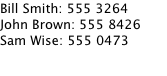
import QtQuick 2.0
ListModel {
    ListElement {
        name: "Bill Smith"
        number: "555 3264"
    }
    ListElement {
        name: "John Brown"
        number: "555 8426"
    }
    ListElement {
        name: "Sam Wise"
        number: "555 0473"
    }
}
Another component can display this model data in a ListView ,像这样:
import QtQuick 2.0
ListView {
    width: 180; height: 200
    model: ContactModel {}
    delegate: Text {
        text: name + ": " + number
    }
}
在这里,
ListView
创建
ContactModel
component for its model, and a
Text
item for its delegate. The view will create a new
Text
component for each item in the model. Notice the delegate is able to access the model's
名称
and
编号
data directly.
An improved list view is shown below. The delegate is visually improved and is moved into a separate
contactDelegate
组件。
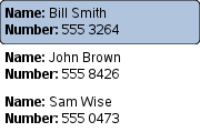
Rectangle {
    width: 180; height: 200
    Component {
        id: contactDelegate
        Item {
            width: 180; height: 40
            Column {
                Text { text: '<b>Name:</b> ' + name }
                Text { text: '<b>Number:</b> ' + number }
            }
        }
    }
    ListView {
        anchors.fill: parent
        model: ContactModel {}
        delegate: contactDelegate
        highlight: Rectangle { color: "lightsteelblue"; radius: 5 }
        focus: true
    }
}
The currently selected item is highlighted with a blue
Rectangle
使用
highlight
property, and
focus
被设为
true
to enable keyboard navigation for the list view. The list view itself is a focus scope (see
Qt Quick 中的键盘聚焦
了解更多细节)。
Delegates are instantiated as needed and may be destroyed at any time. They are parented to ListView 's contentItem , not to the view itself. State should never be stored in a delegate.
ListView
attaches a number of properties to the root item of the delegate, for example
ListView.isCurrentItem
. In the following example, the root delegate item can access this attached property directly as
ListView.isCurrentItem
, while the child
contactInfo
object must refer to this property as
wrapper.ListView.isCurrentItem
.
ListView {
    width: 180; height: 200
    Component {
        id: contactsDelegate
        Rectangle {
            id: wrapper
            width: 180
            height: contactInfo.height
            color: ListView.isCurrentItem ? "black" : "red"
            Text {
                id: contactInfo
                text: name + ": " + number
                color: wrapper.ListView.isCurrentItem ? "red" : "black"
            }
        }
    }
    model: ContactModel {}
    delegate: contactsDelegate
    focus: true
}
注意: Views do not enable clip automatically. If the view is not clipped by another item or the screen, it will be necessary to set clip: true in order to have the out of view items clipped nicely.
The layout of the items in a ListView can be controlled by these properties:
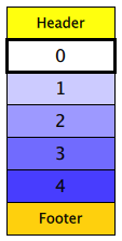
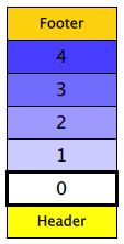
默认情况下, ListView has a vertical orientation, and items are laid out from top to bottom. The table below shows the different layouts that a ListView can have, depending on the values of the properties listed above.
| ListViews with Qt.Vertical orientation | |
|---|---|
Top to bottom
|
Bottom to top
|
| ListViews with Qt.Horizontal orientation | |
Left to right
|
Right to left
|
By default, a vertical ListView sets flickableDirection to Flickable.Vertical , and a horizontal ListView sets it to Flickable.Horizontal . Furthermore, a vertical ListView only calculates (estimates) the contentHeight , and a horizontal ListView only calculates the contentWidth . The other dimension is set to -1 .
Since Qt 5.9 (Qt Quick 2.9), it is possible to make a ListView that can be flicked to both directions. In order to do this, the flickableDirection can be set to Flickable.AutoFlickDirection or Flickable.AutoFlickIfNeeded , and the desired contentWidth or contentHeight must be provided.
ListView {
    width: 180; height: 200
    contentWidth: 320
    flickableDirection: Flickable.AutoFlickDirection
    model: ContactModel {}
    delegate: Row {
        Text { text: '<b>Name:</b> ' + name; width: 160 }
        Text { text: '<b>Number:</b> ' + number; width: 160 }
    }
}
The Z value of items determines whether they are rendered above or below other items. ListView uses several different default Z values, depending on what type of item is being created:
| 特性 | Default Z value |
|---|---|
| delegate | 1 |
| footer | 1 |
| header | 1 |
| highlight | 0 |
| section.delegate | 2 |
These default values are set if the Z value of the item is
0
, so setting the Z value of these items to
0
has no effect. Note that the Z value is of type
real
, so it is possible to set fractional values like
0.1
.
另请参阅 QML Data Models , GridView , PathView ,和 Qt Quick 范例 - 视图 .
|
add : Transition |
This property holds the transition to apply to items that are added to the view.
For example, here is a view that specifies such a transition:
ListView {
    ...
    add: Transition {
        NumberAnimation { properties: "x,y"; from: 100; duration: 1000 }
    }
}
Whenever an item is added to the above view, the item will be animated from the position (100,100) to its final x,y position within the view, over one second. The transition only applies to the new items that are added to the view; it does not apply to the items below that are displaced by the addition of the new items. To animate the displaced items, set the displaced or addDisplaced 特性。
For more details and examples on how to use view transitions, see the ViewTransition 文档编制。
注意: This transition is not applied to the items that are created when the view is initially populated, or when the view's model changes. (In those cases, the populate transition is applied instead.) Additionally, this transition should not animate the height of the new item; doing so will cause any items beneath the new item to be laid out at the wrong position. Instead, the height can be animated within the onAdd handler in the delegate.
另请参阅 addDisplaced , populate ,和 ViewTransition .
|
addDisplaced : Transition |
This property holds the transition to apply to items within the view that are displaced by the addition of other items to the view.
For example, here is a view that specifies such a transition:
ListView {
    ...
    addDisplaced: Transition {
        NumberAnimation { properties: "x,y"; duration: 1000 }
    }
}
Whenever an item is added to the above view, all items beneath the new item are displaced, causing them to move down (or sideways, if horizontally orientated) within the view. As this displacement occurs, the items' movement to their new x,y positions within the view will be animated by a NumberAnimation over one second, as specified. This transition is not applied to the new item that has been added to the view; to animate the added items, set the add 特性。
If an item is displaced by multiple types of operations at the same time, it is not defined as to whether the addDisplaced, moveDisplaced or removeDisplaced transition will be applied. Additionally, if it is not necessary to specify different transitions depending on whether an item is displaced by an add, move or remove operation, consider setting the displaced 特性代替。
For more details and examples on how to use view transitions, see the ViewTransition 文档编制。
注意: This transition is not applied to the items that are created when the view is initially populated, or when the view's model changes. In those cases, the populate transition is applied instead.
另请参阅 displaced , add , populate ,和 ViewTransition .
|
cacheBuffer : int |
This property determines whether delegates are retained outside the visible area of the view.
If this value is greater than zero, the view may keep as many delegates instantiated as it can fit within the buffer specified. For example, if in a vertical view the delegate is 20 pixels high and
cacheBuffer
is set to 40, then up to 2 delegates above and 2 delegates below the visible area may be created/retained. The buffered delegates are created asynchronously, allowing creation to occur across multiple frames and reducing the likelihood of skipping frames. In order to improve painting performance delegates outside the visible area are not painted.
The default value of this property is platform dependent, but will usually be a value greater than zero. Negative values are ignored.
Note that cacheBuffer is not a pixel buffer - it only maintains additional instantiated delegates.
注意: Setting this property is not a replacement for creating efficient delegates. It can improve the smoothness of scrolling behavior at the expense of additional memory usage. The fewer objects and bindings in a delegate, the faster a view can be scrolled. It is important to realize that setting a cacheBuffer will only postpone issues caused by slow-loading delegates, it is not a solution for this scenario.
The cacheBuffer operates outside of any display margins specified by displayMarginBeginning or displayMarginEnd .
|
count : int |
This property holds the number of items in the view.
|
currentIndex : int |
The
currentIndex
property holds the index of the current item, and
currentItem
holds the current item. Setting the currentIndex to -1 will clear the highlight and set
currentItem
to null.
若
highlightFollowsCurrentItem
is
true
, setting either of these properties will smoothly scroll the
ListView
so that the current item becomes visible.
Note that the position of the current item may only be approximate until it becomes visible in the view.
|
currentItem : Item |
The
currentIndex
property holds the index of the current item, and
currentItem
holds the current item. Setting the
currentIndex
to -1 will clear the highlight and set currentItem to null.
若
highlightFollowsCurrentItem
is
true
, setting either of these properties will smoothly scroll the
ListView
so that the current item becomes visible.
Note that the position of the current item may only be approximate until it becomes visible in the view.
|
currentSection : string |
This property holds the section that is currently at the beginning of the view.
|
delegate : Component |
The delegate provides a template defining each item instantiated by the view. The index is exposed as an accessible
index
property. Properties of the model are also available depending upon the type of
Data Model
.
The number of objects and bindings in the delegate has a direct effect on the flicking performance of the view. If at all possible, place functionality that is not needed for the normal display of the delegate in a Loader which can load additional components when needed.
The ListView will lay out the items based on the size of the root item in the delegate.
It is recommended that the delegate's size be a whole number to avoid sub-pixel alignment of items.
默认
stacking order
of delegate instances is
1
.
注意: Delegates are instantiated as needed and may be destroyed at any time. They are parented to ListView 's contentItem , not to the view itself. State should never be stored in a delegate.
另请参阅 Stacking Order in ListView .
|
displaced : Transition |
This property holds the generic transition to apply to items that have been displaced by any model operation that affects the view.
This is a convenience for specifying the generic transition to be applied to any items that are displaced by an add, move or remove operation, without having to specify the individual addDisplaced , moveDisplaced and removeDisplaced properties. For example, here is a view that specifies a displaced transition:
ListView {
    ...
    displaced: Transition {
        NumberAnimation { properties: "x,y"; duration: 1000 }
    }
}
When any item is added, moved or removed within the above view, the items below it are displaced, causing them to move down (or sideways, if horizontally orientated) within the view. As this displacement occurs, the items' movement to their new x,y positions within the view will be animated by a NumberAnimation over one second, as specified.
If a view specifies this generic displaced transition as well as a specific addDisplaced , moveDisplaced or removeDisplaced transition, the more specific transition will be used instead of the generic displaced transition when the relevant operation occurs, providing that the more specific transition has not been disabled (by setting enabled to false). If it has indeed been disabled, the generic displaced transition is applied instead.
For more details and examples on how to use view transitions, see the ViewTransition 文档编制。
另请参阅 addDisplaced , moveDisplaced , removeDisplaced ,和 ViewTransition .
|
displayMarginBeginning : int |
This property allows delegates to be displayed outside of the view geometry.
If this value is non-zero, the view will create extra delegates before the start of the view, or after the end. The view will create as many delegates as it can fit into the pixel size specified.
For example, if in a vertical view the delegate is 20 pixels high and
displayMarginBeginning
and
displayMarginEnd
are both set to 40, then 2 delegates above and 2 delegates below will be created and shown.
默认值为 0。
This property is meant for allowing certain UI configurations, and not as a performance optimization. If you wish to create delegates outside of the view geometry for performance reasons, you probably want to use the cacheBuffer 特性代替。
This property was introduced in QtQuick 2.3.
|
displayMarginEnd : int |
This property allows delegates to be displayed outside of the view geometry.
If this value is non-zero, the view will create extra delegates before the start of the view, or after the end. The view will create as many delegates as it can fit into the pixel size specified.
For example, if in a vertical view the delegate is 20 pixels high and
displayMarginBeginning
and
displayMarginEnd
are both set to 40, then 2 delegates above and 2 delegates below will be created and shown.
默认值为 0。
This property is meant for allowing certain UI configurations, and not as a performance optimization. If you wish to create delegates outside of the view geometry for performance reasons, you probably want to use the cacheBuffer 特性代替。
This property was introduced in QtQuick 2.3.
|
effectiveLayoutDirection : enumeration |
This property holds the effective layout direction of a horizontally-oriented list.
When using the attached property LayoutMirroring::enabled for locale layouts, the visual layout direction of the horizontal list will be mirrored. However, the property layoutDirection will remain unchanged.
另请参阅 ListView::layoutDirection and LayoutMirroring .
|
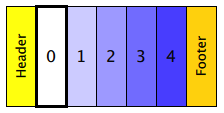
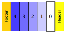
footer : Component |
This property holds the component to use as the footer.
An instance of the footer component is created for each view. The footer is positioned at the end of the view, after any items. The default
stacking order
of the footer is
1
.
另请参阅 header , footerItem ,和 Stacking Order in ListView .
|
footerItem : Item |
This holds the footer item created from the footer 组件。
An instance of the footer component is created for each view. The footer is positioned at the end of the view, after any items. The default
stacking order
of the footer is
1
.
另请参阅 footer , headerItem ,和 Stacking Order in ListView .
|
footerPositioning : enumeration |
This property determines the positioning of the footer item .
可能的值包括:
注意:
This property has no effect on the
stacking order
of the footer. For example, if the footer should be shown above the
delegate
items when using
ListView.OverlayFooter
, its Z value should be set to a value higher than that of the delegates. For more information, see
Stacking Order in ListView
.
该特性在 Qt 5.4 引入。
|
header : Component |
This property holds the component to use as the header.
An instance of the header component is created for each view. The header is positioned at the beginning of the view, before any items. The default
stacking order
of the header is
1
.
另请参阅 footer , headerItem ,和 Stacking Order in ListView .
|
headerItem : Item |
This holds the header item created from the header 组件。
An instance of the header component is created for each view. The header is positioned at the beginning of the view, before any items. The default
stacking order
of the header is
1
.
另请参阅 header , footerItem ,和 Stacking Order in ListView .
|
headerPositioning : enumeration |
This property determines the positioning of the header item .
可能的值包括:
注意:
This property has no effect on the
stacking order
of the header. For example, if the header should be shown above the
delegate
items when using
ListView.OverlayHeader
, its Z value should be set to a value higher than that of the delegates. For more information, see
Stacking Order in ListView
.
该特性在 Qt 5.4 引入。
|
highlight : Component |
This property holds the component to use as the highlight.
An instance of the highlight component is created for each list. The geometry of the resulting component instance is managed by the list so as to stay with the current item, unless the
highlightFollowsCurrentItem
property is false. The default
stacking order
of the highlight item is
0
.
另请参阅 highlightItem , highlightFollowsCurrentItem , ListView highlight example ,和 Stacking Order in ListView .
|
highlightFollowsCurrentItem : bool |
This property holds whether the highlight is managed by the view.
If this property is true (the default value), the highlight is moved smoothly to follow the current item. Otherwise, the highlight is not moved by the view, and any movement must be implemented by the highlight.
Here is a highlight with its motion defined by a SpringAnimation item:
Component {
    id: highlight
    Rectangle {
        width: 180; height: 40
        color: "lightsteelblue"; radius: 5
        y: list.currentItem.y
        Behavior on y {
            SpringAnimation {
                spring: 3
                damping: 0.2
            }
        }
    }
}
ListView {
    id: list
    width: 180; height: 200
    model: ContactModel {}
    delegate: Text { text: name }
    highlight: highlight
    highlightFollowsCurrentItem: false
    focus: true
}
Note that the highlight animation also affects the way that the view is scrolled. This is because the view moves to maintain the highlight within the preferred highlight range (or visible viewport).
另请参阅 highlight and highlightMoveVelocity .
|
highlightItem : Item |
This holds the highlight item created from the highlight 组件。
The
highlightItem
is managed by the view unless
highlightFollowsCurrentItem
is set to false. The default
stacking order
of the highlight item is
0
.
另请参阅 highlight , highlightFollowsCurrentItem ,和 Stacking Order in ListView .
|
highlightMoveDuration : int |
These properties control the speed of the move and resize animations for the highlight delegate.
highlightFollowsCurrentItem must be true for these properties to have effect.
The default value for the velocity properties is 400 pixels/second. The default value for the duration properties is -1, i.e. the highlight will take as much time as necessary to move at the set speed.
These properties have the same characteristics as a SmoothedAnimation : if both the velocity and duration are set, the animation will use whichever gives the shorter duration.
The move velocity and duration properties are used to control movement due to index changes; for example, when incrementCurrentIndex() is called. When the user flicks a ListView , the velocity from the flick is used to control the movement instead.
To set only one property, the other can be set to
-1
. For example, if you only want to animate the duration and not velocity, use the following code:
highlightMoveDuration: 1000
highlightMoveVelocity: -1
另请参阅 highlightFollowsCurrentItem .
|
highlightMoveVelocity : real |
These properties control the speed of the move and resize animations for the highlight delegate.
highlightFollowsCurrentItem must be true for these properties to have effect.
The default value for the velocity properties is 400 pixels/second. The default value for the duration properties is -1, i.e. the highlight will take as much time as necessary to move at the set speed.
These properties have the same characteristics as a SmoothedAnimation : if both the velocity and duration are set, the animation will use whichever gives the shorter duration.
The move velocity and duration properties are used to control movement due to index changes; for example, when incrementCurrentIndex() is called. When the user flicks a ListView , the velocity from the flick is used to control the movement instead.
To set only one property, the other can be set to
-1
. For example, if you only want to animate the duration and not velocity, use the following code:
highlightMoveDuration: 1000
highlightMoveVelocity: -1
另请参阅 highlightFollowsCurrentItem .
|
highlightRangeMode : enumeration |
These properties define the preferred range of the highlight (for the current item) within the view. The
preferredHighlightBegin
value must be less than the
preferredHighlightEnd
值。
These properties affect the position of the current item when the list is scrolled. For example, if the currently selected item should stay in the middle of the list when the view is scrolled, set the
preferredHighlightBegin
and
preferredHighlightEnd
values to the top and bottom coordinates of where the middle item would be. If the
currentItem
is changed programmatically, the list will automatically scroll so that the current item is in the middle of the view. Furthermore, the behavior of the current item index will occur whether or not a highlight exists.
Valid values for
highlightRangeMode
是:
|
highlightResizeDuration : int |
These properties control the speed of the move and resize animations for the highlight delegate.
highlightFollowsCurrentItem must be true for these properties to have effect.
The default value for the velocity properties is 400 pixels/second. The default value for the duration properties is -1, i.e. the highlight will take as much time as necessary to move at the set speed.
These properties have the same characteristics as a SmoothedAnimation : if both the velocity and duration are set, the animation will use whichever gives the shorter duration.
The move velocity and duration properties are used to control movement due to index changes; for example, when incrementCurrentIndex() is called. When the user flicks a ListView , the velocity from the flick is used to control the movement instead.
To set only one property, the other can be set to
-1
. For example, if you only want to animate the duration and not velocity, use the following code:
highlightMoveDuration: 1000
highlightMoveVelocity: -1
另请参阅 highlightFollowsCurrentItem .
|
highlightResizeVelocity : real |
These properties control the speed of the move and resize animations for the highlight delegate.
highlightFollowsCurrentItem must be true for these properties to have effect.
The default value for the velocity properties is 400 pixels/second. The default value for the duration properties is -1, i.e. the highlight will take as much time as necessary to move at the set speed.
These properties have the same characteristics as a SmoothedAnimation : if both the velocity and duration are set, the animation will use whichever gives the shorter duration.
The move velocity and duration properties are used to control movement due to index changes; for example, when incrementCurrentIndex() is called. When the user flicks a ListView , the velocity from the flick is used to control the movement instead.
To set only one property, the other can be set to
-1
. For example, if you only want to animate the duration and not velocity, use the following code:
highlightMoveDuration: 1000
highlightMoveVelocity: -1
另请参阅 highlightFollowsCurrentItem .
|
keyNavigationEnabled : bool |
This property holds whether the key navigation of the list is enabled.
若这为
true
, the user can navigate the view with a keyboard. It is useful for applications that need to selectively enable or disable mouse and keyboard interaction.
By default, the value of this property is bound to interactive to ensure behavior compatibility for existing applications. When explicitly set, it will cease to be bound to the interactive property.
该特性在 Qt 5.7 引入。
另请参阅 interactive .
|
keyNavigationWraps : bool |
This property holds whether the list wraps key navigation.
If this is true, key navigation that would move the current item selection past the end of the list instead wraps around and moves the selection to the start of the list, and vice-versa.
By default, key navigation is not wrapped.
|
layoutDirection : enumeration |
This property holds the layout direction of a horizontally-oriented list.
可能的值:
Setting this property has no effect if the orientation is Qt.Vertical.
另请参阅 ListView::effectiveLayoutDirection and ListView::verticalLayoutDirection .
This property holds the model providing data for the list.
The model provides the set of data that is used to create the items in the view. Models can be created directly in QML using ListModel , XmlListModel or ObjectModel , or provided by C++ model classes. If a C++ model class is used, it must be a subclass of QAbstractItemModel or a simple list.
另请参阅 数据模型 .
|
move : Transition |
This property holds the transition to apply to items in the view that are being moved due to a move operation in the view's model .
For example, here is a view that specifies such a transition:
ListView {
    ...
    move: Transition {
        NumberAnimation { properties: "x,y"; duration: 1000 }
    }
}
Whenever the model performs a move operation to move a particular set of indexes, the respective items in the view will be animated to their new positions in the view over one second. The transition only applies to the items that are the subject of the move operation in the model; it does not apply to items below them that are displaced by the move operation. To animate the displaced items, set the displaced or moveDisplaced 特性。
For more details and examples on how to use view transitions, see the ViewTransition 文档编制。
另请参阅 moveDisplaced and ViewTransition .
|
moveDisplaced : Transition |
This property holds the transition to apply to items that are displaced by a move operation in the view's model .
For example, here is a view that specifies such a transition:
ListView {
    ...
    moveDisplaced: Transition {
        NumberAnimation { properties: "x,y"; duration: 1000 }
    }
}
Whenever the model performs a move operation to move a particular set of indexes, the items between the source and destination indexes of the move operation are displaced, causing them to move upwards or downwards (or sideways, if horizontally orientated) within the view. As this displacement occurs, the items' movement to their new x,y positions within the view will be animated by a NumberAnimation over one second, as specified. This transition is not applied to the items that are the actual subjects of the move operation; to animate the moved items, set the move 特性。
If an item is displaced by multiple types of operations at the same time, it is not defined as to whether the addDisplaced , moveDisplaced or removeDisplaced transition will be applied. Additionally, if it is not necessary to specify different transitions depending on whether an item is displaced by an add, move or remove operation, consider setting the displaced 特性代替。
For more details and examples on how to use view transitions, see the ViewTransition 文档编制。
另请参阅 displaced , move ,和 ViewTransition .
|
orientation : enumeration |
This property holds the orientation of the list.
可能的值:
Horizontal orientation:

|
|
Vertical orientation:
|
另请参阅 Flickable Direction .
|
populate : Transition |
This property holds the transition to apply to the items that are initially created for a view.
It is applied to all items that are created when:
For example, here is a view that specifies such a transition:
ListView {
    ...
    populate: Transition {
        NumberAnimation { properties: "x,y"; duration: 1000 }
    }
}
When the view is initialized, the view will create all the necessary items for the view, then animate them to their correct positions within the view over one second.
However when scrolling the view later, the populate transition does not run, even though delegates are being instantiated as they become visible. When the model changes in a way that new delegates become visible, the
add
transition is the one that runs. So you should not depend on the
populate
transition to initialize properties in the delegate, because it does not apply to every delegate. If your animation sets the
to
value of a property, the property should initially have the
to
value, and the animation should set the
from
value in case it is animated:
ListView {
    ...
    delegate: Rectangle {
        opacity: 1 // not necessary because it's the default
    }
    populate: Transition {
        NumberAnimation { property: "opacity"; from: 0; to: 1; duration: 1000 }
    }
}
For more details and examples on how to use view transitions, see the ViewTransition 文档编制。
另请参阅 add and ViewTransition .
|
preferredHighlightBegin : real |
These properties define the preferred range of the highlight (for the current item) within the view. The
preferredHighlightBegin
value must be less than the
preferredHighlightEnd
值。
These properties affect the position of the current item when the list is scrolled. For example, if the currently selected item should stay in the middle of the list when the view is scrolled, set the
preferredHighlightBegin
and
preferredHighlightEnd
values to the top and bottom coordinates of where the middle item would be. If the
currentItem
is changed programmatically, the list will automatically scroll so that the current item is in the middle of the view. Furthermore, the behavior of the current item index will occur whether or not a highlight exists.
Valid values for
highlightRangeMode
是:
|
preferredHighlightEnd : real |
These properties define the preferred range of the highlight (for the current item) within the view. The
preferredHighlightBegin
value must be less than the
preferredHighlightEnd
值。
These properties affect the position of the current item when the list is scrolled. For example, if the currently selected item should stay in the middle of the list when the view is scrolled, set the
preferredHighlightBegin
and
preferredHighlightEnd
values to the top and bottom coordinates of where the middle item would be. If the
currentItem
is changed programmatically, the list will automatically scroll so that the current item is in the middle of the view. Furthermore, the behavior of the current item index will occur whether or not a highlight exists.
Valid values for
highlightRangeMode
是:
|
remove : Transition |
This property holds the transition to apply to items that are removed from the view.
For example, here is a view that specifies such a transition:
ListView {
    ...
    remove: Transition {
        ParallelAnimation {
            NumberAnimation { property: "opacity"; to: 0; duration: 1000 }
            NumberAnimation { properties: "x,y"; to: 100; duration: 1000 }
        }
    }
}
Whenever an item is removed from the above view, the item will be animated to the position (100,100) over one second, and in parallel will also change its opacity to 0. The transition only applies to the items that are removed from the view; it does not apply to the items below them that are displaced by the removal of the items. To animate the displaced items, set the displaced or removeDisplaced 特性。
Note that by the time the transition is applied, the item has already been removed from the model; any references to the model data for the removed index will not be valid.
Additionally, if the delayRemove attached property has been set for a delegate item, the remove transition will not be applied until delayRemove becomes false again.
For more details and examples on how to use view transitions, see the ViewTransition 文档编制。
另请参阅 removeDisplaced and ViewTransition .
|
removeDisplaced : Transition |
This property holds the transition to apply to items in the view that are displaced by the removal of other items in the view.
For example, here is a view that specifies such a transition:
ListView {
    ...
    removeDisplaced: Transition {
        NumberAnimation { properties: "x,y"; duration: 1000 }
    }
}
Whenever an item is removed from the above view, all items beneath it are displaced, causing them to move upwards (or sideways, if horizontally orientated) within the view. As this displacement occurs, the items' movement to their new x,y positions within the view will be animated by a NumberAnimation over one second, as specified. This transition is not applied to the item that has actually been removed from the view; to animate the removed items, set the remove 特性。
If an item is displaced by multiple types of operations at the same time, it is not defined as to whether the addDisplaced , moveDisplaced or removeDisplaced transition will be applied. Additionally, if it is not necessary to specify different transitions depending on whether an item is displaced by an add, move or remove operation, consider setting the displaced 特性代替。
For more details and examples on how to use view transitions, see the ViewTransition 文档编制。
另请参阅 displaced , remove ,和 ViewTransition .
|
section group |
|---|
|
section.property : string |
|
section.criteria : enumeration |
|
section.delegate : Component |
|
section.labelPositioning : enumeration |
These properties determine the expression to be evaluated and appearance of the section labels.
section.property
holds the name of the property that is the basis of each section.
section.criteria
holds the criteria for forming each section based on
section.property
. This value can be one of:
section.property
值。
section.property
value (for example, 'A', 'B', 'C' sections, etc. for an address book)
A case insensitive comparison is used when determining section boundaries.
section.delegate
holds the delegate component for each section. The default
stacking order
of section delegate instances is
2
.
section.labelPositioning
determines whether the current and/or next section labels stick to the start/end of the view, and whether the labels are shown inline. This value can be a combination of:
ViewSection.NextLabelAtEnd - the next section label (beyond all visible sections) sticks to the end of the view as it is moved.
注意:
Enabling
ViewSection.NextLabelAtEnd
requires the view to scan ahead for the next section, which has performance implications, especially for slower models.
Each item in the list has attached properties named
ListView.section
,
ListView.previousSection
and
ListView.nextSection
.
For example, here is a
ListView
that displays a list of animals, separated into sections. Each item in the
ListView
is placed in a different section depending on the "size" property of the model item. The
sectionHeading
delegate component provides the light blue bar that marks the beginning of each section.
    // The delegate for each section header
    Component {
        id: sectionHeading
        Rectangle {
            width: container.width
            height: childrenRect.height
            color: "lightsteelblue"
            Text {
                text: section
                font.bold: true
                font.pixelSize: 20
            }
        }
    }
    ListView {
        id: view
        anchors.top: parent.top
        anchors.bottom: buttonBar.top
        width: parent.width
        model: animalsModel
        delegate: Text { text: name; font.pixelSize: 18 }
        section.property: "size"
        section.criteria: ViewSection.FullString
        section.delegate: sectionHeading
    }
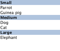
注意: Adding sections to a ListView does not automatically re-order the list items by the section criteria. If the model is not ordered by section, then it is possible that the sections created will not be unique; each boundary between differing sections will result in a section header being created even if that section exists elsewhere.
另请参阅 ListView examples and Stacking Order in ListView .
|
snapMode : enumeration |
This property determines how the view scrolling will settle following a drag or flick. The possible values are:
snapMode
does not affect the
currentIndex
. To update the
currentIndex
as the list is moved, set
highlightRangeMode
to
ListView.StrictlyEnforceRange
.
另请参阅 highlightRangeMode .
|
spacing : real |
This property holds the spacing between items.
默认值为 0。
|
verticalLayoutDirection : enumeration |
This property holds the layout direction of a vertically-oriented list.
可能的值:
Setting this property has no effect if the orientation is Qt.Horizontal.
另请参阅 ListView::layoutDirection .
|
ListView.delayRemove : bool |
This attached property holds whether the delegate may be destroyed. It is attached to each instance of the delegate. The default value is false.
It is sometimes necessary to delay the destruction of an item until an animation completes. The example delegate below ensures that the animation completes before the item is removed from the list.
Component {
    id: delegate
    Item {
        ListView.onRemove: SequentialAnimation {
            PropertyAction { target: wrapper; property: "ListView.delayRemove"; value: true }
            NumberAnimation { target: wrapper; property: "scale"; to: 0; duration: 250; easing.type: Easing.InOutQuad }
            PropertyAction { target: wrapper; property: "ListView.delayRemove"; value: false }
        }
    }
}
若
remove
transition has been specified, it will not be applied until delayRemove is returned to
false
.
|
ListView.isCurrentItem : bool |
This attached property is true if this delegate is the current item; otherwise false.
It is attached to each instance of the delegate.
This property may be used to adjust the appearance of the current item, for example:
ListView {
    width: 180; height: 200
    Component {
        id: contactsDelegate
        Rectangle {
            id: wrapper
            width: 180
            height: contactInfo.height
            color: ListView.isCurrentItem ? "black" : "red"
            Text {
                id: contactInfo
                text: name + ": " + number
                color: wrapper.ListView.isCurrentItem ? "red" : "black"
            }
        }
    }
    model: ContactModel {}
    delegate: contactsDelegate
    focus: true
}
|
ListView.nextSection : string |
This attached property holds the section of the next element.
It is attached to each instance of the delegate.
The section is evaluated using the section 特性。
|
ListView.previousSection : string |
This attached property holds the section of the previous element.
It is attached to each instance of the delegate.
The section is evaluated using the section 特性。
|
ListView.section : string |
This attached property holds the section of this element.
It is attached to each instance of the delegate.
The section is evaluated using the section 特性。
|
ListView.view : ListView |
This attached property holds the view that manages this delegate instance.
It is attached to each instance of the delegate and also to the header, the footer, the section and the highlight delegates.
This attached signal is emitted immediately after an item is added to the view.
If an add transition is specified, it is applied immediately after this signal is handled.
相应处理程序是
onAdd
.
This attached signal is emitted immediately before an item is removed from the view.
若 remove transition has been specified, it is applied after this signal is handled, providing that delayRemove 为 false。
相应处理程序是
onRemove
.
Positions the view at the beginning or end, taking into account any header or footer.
It is not recommended to use contentX or contentY to position the view at a particular index. This is unreliable since removing items from the start of the list does not cause all other items to be repositioned, and because the actual start of the view can vary based on the size of the delegates.
注意 : methods should only be called after the Component has completed. To position the view at startup, this method should be called by Component.onCompleted. For example, to position the view at the end on startup:
Component.onCompleted: positionViewAtEnd()
Decrements the current index. The current index will wrap if keyNavigationWraps is true and it is currently at the beginning. This method has no effect if the count is zero.
注意 : methods should only be called after the Component has completed.
Responding to changes in the model is usually batched to happen only once per frame. This means that inside script blocks it is possible for the underlying model to have changed, but the ListView has not caught up yet.
This method forces the ListView to immediately respond to any outstanding changes in the model.
注意 : methods should only be called after the Component has completed.
该方法在 Qt 5.1 引入。
Increments the current index. The current index will wrap if keyNavigationWraps is true and it is currently at the end. This method has no effect if the count is zero.
注意 : methods should only be called after the Component has completed.
Returns the index of the visible item containing the point x , y in content coordinates. If there is no item at the point specified, or the item is not visible -1 is returned.
If the item is outside the visible area, -1 is returned, regardless of whether an item will exist at that point when scrolled into view.
注意 : methods should only be called after the Component has completed.
Returns the visible item containing the point x , y in content coordinates. If there is no item at the point specified, or the item is not visible null is returned.
If the item is outside the visible area, null is returned, regardless of whether an item will exist at that point when scrolled into view.
注意 : methods should only be called after the Component has completed.
|
positionViewAtIndex ( int index , PositionMode mode ) |
Positions the view such that the index is at the position specified by mode :
If positioning the view at index would cause empty space to be displayed at the beginning or end of the view, the view will be positioned at the boundary.
It is not recommended to use
contentX
or
contentY
to position the view at a particular index. This is unreliable since removing items from the start of the list does not cause all other items to be repositioned, and because the actual start of the view can vary based on the size of the delegates. The correct way to bring an item into view is with
positionViewAtIndex
.
注意 : methods should only be called after the Component has completed. To position the view at startup, this method should be called by Component.onCompleted. For example, to position the view at the end:
Component.onCompleted: positionViewAtIndex(count - 1, ListView.Beginning)