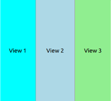
Lays out items with a draggable splitter between each item. 更多...
| import 语句: | import QtQuick.Controls 1.4 |
| Since: | Qt 5.1 |
| 继承: | Item |

SplitView is a control that lays out items horizontally or vertically with a draggable splitter between each item.
There will always be one (and only one) item in the
SplitView
that has
Layout.fillWidth
设为
true
(或
Layout.fillHeight
, if orientation is Qt.Vertical). This means that the item will get all leftover space when other items have been laid out. By default, the last visible child of the
SplitView
will have this set, but it can be changed by explicitly setting fillWidth to
true
on another item.
As the fillWidth item will automatically be resized to fit the extra space, explicit assignments to its width and height properties will be ignored (but Layout.minimumWidth and Layout.maximumWidth will still be respected). The initial sizes of other items should be set via their width and height properties. Any binding assignment to an item's width or height will be broken as soon as the user drags that item's splitter handle.
A handle can belong to the item either on the left or top side, or on the right or bottom side:
This will again control which item gets resized when the user drags a handle, and which handle gets hidden when an item is told to hide.
SplitView supports setting attached Layout properties on child items, which means that you can set the following attached properties for each child:
true
for only one child)
true
for only one child)
注意: import QtQuick .Layouts 1.0 in your QML file in order to use the Layout attached properties inside SplitView .
范例:
要创建 SplitView with three items, and let the center item get superfluous space, one could do the following:
SplitView {
    anchors.fill: parent
    orientation: Qt.Horizontal
    Rectangle {
        width: 200
        Layout.maximumWidth: 400
        color: "lightblue"
        Text {
            text: "View 1"
            anchors.centerIn: parent
        }
    }
    Rectangle {
        id: centerItem
        Layout.minimumWidth: 50
        Layout.fillWidth: true
        color: "lightgray"
        Text {
            text: "View 2"
            anchors.centerIn: parent
        }
    }
    Rectangle {
        width: 200
        color: "lightgreen"
        Text {
            text: "View 3"
            anchors.centerIn: parent
        }
    }
}
|
handleDelegate : Component |
This property holds the delegate that will be instantiated between each child item. Inside the delegate the following properties are available:
| readonly property bool styleData.index | Specifies the index of the splitter handle. The handle between the first and the second item will get index 0, the next handle index 1 etc. |
| readonly property bool styleData.hovered | The handle is being hovered. |
| readonly property bool styleData.pressed | The handle is being pressed. |
| readonly property bool styleData.resizing | The handle is being dragged. |
This property holds the orientation of the
SplitView
. The value can be either
Qt.Horizontal
or
Qt.Vertical
。默认值为
Qt.Horizontal
.
This propery is
true
when the user is resizing any of the items by dragging on the splitter handles.
|
void addItem ( Item item ) |
Add an item to the end of the view.
This QML method was introduced in QtQuick.Controls 1.3.
|
void removeItem ( Item item ) |
移除 item from the view.
This QML method was introduced in QtQuick.Controls 1.4.