現在,我們會見到一些使用 Qt 樣式錶的入門範例。
讓我們通過將黃色設為背景色對於所有 QLineEdit 在應用程序中。可以像這樣達成:
qApp->setStyleSheet("QLineEdit { background-color: yellow }");
若想要特性僅應用於 QLineEdit 的子級 (或孫輩或曾孫輩) 在特定對話框,最好這樣做:
myDialog->setStyleSheet("QLineEdit { background-color: yellow }");
若想要特性僅應用於某一特定 QLineEdit ,可以賦予它名稱使用 QObject::setObjectName () 並使用 ID 選擇器來引用它:
myDialog->setStyleSheet("QLineEdit#nameEdit { background-color: yellow }");
另外,可以設置 background-color 特性直接在 QLineEdit ,省略選擇器:
nameEdit->setStyleSheet("background-color: yellow");
為確保良好的對比度,還應該為文本指定閤適顔色:
nameEdit->setStyleSheet("color: blue; background-color: yellow");
改變選中文本所用顔色,可能是好主意:
nameEdit->setStyleSheet("color: blue;"
                        "background-color: yellow;"
                        "selection-color: yellow;"
                        "selection-background-color: blue;");
在很多狀況下,需要呈現擁有強製性字段的錶單。為嚮用戶指示字段是強製性的,一種有效 (盡管審美可疑) 解決方案是使用黃色作為這些字段的背景色。事實證明,使用 Qt 樣式錶能輕鬆實現。首先,將使用以下應用程序範圍樣式錶:
*[mandatoryField="true"] { background-color: yellow }
這意味著每個 Widget 的
mandatoryField
Qt 特性被設為 true 將擁有黃色背景。
接著,對於各強製性字段 Widget,隻需創建
mandatoryField
動態特性並將其設為 true。例如:
QLineEdit *nameEdit = new QLineEdit(this);
nameEdit->setProperty("mandatoryField", true);
QLineEdit *emailEdit = new QLineEdit(this);
emailEdit->setProperty("mandatoryField", true);
QSpinBox *ageSpinBox = new QSpinBox(this);
ageSpinBox->setProperty("mandatoryField", true);
這次,將展示如何創建紅色 QPushButton 。此 QPushButton 大概會連接到一段極具破壞性代碼。
首先,我們試圖使用此樣式錶:
QPushButton#evilButton { background-color: red }
不管怎樣,結果是沒有邊框的單調、扁平按鈕:
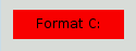
發生瞭什麼是這樣的:
none
.
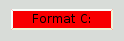
讓我們通過指定邊框來改善這種狀況:
QPushButton#evilButton {
    background-color: red;
    border-style: outset;
    border-width: 2px;
    border-color: beige;
}
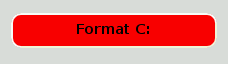
Things look already a lot better. But the button looks a bit cramped. Let's specify some spacing between the border and the text using the padding . Additionally, we will enforce a minimum width, round the corners, and specify a larger font to make the button look nicer:
QPushButton#evilButton {
    background-color: red;
    border-style: outset;
    border-width: 2px;
    border-radius: 10px;
    border-color: beige;
    font: bold 14px;
    min-width: 10em;
    padding: 6px;
}
The only issue remaining is that the button doesn't react when we press it. We can fix this by specifying a slightly different background color and use a different border style.
QPushButton#evilButton {
    background-color: red;
    border-style: outset;
    border-width: 2px;
    border-radius: 10px;
    border-color: beige;
    font: bold 14px;
    min-width: 10em;
    padding: 6px;
}
QPushButton#evilButton:pressed {
    background-color: rgb(224, 0, 0);
    border-style: inset;
}
子控件給齣對 Widget 子元素的訪問。例如, QPushButton 關聯的菜單 (使用 QPushButton::setMenu ()) 擁有菜單指示器。讓我們定製紅色按鈕的菜單指示器:
QPushButton#evilButton::menu-indicator {
    image: url(myindicator.png);
}
By default, the menu indicator is located at the bottom-right corner of the padding rectangle. We can change this by specifying subcontrol-position and subcontrol-origin to anchor the indicator differently. We can also use top and left to move the indicator by a few pixels. For example:
QPushButton::menu-indicator {
    image: url(myindicator.png);
    subcontrol-position: right center;
    subcontrol-origin: padding;
    left: -2px;
}
This positions the
myindicator.png
to the center right of the
QPushButton
's
padding
rectangle (see
subcontrol-origin
瞭解更多信息)。
Since red seems to be our favorite color, let's make the text in QLineEdit red by setting the following application-wide stylesheet:
QLineEdit { color: red }
However, we would like to give a visual indication that a QLineEdit is read-only by making it appear gray:
QLineEdit { color: red }
QLineEdit[readOnly="true"] { color: gray }
At some point, our design team comes with the requirement that all
QLineEdit
s in the registration form (with the
對象名稱
registrationDialog
) to be brown:
QLineEdit { color: red }
QLineEdit[readOnly="true"] { color: gray }
#registrationDialog QLineEdit { color: brown }
A few UI design meetings later, we decide that all our QDialog s should have brown colored QLineEdit :
QLineEdit { color: red }
QLineEdit[readOnly="true"] { color: gray }
QDialog QLineEdit { color: brown }
Quiz: What happens if we have a read-only QLineEdit 在 QDialog ? [Hint: The 解決衝突 section above explains what happens in cases like this.]
此節提供使用樣式錶定製特定 Widget 的範例。
背景對於任何 QAbstractScrollArea (項視圖, QTextEdit and QTextBrowser ) can be set using the background properties. For example, to set a background-image that scrolls with the scroll bar:
QTextEdit, QListView {
    background-color: white;
    background-image: url(draft.png);
    background-attachment: scroll;
}
若 background-image 要與視口固定:
QTextEdit, QListView {
    background-color: white;
    background-image: url(draft.png);
    background-attachment: fixed;
}
樣式化的 QCheckBox 幾乎等同於樣式化 QRadioButton 。主要差異是三態 QCheckBox 擁有不確定狀態。
QCheckBox {
    spacing: 5px;
}
QCheckBox::indicator {
    width: 13px;
    height: 13px;
}
QCheckBox::indicator:unchecked {
    image: url(:/images/checkbox_unchecked.png);
}
QCheckBox::indicator:unchecked:hover {
    image: url(:/images/checkbox_unchecked_hover.png);
}
QCheckBox::indicator:unchecked:pressed {
    image: url(:/images/checkbox_unchecked_pressed.png);
}
QCheckBox::indicator:checked {
    image: url(:/images/checkbox_checked.png);
}
QCheckBox::indicator:checked:hover {
    image: url(:/images/checkbox_checked_hover.png);
}
QCheckBox::indicator:checked:pressed {
    image: url(:/images/checkbox_checked_pressed.png);
}
QCheckBox::indicator:indeterminate:hover {
    image: url(:/images/checkbox_indeterminate_hover.png);
}
QCheckBox::indicator:indeterminate:pressed {
    image: url(:/images/checkbox_indeterminate_pressed.png);
}
查看示例,其中下拉按鈕對於 QComboBox 齣現同組閤框框架閤並。
QComboBox {
    border: 1px solid gray;
    border-radius: 3px;
    padding: 1px 18px 1px 3px;
    min-width: 6em;
}
QComboBox:editable {
    background: white;
}
QComboBox:!editable, QComboBox::drop-down:editable {
     background: qlineargradient(x1: 0, y1: 0, x2: 0, y2: 1,
                                 stop: 0 #E1E1E1, stop: 0.4 #DDDDDD,
                                 stop: 0.5 #D8D8D8, stop: 1.0 #D3D3D3);
}
/* QComboBox gets the "on" state when the popup is open */
QComboBox:!editable:on, QComboBox::drop-down:editable:on {
    background: qlineargradient(x1: 0, y1: 0, x2: 0, y2: 1,
                                stop: 0 #D3D3D3, stop: 0.4 #D8D8D8,
                                stop: 0.5 #DDDDDD, stop: 1.0 #E1E1E1);
}
QComboBox:on { /* shift the text when the popup opens */
    padding-top: 3px;
    padding-left: 4px;
}
QComboBox::drop-down {
    subcontrol-origin: padding;
    subcontrol-position: top right;
    width: 15px;
    border-left-width: 1px;
    border-left-color: darkgray;
    border-left-style: solid; /* just a single line */
    border-top-right-radius: 3px; /* same radius as the QComboBox */
    border-bottom-right-radius: 3px;
}
QComboBox::down-arrow {
    image: url(/usr/share/icons/crystalsvg/16x16/actions/1downarrow.png);
}
QComboBox::down-arrow:on { /* shift the arrow when popup is open */
    top: 1px;
    left: 1px;
}
彈齣對於 QComboBox 是 QAbstractItemView 且樣式化是使用後代選擇器:
QComboBox QAbstractItemView {
    border: 2px solid darkgray;
    selection-background-color: lightgray;
}
標題欄和按鈕對於 QDockWidget 可以按以下定製:
QDockWidget {
    border: 1px solid lightgray;
    titlebar-close-icon: url(close.png);
    titlebar-normal-icon: url(undock.png);
}
QDockWidget::title {
    text-align: left; /* align the text to the left */
    background: lightgray;
    padding-left: 5px;
}
QDockWidget::close-button, QDockWidget::float-button {
    border: 1px solid transparent;
    background: darkgray;
    padding: 0px;
}
QDockWidget::close-button:hover, QDockWidget::float-button:hover {
    background: gray;
}
QDockWidget::close-button:pressed, QDockWidget::float-button:pressed {
    padding: 1px -1px -1px 1px;
}
If one desires to move the dock widget buttons to the left, the following style sheet can be used:
QDockWidget {
    border: 1px solid lightgray;
    titlebar-close-icon: url(close.png);
    titlebar-normal-icon: url(float.png);
}
QDockWidget::title {
    text-align: left;
    background: lightgray;
    padding-left: 35px;
}
QDockWidget::close-button, QDockWidget::float-button {
    background: darkgray;
    padding: 0px;
    icon-size: 14px; /* maximum icon size */
}
QDockWidget::close-button:hover, QDockWidget::float-button:hover {
    background: gray;
}
QDockWidget::close-button:pressed, QDockWidget::float-button:pressed {
    padding: 1px -1px -1px 1px;
}
QDockWidget::close-button {
    subcontrol-position: top left;
    subcontrol-origin: margin;
    position: absolute;
    top: 0px; left: 0px; bottom: 0px;
    width: 14px;
}
QDockWidget::float-button {
    subcontrol-position: top left;
    subcontrol-origin: margin;
    position: absolute;
    top: 0px; left: 16px; bottom: 0px;
    width: 14px;
}
注意: 要定製分隔符 (重置大小手柄) 為 QDockWidget ,使用 QMainWindow::separator。
QFrame, QLabel, QToolTip {
    border: 2px solid green;
    border-radius: 4px;
    padding: 2px;
    background-image: url(images/welcome.png);
}
讓我們看看範例如何移動 QGroupBox 標題到中心。
QGroupBox {
    background-color: qlineargradient(x1: 0, y1: 0, x2: 0, y2: 1,
                                      stop: 0 #E0E0E0, stop: 1 #FFFFFF);
    border: 2px solid gray;
    border-radius: 5px;
    margin-top: 1ex; /* leave space at the top for the title */
}
QGroupBox::title {
    subcontrol-origin: margin;
    subcontrol-position: top center; /* position at the top center */
    padding: 0 3px;
    background-color: qlineargradient(x1: 0, y1: 0, x2: 0, y2: 1,
                                      stop: 0 #FF0ECE, stop: 1 #FFFFFF);
}
對於可復選 QGroupBox ,使用 {#indicator-sub}{::indicator} 子控件並樣式化它準確像 QCheckBox (即)
QGroupBox::indicator {
    width: 13px;
    height: 13px;
}
QGroupBox::indicator:unchecked {
    image: url(:/images/checkbox_unchecked.png);
}
/* proceed with styling just like QCheckBox */
QHeaderView 的定製如下:
QHeaderView::section {
    background-color: qlineargradient(x1:0, y1:0, x2:0, y2:1,
                                      stop:0 #616161, stop: 0.5 #505050,
                                      stop: 0.6 #434343, stop:1 #656565);
    color: white;
    padding-left: 4px;
    border: 1px solid #6c6c6c;
}
QHeaderView::section:checked
{
    background-color: red;
}
/* style the sort indicator */
QHeaderView::down-arrow {
    image: url(down_arrow.png);
}
QHeaderView::up-arrow {
    image: url(up_arrow.png);
}
框架對於 QLineEdit 的樣式化是使用 Box 模型 。要創建帶圓角的行編輯,可以設置:
QLineEdit {
    border: 2px solid gray;
    border-radius: 10px;
    padding: 0 8px;
    background: yellow;
    selection-background-color: darkgray;
}
口令字符行編輯擁有 QLineEdit::Password 迴顯模式,設置可以使用:
QLineEdit[echoMode="2"] {
    lineedit-password-character: 9679;
}
背景對於隻讀 QLineEdit 可以按如下修改:
QLineEdit:read-only {
    background: lightblue;
}
可以使用以下樣式錶定製交替行的背景色:
QListView {
    alternate-background-color: yellow;
}
為懸停項提供特殊背景,可以使用 ::item 子控件。例如,
QListView {
    show-decoration-selected: 1; /* make the selection span the entire width of the view */
}
QListView::item:alternate {
    background: #EEEEEE;
}
QListView::item:selected {
    border: 1px solid #6a6ea9;
}
QListView::item:selected:!active {
    background: qlineargradient(x1: 0, y1: 0, x2: 0, y2: 1,
                                stop: 0 #ABAFE5, stop: 1 #8588B2);
}
QListView::item:selected:active {
    background: qlineargradient(x1: 0, y1: 0, x2: 0, y2: 1,
                                stop: 0 #6a6ea9, stop: 1 #888dd9);
}
QListView::item:hover {
    background: qlineargradient(x1: 0, y1: 0, x2: 0, y2: 1,
                                stop: 0 #FAFBFE, stop: 1 #DCDEF1);
}
分隔符對於 QMainWindow 可以樣式化如下:
QMainWindow::separator {
    background: yellow;
    width: 10px; /* when vertical */
    height: 10px; /* when horizontal */
}
QMainWindow::separator:hover {
    background: red;
}
單個項對於 QMenu 的樣式化使用如下所示的 item 子控件:
QMenu {
    background-color: #ABABAB; /* sets background of the menu */
    border: 1px solid black;
}
QMenu::item {
    /* sets background of menu item. set this to something non-transparent
        if you want menu color and menu item color to be different */
    background-color: transparent;
}
QMenu::item:selected { /* when user selects item using mouse or keyboard */
    background-color: #654321;
}
對於更高級定製,使用如下所示樣式錶:
QMenu {
    background-color: white;
    margin: 2px; /* some spacing around the menu */
}
QMenu::item {
    padding: 2px 25px 2px 20px;
    border: 1px solid transparent; /* reserve space for selection border */
}
QMenu::item:selected {
    border-color: darkblue;
    background: rgba(100, 100, 100, 150);
}
QMenu::icon:checked { /* appearance of a 'checked' icon */
    background: gray;
    border: 1px inset gray;
    position: absolute;
    top: 1px;
    right: 1px;
    bottom: 1px;
    left: 1px;
}
QMenu::separator {
    height: 2px;
    background: lightblue;
    margin-left: 10px;
    margin-right: 5px;
}
QMenu::indicator {
    width: 13px;
    height: 13px;
}
/* non-exclusive indicator = check box style indicator (see QActionGroup::setExclusive) */
QMenu::indicator:non-exclusive:unchecked {
    image: url(:/images/checkbox_unchecked.png);
}
QMenu::indicator:non-exclusive:unchecked:selected {
    image: url(:/images/checkbox_unchecked_hover.png);
}
QMenu::indicator:non-exclusive:checked {
    image: url(:/images/checkbox_checked.png);
}
QMenu::indicator:non-exclusive:checked:selected {
    image: url(:/images/checkbox_checked_hover.png);
}
/* exclusive indicator = radio button style indicator (see QActionGroup::setExclusive) */
QMenu::indicator:exclusive:unchecked {
    image: url(:/images/radiobutton_unchecked.png);
}
QMenu::indicator:exclusive:unchecked:selected {
    image: url(:/images/radiobutton_unchecked_hover.png);
}
QMenu::indicator:exclusive:checked {
    image: url(:/images/radiobutton_checked.png);
}
QMenu::indicator:exclusive:checked:selected {
    image: url(:/images/radiobutton_checked_hover.png);
}
QMenuBar 樣式化如下:
QMenuBar {
    background-color: qlineargradient(x1:0, y1:0, x2:0, y2:1,
                                      stop:0 lightgray, stop:1 darkgray);
}
QMenuBar::item {
    spacing: 3px; /* spacing between menu bar items */
    padding: 1px 4px;
    background: transparent;
    border-radius: 4px;
}
QMenuBar::item:selected { /* when selected using mouse or keyboard */
    background: #a8a8a8;
}
QMenuBar::item:pressed {
    background: #888888;
}
The QProgressBar 's border , chunk ,和 text-align 可以使用樣式錶定製。不管怎樣,若定製瞭一個特性或子控件,則所有其它特性或子控件也必須定製。
QProgressBar {
    border: 2px solid grey;
    border-radius: 5px;
}
QProgressBar::chunk {
    background-color: #05B8CC;
    width: 20px;
}
這剩 text-align ,通過使文本居中進度條進行定位定製。
QProgressBar {
    border: 2px solid grey;
    border-radius: 5px;
    text-align: center;
}
A margin 可以包括以獲得更多可見組塊。
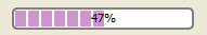
以上屏幕截圖使用 margin 0.5 像素。
QProgressBar::chunk {
    background-color: #CD96CD;
    width: 10px;
    margin: 0.5px;
}
A QPushButton 樣式化如下:
QPushButton {
    border: 2px solid #8f8f91;
    border-radius: 6px;
    background-color: qlineargradient(x1: 0, y1: 0, x2: 0, y2: 1,
                                      stop: 0 #f6f7fa, stop: 1 #dadbde);
    min-width: 80px;
}
QPushButton:pressed {
    background-color: qlineargradient(x1: 0, y1: 0, x2: 0, y2: 1,
                                      stop: 0 #dadbde, stop: 1 #f6f7fa);
}
QPushButton:flat {
    border: none; /* no border for a flat push button */
}
QPushButton:default {
    border-color: navy; /* make the default button prominent */
}
對於 QPushButton 具有菜單,使用 ::menu-indicator 子控件。
QPushButton:open { /* when the button has its menu open */
    background-color: qlineargradient(x1: 0, y1: 0, x2: 0, y2: 1,
                                      stop: 0 #dadbde, stop: 1 #f6f7fa);
}
QPushButton::menu-indicator {
    image: url(menu_indicator.png);
    subcontrol-origin: padding;
    subcontrol-position: bottom right;
}
QPushButton::menu-indicator:pressed, QPushButton::menu-indicator:open {
    position: relative;
    top: 2px; left: 2px; /* shift the arrow by 2 px */
}
可復選 QPushButton 擁有 :checked 僞狀態設置。
指示器對於 QRadioButton 可以改變使用:
QRadioButton::indicator {
    width: 13px;
    height: 13px;
}
QRadioButton::indicator::unchecked {
    image: url(:/images/radiobutton_unchecked.png);
}
QRadioButton::indicator:unchecked:hover {
    image: url(:/images/radiobutton_unchecked_hover.png);
}
QRadioButton::indicator:unchecked:pressed {
    image: url(:/images/radiobutton_unchecked_pressed.png);
}
QRadioButton::indicator::checked {
    image: url(:/images/radiobutton_checked.png);
}
QRadioButton::indicator:checked:hover {
    image: url(:/images/radiobutton_checked_hover.png);
}
QRadioButton::indicator:checked:pressed {
    image: url(:/images/radiobutton_checked_pressed.png);
}
The QScrollBar 可以被樣式化使用其子控件像 handle , add-line , sub-line , and so on. Note that if one property or sub-control is customized, all the other properties or sub-controls must be customized as well.
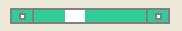
采用純灰色邊框,以碧綠色樣式化以上滾動條。
QScrollBar:horizontal {
    border: 2px solid grey;
    background: #32CC99;
    height: 15px;
    margin: 0px 20px 0 20px;
}
QScrollBar::handle:horizontal {
    background: white;
    min-width: 20px;
}
QScrollBar::add-line:horizontal {
    border: 2px solid grey;
    background: #32CC99;
    width: 20px;
    subcontrol-position: right;
    subcontrol-origin: margin;
}
QScrollBar::sub-line:horizontal {
    border: 2px solid grey;
    background: #32CC99;
    width: 20px;
    subcontrol-position: left;
    subcontrol-origin: margin;
}
The left-arrow and right-arrow have a solid grey border with a white background. As an alternative, you could also embed the image of an arrow.
QScrollBar:left-arrow:horizontal, QScrollBar::right-arrow:horizontal {
    border: 2px solid grey;
    width: 3px;
    height: 3px;
    background: white;
}
QScrollBar::add-page:horizontal, QScrollBar::sub-page:horizontal {
    background: none;
}
If you want the scroll buttons of the scroll bar to be placed together (instead of the edges) like on macOS , you can use the following stylesheet:
QScrollBar:horizontal {
    border: 2px solid green;
    background: cyan;
    height: 15px;
    margin: 0px 40px 0 0px;
}
QScrollBar::handle:horizontal {
    background: gray;
    min-width: 20px;
}
QScrollBar::add-line:horizontal {
    background: blue;
    width: 16px;
    subcontrol-position: right;
    subcontrol-origin: margin;
    border: 2px solid black;
}
QScrollBar::sub-line:horizontal {
    background: magenta;
    width: 16px;
    subcontrol-position: top right;
    subcontrol-origin: margin;
    border: 2px solid black;
    position: absolute;
    right: 20px;
}
QScrollBar:left-arrow:horizontal, QScrollBar::right-arrow:horizontal {
    width: 3px;
    height: 3px;
    background: pink;
}
QScrollBar::add-page:horizontal, QScrollBar::sub-page:horizontal {
    background: none;
}
使用上述樣式錶的滾動條看起來像這樣:

要定製垂直滾動條,使用類似以下的樣式錶:
 QScrollBar:vertical {
     border: 2px solid grey;
     background: #32CC99;
     width: 15px;
     margin: 22px 0 22px 0;
 }
 QScrollBar::handle:vertical {
     background: white;
     min-height: 20px;
 }
 QScrollBar::add-line:vertical {
     border: 2px solid grey;
     background: #32CC99;
     height: 20px;
     subcontrol-position: bottom;
     subcontrol-origin: margin;
 }
 QScrollBar::sub-line:vertical {
     border: 2px solid grey;
     background: #32CC99;
     height: 20px;
     subcontrol-position: top;
     subcontrol-origin: margin;
 }
 QScrollBar::up-arrow:vertical, QScrollBar::down-arrow:vertical {
     border: 2px solid grey;
     width: 3px;
     height: 3px;
     background: white;
 }
 QScrollBar::add-page:vertical, QScrollBar::sub-page:vertical {
     background: none;
 }
QSizeGrip 通常通過僅僅設置圖像以樣式化。
QSizeGrip {
    image: url(:/images/sizegrip.png);
    width: 16px;
    height: 16px;
}
可以按如下樣式化水平滑塊:
QSlider::groove:horizontal {
    border: 1px solid #999999;
    height: 8px; /* the groove expands to the size of the slider by default. by giving it a height, it has a fixed size */
    background: qlineargradient(x1:0, y1:0, x2:0, y2:1, stop:0 #B1B1B1, stop:1 #c4c4c4);
    margin: 2px 0;
}
QSlider::handle:horizontal {
    background: qlineargradient(x1:0, y1:0, x2:1, y2:1, stop:0 #b4b4b4, stop:1 #8f8f8f);
    border: 1px solid #5c5c5c;
    width: 18px;
    margin: -2px 0; /* handle is placed by default on the contents rect of the groove. Expand outside the groove */
    border-radius: 3px;
}
若想要改變手柄前後滑塊部分的顔色,可以使用添加頁麵和子頁麵子控件。例如,對於垂直滑塊:
QSlider::groove:vertical {
    background: red;
    position: absolute; /* absolutely position 4px from the left and right of the widget. setting margins on the widget should work too... */
    left: 4px; right: 4px;
}
QSlider::handle:vertical {
    height: 10px;
    background: green;
    margin: 0 -4px; /* expand outside the groove */
}
QSlider::add-page:vertical {
    background: white;
}
QSlider::sub-page:vertical {
    background: pink;
}
QSpinBox 可以完全定製如下 (樣式錶有內聯解說):
QSpinBox {
    padding-right: 15px; /* make room for the arrows */
    border-image: url(:/images/frame.png) 4;
    border-width: 3;
}
QSpinBox::up-button {
    subcontrol-origin: border;
    subcontrol-position: top right; /* position at the top right corner */
    width: 16px; /* 16 + 2*1px border-width = 15px padding + 3px parent border */
    border-image: url(:/images/spinup.png) 1;
    border-width: 1px;
}
QSpinBox::up-button:hover {
    border-image: url(:/images/spinup_hover.png) 1;
}
QSpinBox::up-button:pressed {
    border-image: url(:/images/spinup_pressed.png) 1;
}
QSpinBox::up-arrow {
    image: url(:/images/up_arrow.png);
    width: 7px;
    height: 7px;
}
QSpinBox::up-arrow:disabled, QSpinBox::up-arrow:off { /* off state when value is max */
   image: url(:/images/up_arrow_disabled.png);
}
QSpinBox::down-button {
    subcontrol-origin: border;
    subcontrol-position: bottom right; /* position at bottom right corner */
    width: 16px;
    border-image: url(:/images/spindown.png) 1;
    border-width: 1px;
    border-top-width: 0;
}
QSpinBox::down-button:hover {
    border-image: url(:/images/spindown_hover.png) 1;
}
QSpinBox::down-button:pressed {
    border-image: url(:/images/spindown_pressed.png) 1;
}
QSpinBox::down-arrow {
    image: url(:/images/down_arrow.png);
    width: 7px;
    height: 7px;
}
QSpinBox::down-arrow:disabled,
QSpinBox::down-arrow:off { /* off state when value in min */
   image: url(:/images/down_arrow_disabled.png);
}
A QSplitter 派生自 QFrame 因此可以被樣式化像 QFrame 。握把或手柄的定製使用 ::handle 子控件。
QSplitter::handle {
    image: url(images/splitter.png);
}
QSplitter::handle:horizontal {
    width: 2px;
}
QSplitter::handle:vertical {
    height: 2px;
}
QSplitter::handle:pressed {
    url(images/splitter_pressed.png);
}
We can provide a background for the status bar and a border for items inside the status bar as follows:
QStatusBar {
    background: brown;
}
QStatusBar::item {
    border: 1px solid red;
    border-radius: 3px;
}
Note that widgets that have been added to the QStatusBar can be styled using the descendant declaration (i.e)
QStatusBar QLabel {
    border: 3px solid white;
}
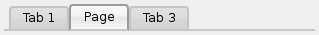
對於以上截圖,需要以下樣式錶:
QTabWidget::pane { /* The tab widget frame */
    border-top: 2px solid #C2C7CB;
}
QTabWidget::tab-bar {
    left: 5px; /* move to the right by 5px */
}
/* Style the tab using the tab sub-control. Note that
    it reads QTabBar _not_ QTabWidget */
QTabBar::tab {
    background: qlineargradient(x1: 0, y1: 0, x2: 0, y2: 1,
                                stop: 0 #E1E1E1, stop: 0.4 #DDDDDD,
                                stop: 0.5 #D8D8D8, stop: 1.0 #D3D3D3);
    border: 2px solid #C4C4C3;
    border-bottom-color: #C2C7CB; /* same as the pane color */
    border-top-left-radius: 4px;
    border-top-right-radius: 4px;
    min-width: 8ex;
    padding: 2px;
}
QTabBar::tab:selected, QTabBar::tab:hover {
    background: qlineargradient(x1: 0, y1: 0, x2: 0, y2: 1,
                                stop: 0 #fafafa, stop: 0.4 #f4f4f4,
                                stop: 0.5 #e7e7e7, stop: 1.0 #fafafa);
}
QTabBar::tab:selected {
    border-color: #9B9B9B;
    border-bottom-color: #C2C7CB; /* same as pane color */
}
QTabBar::tab:!selected {
    margin-top: 2px; /* make non-selected tabs look smaller */
}
經常要求重疊的選項卡外觀如下:
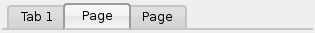
外觀如上的選項卡 Widget,製作是使用 負邊距 。結果樣式錶看起來像這樣:
QTabWidget::pane { /* The tab widget frame */
    border-top: 2px solid #C2C7CB;
}
QTabWidget::tab-bar {
    left: 5px; /* move to the right by 5px */
}
/* Style the tab using the tab sub-control. Note that
    it reads QTabBar _not_ QTabWidget */
QTabBar::tab {
    background: qlineargradient(x1: 0, y1: 0, x2: 0, y2: 1,
                                stop: 0 #E1E1E1, stop: 0.4 #DDDDDD,
                                stop: 0.5 #D8D8D8, stop: 1.0 #D3D3D3);
    border: 2px solid #C4C4C3;
    border-bottom-color: #C2C7CB; /* same as the pane color */
    border-top-left-radius: 4px;
    border-top-right-radius: 4px;
    min-width: 8ex;
    padding: 2px;
}
QTabBar::tab:selected, QTabBar::tab:hover {
    background: qlineargradient(x1: 0, y1: 0, x2: 0, y2: 1,
                                stop: 0 #fafafa, stop: 0.4 #f4f4f4,
                                stop: 0.5 #e7e7e7, stop: 1.0 #fafafa);
}
QTabBar::tab:selected {
    border-color: #9B9B9B;
    border-bottom-color: #C2C7CB; /* same as pane color */
}
QTabBar::tab:!selected {
    margin-top: 2px; /* make non-selected tabs look smaller */
}
/* make use of negative margins for overlapping tabs */
QTabBar::tab:selected {
    /* expand/overlap to the left and right by 4px */
    margin-left: -4px;
    margin-right: -4px;
}
QTabBar::tab:first:selected {
    margin-left: 0; /* the first selected tab has nothing to overlap with on the left */
}
QTabBar::tab:last:selected {
    margin-right: 0; /* the last selected tab has nothing to overlap with on the right */
}
QTabBar::tab:only-one {
    margin: 0; /* if there is only one tab, we don't want overlapping margins */
}
要將選項卡欄移動到中心 (如下),要求以下樣式錶:

QTabWidget::pane { /* The tab widget frame */
    border-top: 2px solid #C2C7CB;
    position: absolute;
    top: -0.5em;
}
QTabWidget::tab-bar {
    alignment: center;
}
/* Style the tab using the tab sub-control. Note that
    it reads QTabBar _not_ QTabWidget */
QTabBar::tab {
    background: qlineargradient(x1: 0, y1: 0, x2: 0, y2: 1,
                                stop: 0 #E1E1E1, stop: 0.4 #DDDDDD,
                                stop: 0.5 #D8D8D8, stop: 1.0 #D3D3D3);
    border: 2px solid #C4C4C3;
    border-bottom-color: #C2C7CB; /* same as the pane color */
    border-top-left-radius: 4px;
    border-top-right-radius: 4px;
    min-width: 8ex;
    padding: 2px;
}
QTabBar::tab:selected, QTabBar::tab:hover {
    background: qlineargradient(x1: 0, y1: 0, x2: 0, y2: 1,
                                stop: 0 #fafafa, stop: 0.4 #f4f4f4,
                                stop: 0.5 #e7e7e7, stop: 1.0 #fafafa);
}
QTabBar::tab:selected {
    border-color: #9B9B9B;
    border-bottom-color: #C2C7CB; /* same as pane color */
}
The tear indicator and the scroll buttons can be further customized as follows:
QTabBar::tear {
    image: url(tear_indicator.png);
}
QTabBar::scroller { /* the width of the scroll buttons */
    width: 20px;
}
QTabBar QToolButton { /* the scroll buttons are tool buttons */
    border-image: url(scrollbutton.png) 2;
    border-width: 2px;
}
QTabBar QToolButton::right-arrow { /* the arrow mark in the tool buttons */
    image: url(rightarrow.png);
}
QTabBar QToolButton::left-arrow {
    image: url(leftarrow.png);
}
從 Qt 4.6 起,可以定製關閉按鈕如下:
QTabBar::close-button {
    image: url(close.png)
    subcontrol-position: left;
}
QTabBar::close-button:hover {
    image: url(close-hover.png)
}
假設像選中項在 QTableView 將泡泡糖粉紅色淡化成白色作為其背景。
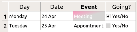
這是可能的采用 selection-background-color 特性和要求句法:
QTableView {
    selection-background-color: qlineargradient(x1: 0, y1: 0, x2: 0.5, y2: 0.5,
                                stop: 0 #FF92BB, stop: 1 white);
}
可以使用以下樣式錶定製角落 Widget
QTableView QTableCornerButton::section {
    background: red;
    border: 2px outset red;
}
The
QTableView
的復選框指示器也可以定製。以下片段中指示器
background-color
是按 unchecked (取消復選) 狀態定製的:
QTableView::indicator:unchecked {
    background-color: #d7d6d5
}
背景和手柄對於 QToolBar 的定製如下:
QToolBar {
    background: red;
    spacing: 3px; /* spacing between items in the tool bar */
}
QToolBar::handle {
    image: url(handle.png);
}
tab 對於 QToolBox 的定製是使用 tab 子控件。
QToolBox::tab {
    background: qlineargradient(x1: 0, y1: 0, x2: 0, y2: 1,
                                stop: 0 #E1E1E1, stop: 0.4 #DDDDDD,
                                stop: 0.5 #D8D8D8, stop: 1.0 #D3D3D3);
    border-radius: 5px;
    color: darkgray;
}
QToolBox::tab:selected { /* italicize selected tabs */
    font: italic;
    color: white;
}
QToolButton 有 3 種類型。
QToolButton { /* all types of tool button */
    border: 2px solid #8f8f91;
    border-radius: 6px;
    background-color: qlineargradient(x1: 0, y1: 0, x2: 0, y2: 1,
                                      stop: 0 #f6f7fa, stop: 1 #dadbde);
}
QToolButton[popupMode="1"] { /* only for MenuButtonPopup */
    padding-right: 20px; /* make way for the popup button */
}
QToolButton:pressed {
    background-color: qlineargradient(x1: 0, y1: 0, x2: 0, y2: 1,
                                      stop: 0 #dadbde, stop: 1 #f6f7fa);
}
/* the subcontrols below are used only in the MenuButtonPopup mode */
QToolButton::menu-button {
    border: 2px solid gray;
    border-top-right-radius: 6px;
    border-bottom-right-radius: 6px;
    /* 16px width + 4px for border = 20px allocated above */
    width: 16px;
}
QToolButton::menu-arrow {
    image: url(downarrow.png);
}
QToolButton::menu-arrow:open {
    top: 1px; left: 1px; /* shift it a bit */
}
QToolTip 的定製準確像 QLabel 。此外,對於支持它的平颱,可以設置 opacity 特性來調節不透明度。
例如,
QToolTip {
    border: 2px solid darkkhaki;
    padding: 5px;
    border-radius: 3px;
    opacity: 200;
}
可以使用以下樣式錶定製交替行的背景色:
QTreeView {
    alternate-background-color: yellow;
}
為懸停項提供特殊背景,可以使用 ::item 子控件。例如,
QTreeView {
    show-decoration-selected: 1;
}
QTreeView::item {
     border: 1px solid #d9d9d9;
    border-top-color: transparent;
    border-bottom-color: transparent;
}
QTreeView::item:hover {
    background: qlineargradient(x1: 0, y1: 0, x2: 0, y2: 1, stop: 0 #e7effd, stop: 1 #cbdaf1);
    border: 1px solid #bfcde4;
}
QTreeView::item:selected {
    border: 1px solid #567dbc;
}
QTreeView::item:selected:active{
    background: qlineargradient(x1: 0, y1: 0, x2: 0, y2: 1, stop: 0 #6ea1f1, stop: 1 #567dbc);
}
QTreeView::item:selected:!active {
    background: qlineargradient(x1: 0, y1: 0, x2: 0, y2: 1, stop: 0 #6b9be8, stop: 1 #577fbf);
}
分支在 QTreeView 被樣式化使用 ::branch 子控件。以下樣式錶按顔色編碼各種狀態,當繪製分支時。
QTreeView::branch {
        background: palette(base);
}
QTreeView::branch:has-siblings:!adjoins-item {
        background: cyan;
}
QTreeView::branch:has-siblings:adjoins-item {
        background: red;
}
QTreeView::branch:!has-children:!has-siblings:adjoins-item {
        background: blue;
}
QTreeView::branch:closed:has-children:has-siblings {
        background: pink;
}
QTreeView::branch:has-children:!has-siblings:closed {
        background: gray;
}
QTreeView::branch:open:has-children:has-siblings {
        background: magenta;
}
QTreeView::branch:open:has-children:!has-siblings {
        background: green;
}
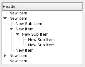
雖然它色彩繽紛,但更有用的範例是使用下列圖像:

|

|

|

|

|
| vline.png | branch-more.png | branch-end.png | branch-closed.png | branch-open.png |
QTreeView::branch:has-siblings:!adjoins-item {
    border-image: url(vline.png) 0;
}
QTreeView::branch:has-siblings:adjoins-item {
    border-image: url(branch-more.png) 0;
}
QTreeView::branch:!has-children:!has-siblings:adjoins-item {
    border-image: url(branch-end.png) 0;
}
QTreeView::branch:has-children:!has-siblings:closed,
QTreeView::branch:closed:has-children:has-siblings {
        border-image: none;
        image: url(branch-closed.png);
}
QTreeView::branch:open:has-children:!has-siblings,
QTreeView::branch:open:has-children:has-siblings  {
        border-image: none;
        image: url(branch-open.png);
}
結果樹視圖看起來像這樣:
此節列齣一些常見過失,當使用樣式錶時。
當樣式化 QPushButton ,經常期望使用圖像作為按鈕圖形。常見的是嘗試 background-image 特性,但這有很多缺點:例如,背景經常隱藏在按鈕裝飾後麵,因為不被認為是背景。此外,若調整按鈕大小,整個背景將被拉伸或平鋪,外觀總是不好。
最好使用 border-image 特性,因為它始終顯示圖像,不管背景 (若有 Alpha 值,可以組閤它與背景),且它有特殊設置以處理按鈕大小調整。
考慮以下片段:
        QPushButton {
            color: grey;
            border-image: url(/home/kamlie/code/button.png) 3 10 3 10;
            border-top: 3px transparent;
            border-bottom: 3px transparent;
            border-right: 10px transparent;
            border-left: 10px transparent;
        }
這將産生看起來像這樣的按鈕:
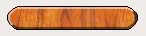
The numbers after the url gives the top, right, bottom and left number of pixels, respectively. These numbers correspond to the border and should not stretch when the size changes. Whenever you resize the button, the middle part of the image will stretch in both directions, while the pixels specified in the stylesheet will not. This makes the borders of the button look more natural, like this:

|
| 具有邊框 |

|
| 沒有邊框 |
另請參閱 樣式錶範例 , 支持的 HTML 子集 ,和 QStyle .