Provides custom styling for Gauge. 更多...
| import 语句: | import QtQuick.Controls.Styles 1.4 |
| Since: | Qt 5.5 |
You can create a custom gauge by replacing the following delegates:
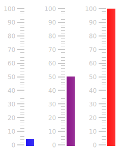
Below, you'll find an example of how to create a temperature gauge that changes color as its value increases:
import QtQuick 2.2
import QtQuick.Controls 1.4
import QtQuick.Controls.Styles 1.4
import QtQuick.Extras 1.4
Rectangle {
    width: 80
    height: 200
    Timer {
        running: true
        repeat: true
        interval: 2000
        onTriggered: gauge.value = gauge.value == gauge.maximumValue ? 5 : gauge.maximumValue
    }
    Gauge {
        id: gauge
        anchors.fill: parent
        anchors.margins: 10
        value: 5
        Behavior on value {
            NumberAnimation {
                duration: 1000
            }
        }
        style: GaugeStyle {
            valueBar: Rectangle {
                implicitWidth: 16
                color: Qt.rgba(gauge.value / gauge.maximumValue, 0, 1 - gauge.value / gauge.maximumValue, 1)
            }
        }
    }
}

The gauge displaying values at various points during the animation.
另请参阅 Styling Gauge .
|
background : Component |
The background of the gauge, displayed behind the valueBar .
By default, no background is defined.
|
[read-only] control : Gauge |
The Gauge that this style is attached to.
|
foreground : Component |
The bar that represents the foreground of the gauge.
This component is drawn above every other component.
|
minorTickmark : Component |
Each minor tickmark displayed by the gauge.
To set the size of the minor tickmarks, specify an implicitWidth and implicitHeight .
For layouting reasons, each minor tickmark should have the same
implicitHeight
. If different heights are needed for individual tickmarks, specify those heights in a child item of the component.
In the example below, we decrease the width of the minor tickmarks:
minorTickmark: Item {
    implicitWidth: 8
    implicitHeight: 1
    Rectangle {
        color: "#cccccc"
        anchors.fill: parent
        anchors.leftMargin: 2
        anchors.rightMargin: 4
    }
}

Each instance of this component has access to the following property:
readonly property int
styleData.index
|
The index of this minor tickmark. |
readonly property real
styleData.value
|
The value that this minor tickmark represents. |
readonly property real
styleData.valuePosition
|
The value that this minor tickmark represents as a position in pixels, with 0 being at the bottom of the gauge. |
另请参阅 tickmark .
|
tickmark : Component |
Each tickmark displayed by the gauge.
To set the size of the tickmarks, specify an implicitWidth and implicitHeight .
The widest tickmark will determine the space set aside for all tickmarks. For this reason, the
implicitWidth
of each tickmark should be greater than or equal to that of each minor tickmark. If you need minor tickmarks to have greater widths than the major tickmarks, set the larger width in a child item of the
minorTickmark
组件。
For layouting reasons, each tickmark should have the same
implicitHeight
. If different heights are needed for individual tickmarks, specify those heights in a child item of the component.
In the example below, we decrease the height of the tickmarks:
tickmark: Item {
    implicitWidth: 18
    implicitHeight: 1
    Rectangle {
        color: "#c8c8c8"
        anchors.fill: parent
        anchors.leftMargin: 3
        anchors.rightMargin: 3
    }
}

Each instance of this component has access to the following properties:
readonly property int
styleData.index
|
The index of this tickmark. |
readonly property real
styleData.value
|
The value that this tickmark represents. |
readonly property real
styleData.valuePosition
|
The value that this tickmark represents as a position in pixels, with 0 being at the bottom of the gauge. |
另请参阅 minorTickmark .
|
tickmarkLabel : Component |
This defines the text of each tickmark label on the gauge.
Each instance of this component has access to the following properties:
readonly property int
styleData.index
|
The index of this label. |
readonly property real
styleData.value
|
The value that this label represents. |
|
valueBar : Component |
The bar that represents the value of the gauge.
To height of the value bar is automatically resized according to value , and does not need to be specified.
When a custom valueBar is defined, its implicitWidth property must be set.
This property holds the value displayed by the gauge as a position in pixels.
It is useful for custom styling.