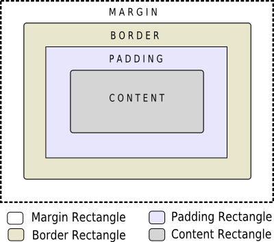
當使用樣式錶時,每個 Widget 被視為具有 4 個同心矩形的框:邊距矩形、邊框矩形、鋪墊矩形及內容矩形。Box 模型將進一步詳細描述這。
4 個同心矩形在概念上的齣現如下所示:
The
margin
,
border-width
,和
padding
特性默認為 0。在此情況下,所有 4 矩形 (
margin
,
border
,
padding
,和
content
) 準確重閤。
可以為 Widget 指定背景使用 background-image 特性。默認情況下,background-image 僅在邊框內區域繪製。可以改變這使用 background-clip 特性。可以使用 background-repeat and background-origin 來控製背景圖像的重復和原點。
A background-image does not scale with the size of the widget. To provide a "skin" or background that scales along with the widget size, one must use border-image . Since the border-image property provides an alternate background, it is not required to specify a background-image when border-image is specified. In the case, when both of them are specified, the border-image draws over the background-image.
此外, image property may be used to draw an image over the border-image. The image specified does not tile or stretch and when its size does not match the size of the widget, its alignment is specified using the image-position property. Unlike background-image and border-image, one may specify a SVG in the image property, in which case the image is scaled automatically according to the widget size.
渲染規則的步驟如下所示:
A widget is considered as a hierarchy (tree) of subcontrols drawn on top of each other. For example, the QComboBox draws the drop-down sub-control followed by the down-arrow sub-control. A QComboBox is thus rendered as follows:
Sub-controls share a parent-child relationship. In the case of QComboBox , the parent of down-arrow is the drop-down and the parent of drop-down is the widget itself. Sub-controls are positioned within their parent using the subcontrol-position and subcontrol-origin 特性。
一旦定位,子控件就可以被樣式化使用 Box 模型 .
注意: 采用復雜 Widget,譬如 QComboBox and QScrollBar , if one property or sub-control is customized, all the other properties or sub-controls must be customized as well.