Qt Charts 使您能夠創建時尚、交互式、以數據為中心的用戶界麵。Qt Charts 使用 圖形視圖框架 為易於集成。圖錶組件可以用作 QWidget or QGraphicsWidget 對象或 QML 類型。
The QChart 類管理不同係列類型和其它圖錶相關對象的圖形錶示,譬如:圖例和軸。 QChart 是 QGraphicsWidget 可以展示在 QGraphicsScene 。在布局中顯示圖錶的更簡單解決方案,是使用方便類 QChartView 而不是 QChart 。在 QML,圖錶的顯示是使用 ChartView 類型。
某些圖錶組件還可以呈現極坐標圖錶通過使用 QPolarChart 類,特殊化的 QChart 類或 PolarChartView QML 類型,特殊化的 ChartView 類型。
可以定製圖錶的外觀和感覺,通過使用主題、修改顔色和特性、隱藏圖錶組件或動畫圖錶。
模型映射器允許使用的數據模型派生自 QAbstractItemModel 類作為圖錶的數據源。模型映射器可以是水平的 (或垂直的)。
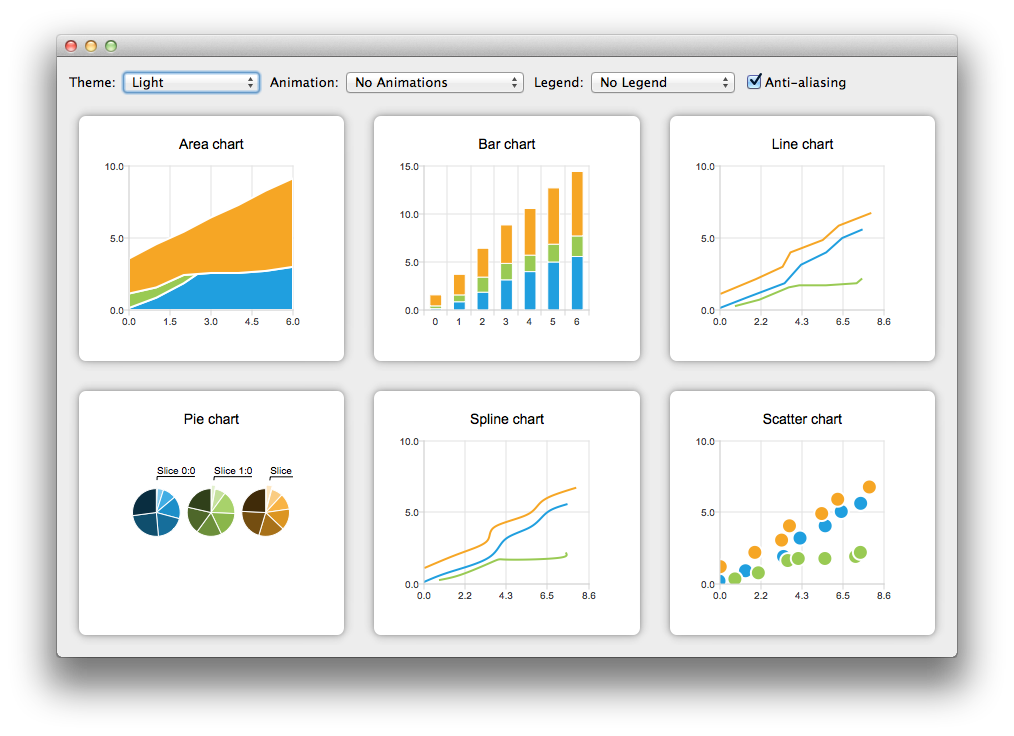
Qt Charts 模塊提供下列圖錶類型:
每種圖錶類型的錶示都是通過 QAbstractSeries 派生類或 AbstractSeries 派生類型在 QML。圖錶的創建是通過使用係列類的實例並將它添加到 QChart or ChartView 實例。
例如:
QLineSeries* series = new QLineSeries();
series->add(0, 6);
series->add(2, 4);
...
chartView->chart()->addSeries(series);
chartView->chart()->createDefaultAxes();
或,以 QML:
import QtQuick 2.0
import QtCharts 2.0
ChartView {
    width: 400
    height: 300
    theme: ChartView.ChartThemeBrownSand
    antialiasing: true
    PieSeries {
        id: pieSeries
        PieSlice { label: "eaten"; value: 94.9 }
        PieSlice { label: "not yet eaten"; value: 5.1 }
    }
}
可以在一個圖錶中組閤不同係列類型。
綫圖錶和樣條綫圖錶將數據呈現為由綫連接的一係列數據點。在綫圖錶中,數據點由直綫連接,而在樣條綫圖錶中,它們由樣條綫連接。樣條綫的繪製是通過使用 QPainterPath .


綫圖錶的實現是通過使用 QLineSeries 類或 LineSeries QML 類型。
樣條綫圖錶的實現是通過使用 QSplineSeries 類繼承 QLineSeries 或 SplineSeries 類型繼承 LineSeries .
更多信息,見 綫圖錶範例 , 樣條綫圖錶範例 ,和 動態樣條綫範例 。對於組閤綫圖錶與條形圖錶且 2 者使用公共軸的範例,見 綫和條形圖範例 .
區域圖錶將數據呈現為由 2 條綫作邊界的區域,而散點圖錶將數據呈現為點的集閤。


區域圖錶的實現是通過使用 QAreaSeries 類或 AreaSeries QML 類型。默認情況下,X 軸用作一邊界而 QLineSeries or LineSeries 作為其它。不管怎樣,可以使用 QLineSeries or LineSeries 作為 2 邊界。
散點圖錶的實現是通過使用 QScatterSeries 類或 ScatterSeries QML 類型。
更多信息,見 區域圖錶範例 , 散點圖錶範例 ,和 散點交互範例 .
條形圖錶將數據呈現為按類彆分組的水平 (或垂直) 條形。 QBarSet 類和 BarSet QML 類型錶示條形圖錶中的一組條形。 QAbstractBarSeries 類是所有條形係列類的抽象父級類,而 AbstractBarSeries 類型是條形係列類型的父級類型。係列類型確定數據如何呈現。
The QBarSeries 類和 BarSeries QML type present data as vertical bars grouped by category. Similarly, the QHorizontalBarSeries 類和 HorizontalBarSeries QML type present data as horizontal bars.


The QStackedBarSeries 類和 StackedBarSeries type present a series of data as vertically stacked bars, with one bar per category. The corresponding horizontal class and type are QHorizontalStackedBarSeries and HorizontalStackedBarSeries ,分彆。

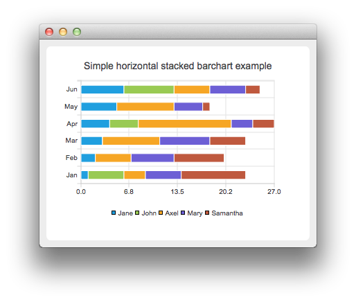
The QPercentBarSeries class and PercentBarSeries QML type present a series of categorized data as a percentage of each category. The corresponding horizontal class and type are QHorizontalPercentBarSeries and HorizontalPercentBarSeries ,分彆。


更多信息,見 條形圖錶範例 , 水平條形圖錶範例 , 堆疊條形圖錶範例 , 水平堆疊條形圖錶範例 , 百分比條形圖錶範例 ,和 水平百分比條形圖錶範例 .
Pie charts present data as a pie that consists of pie slices. The pie is implemented using the QPieSeries 類或 PieSeries QML type and the pie slices are added using the QPieSlice 類或 PieSlice QML 類型。
The pie can be turned into a donut by specifying a hole size between 0.0 and 1.0.
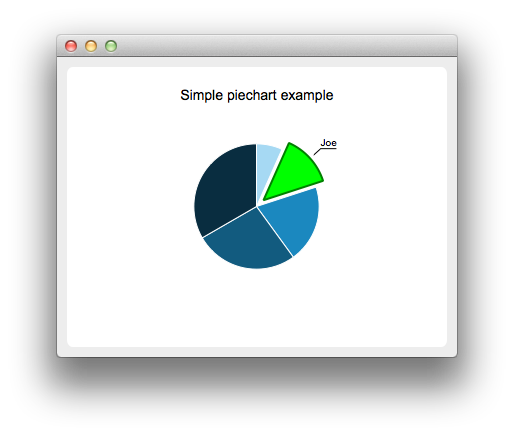
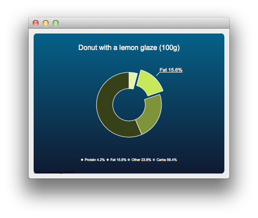
更多信息,見 PieChart Example , 餅狀圖錶定製範例 , DonutChart Example , 圓環圖錶分解範例 ,和 嵌套圓環範例 .
The box-and-whiskers charts present data as quartiles extended with whiskers that show the variability of the values. The items in box plot series are grouped by category, similarly to bar sets in bar series. For each box-and-whiskers item, the lower extreme, lower quartile, median, upper quartile, and upper extreme value are specified.
A box-and-whiskers chart is implemented by using the QBoxPlotSeries and QBoxSet classes or the BoxPlotSeries and BoxSet QML types.

更多信息,見 方框和晶須範例 .
Candlestick charts presents a series of data shown as candlesticks.

A candlestick chart is implemented by using the QCandlestickSeries and QCandlestickSet classes or the CandlestickSeries and CandlestickSet QML types.
Polar charts present data in a circular graph, where the placement of data is based on the angle and distance from the center of the graph, the pole .
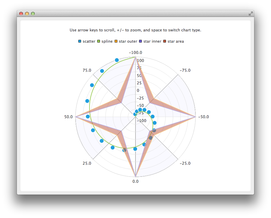
The QPolarChart class is a specialization of the QChart class. It supports line, spline, area, and scatter series, as well as all the axis types supported by them. The axis can be used either as a radial or an angular axis. In QML, the corresponding type is PolarChartView .
更多信息,見 極坐標圖錶範例 and QML 極坐標圖錶 .
Qt Charts 支持下列軸類型:
An axis can be set up to show a line with tick marks, grid lines, and shades. The values on the axis are drawn at the positions of tick marks. All axis types are specializations of the QAbstractAxis 類或 AbstractAxis QML 類型。
A value axis adds real values to a chart's axis. It is implemented using the QValueAxis 類或 ValueAxis QML 類型。
A category axis is implemented using the QCategoryAxis 類或 CategoryAxis QML type. It has named ranges and adjustable range widths.
The bar category axis is similar to a category axis, but the range width is the same for all ranges. A bar category axis is implemented using the QBarCategoryAxis 類或 BarCategoryAxis QML 類型。
A date-time axis adds dates and times to a chart's axis. It is implemented using the QDateTimeAxis 類或 DateTimeAxis QML 類型。
A logarithmic axis adds a logarithmic scale to a chart's axis. A logarithmic scale is a nonlinear scale that is based on orders of magnitude, so that each tick mark on the axis is the previous tick mark multiplied by a value. A logarithmic axis is implemented using the QLogValueAxis 類或 LogValueAxis QML 類型。
Multiple axes can be defined for one chart. The axes can be placed down, up, left, or right of the chart. Further, the axes can be of different types. However, mixing axis types that would result in different domains is not supported, such as specifying QValueAxis and QLogValueAxis on the same orientation.
更多信息,見 日期時間軸範例 , 對數軸範例 , 多軸範例 ,和 QML 軸 .
A legend is a graphical object that displays the legend of a chart. Legend objects cannot be created or deleted, but they can be referenced via the QChart 類或 ChartView QML type. The legend state is updated by QChart or ChartView when series change.
A legend can be positioned below or above the chart, as well as to the left or right of it. By default, the legend is attached to the chart view, but it can be detached to a separate graphics item that can be moved around freely.
It is possible to hide either individual markers from the legend or the whole legend.
Legend markers can be modified by using the QLegendMarker base class and the subclasses for each series type: QAreaLegendMarker , QBarLegendMarker , QBoxPlotLegendMarker , QCandlestickLegendMarker ,和 QXYLegendMarker .
In QML, legend markers can be modified by creating custom legends, as illustrated by the QML 自定義圖例 範例。
End users can interact with charts by dynamically adding values to them, drilling down into data, zooming into and out of charts, scrolling charts, and clicking items in charts or hovering the mouse over them.
It is possible to add data to charts dynamically and to make the chart view scroll automatically to display the new data.
更多信息,見 動態樣條綫範例 .
Drilldown effects can be implemented to bar or pie charts, for example. When users select an item in the chart, a more detailed view of the item is displayed. This is implemented by deleting the first series and adding another one.
更多信息,見 堆疊條形圖錶深入研究範例 and 餅狀圖錶深入研究範例 .
Users can use the keyboard for zooming and scrolling. They can scroll charts by using the arrow keys and zoom into or out of charts by using the plus and minus keys. In addition, QRubberBand can be used for selecting the area to zoom into.
On touch devices, gestures can be used for panning and zooming.
更多信息,見 縮放綫範例 .
You can connect slots to signals emitted when end users click items in charts or hover the mouse over them. This enables you to add elements, such as callouts, to the charts.
更多信息,見 標注範例 .
主題是應用於圖錶所有視覺元素的 UI 樣式相關設置的內置集閤,譬如:顔色、鋼筆、筆刷和係列字體,及軸、標題和圖例。

Qt Charts 帶有下列預定義主題:
可以通過改變顔色、鋼筆、筆刷及字體,定製主題。通過修改 Qt Charts 源代碼,可以添加新主題。
注意: 改變主題將覆寫先前應用於係列的所有定製。
更多信息,見 圖錶主題範例 .