The QGroupBox 小部件提供帶有標題的組框框架。 更多...
| 頭: | #include <QGroupBox> |
| qmake: | QT += widgets |
| 繼承: | QWidget |
| QGroupBox (QWidget * parent = Q_NULLPTR) | |
| QGroupBox (const QString & title , QWidget * parent = Q_NULLPTR) | |
| ~QGroupBox () | |
| Qt::Alignment | alignment () const |
| bool | isCheckable () const |
| bool | isChecked () const |
| bool | isFlat () const |
| void | setAlignment (int alignment ) |
| void | setCheckable (bool checkable ) |
| void | setFlat (bool flat ) |
| void | setTitle (const QString & title ) |
| QString | title () const |
| virtual QSize | minimumSizeHint () const |
| void | setChecked (bool checked ) |
| void | clicked (bool checked = false) |
| void | toggled (bool on ) |
| void | initStyleOption (QStyleOptionGroupBox * option ) const |
| virtual void | changeEvent (QEvent * ev ) |
| virtual void | childEvent (QChildEvent * c ) |
| virtual bool | event (QEvent * e ) |
| virtual void | focusInEvent (QFocusEvent * fe ) |
| virtual void | mouseMoveEvent (QMouseEvent * event ) |
| virtual void | mousePressEvent (QMouseEvent * event ) |
| virtual void | mouseReleaseEvent (QMouseEvent * event ) |
| virtual void | paintEvent (QPaintEvent * event ) |
| virtual void | resizeEvent (QResizeEvent * e ) |
The QGroupBox 小部件提供帶有標題的組框框架。
組框提供框架、頂部標題、鍵盤快捷方式,並在其內部顯示各種其它 Widget。鍵盤快捷方式將鍵盤聚焦移到組框中的某一子級 Widget。
QGroupBox also lets you set the title (通常在構造函數中設置) 和標題 alignment 。組框可以 checkable 。可復選組框中的子級 Widget 的啓用 (或禁用) 從屬組框是否 checked .
可以最小化組框的空間消耗,通過啓用 flat 特性。對於大多數 styles ,啓用此特性會導緻移除框架的左邊緣、右邊緣及底邊緣。
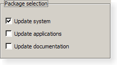
QGroupBox doesn't automatically lay out the child widgets (which are often QCheckBox 或 QRadioButton s but can be any widgets). The following example shows how we can set up a QGroupBox with a layout:
    QGroupBox *groupBox = new QGroupBox(tr("Exclusive Radio Buttons"));
    QRadioButton *radio1 = new QRadioButton(tr("&Radio button 1"));
    QRadioButton *radio2 = new QRadioButton(tr("R&adio button 2"));
    QRadioButton *radio3 = new QRadioButton(tr("Ra&dio button 3"));
    radio1->setChecked(true);
    QVBoxLayout *vbox = new QVBoxLayout;
    vbox->addWidget(radio1);
    vbox->addWidget(radio2);
    vbox->addWidget(radio3);
    vbox->addStretch(1);
    groupBox->setLayout(vbox);
另請參閱 QButtonGroup and 組框範例 .
此特性保持組框標題的對齊方式。
Most styles place the title at the top of the frame. The horizontal alignment of the title can be specified using single values from the following list:
默認對齊方式為 Qt::AlignLeft .
訪問函數:
| Qt::Alignment | alignment () const |
| void | setAlignment (int alignment ) |
另請參閱 Qt::Alignment .
此特性保持組框標題中是否擁有復選框
若此特性為
true
, the group box displays its title using a checkbox in place of an ordinary label. If the checkbox is checked, the group box's children are enabled; otherwise, they are disabled and inaccessible.
默認情況下,組框不可復選。
若組框有啓用此特性,還會初始校驗它,以確保啓用其內容。
訪問函數:
| bool | isCheckable () const |
| void | setCheckable (bool checkable ) |
另請參閱 checked .
此特性保持組框是否被復選
If the group box is checkable, it is displayed with a check box. If the check box is checked, the group box's children are enabled; otherwise, the children are disabled and are inaccessible to the user.
默認情況下,可復選組框還會被復選。
訪問函數:
| bool | isChecked () const |
| void | setChecked (bool checked ) |
通知程序信號:
| void | toggled (bool on ) |
另請參閱 checkable .
此特性保持是扁平化,還是帶框架描繪組框
A group box usually consists of a surrounding frame with a title at the top. If this property is enabled, only the top part of the frame is drawn in most styles; otherwise, the whole frame is drawn.
默認情況下,此特性被禁用。即:組框不是扁平化的,除非明確指定。
注意: In some styles, flat and non-flat group boxes have similar representations and may not be as distinguishable as they are in other styles.
訪問函數:
| bool | isFlat () const |
| void | setFlat (bool flat ) |
另請參閱 title .
此特性保持組框標題文本
The group box title text will have a keyboard shortcut if the title contains an ampersand ('&') followed by a letter.
g->setTitle("&User information");
在以上範例中, Alt+U 將鍵盤聚焦移動到組框。見 QShortcut 文檔編製瞭解細節 (要顯示實際和號,使用 &&)。
沒有標題文本,默認情況下。
訪問函數:
| QString | title () const |
| void | setTitle (const QString & title ) |
另請參閱 alignment .
構造組框 Widget 采用給定 parent 但沒有標題。
構造組框采用給定 title and parent .
銷毀組框。
[virtual protected]
void
QGroupBox::
changeEvent
(
QEvent
*
ev
)
重實現自 QWidget::changeEvent ().
[virtual protected]
void
QGroupBox::
childEvent
(
QChildEvent
*
c
)
重實現自 QObject::childEvent ().
[signal]
void
QGroupBox::
clicked
(
bool
checked
= false)
This signal is emitted when the check box is activated (i.e., pressed down then released while the mouse cursor is inside the button), or when the shortcut key is typed. Notably, this signal is not 被發射若調用 setChecked ().
若復選框被復選, checked 為 true;它為 false,若復選框被取消復選。
該函數在 Qt 4.2 引入。
另請參閱 checkable , toggled (),和 checked .
[virtual protected]
bool
QGroupBox::
event
(
QEvent
*
e
)
重實現自 QObject::event ().
[virtual protected]
void
QGroupBox::
focusInEvent
(
QFocusEvent
*
fe
)
重實現自 QWidget::focusInEvent ().
[protected]
void
QGroupBox::
initStyleOption
(
QStyleOptionGroupBox
*
option
) const
初始化 option 采用值來自此 QGroupBox 。此方法對子類是有用的,當需要 QStyleOptionGroupBox ,但不希望自己填充所有信息。
另請參閱 QStyleOption::initFrom ().
[虛擬]
QSize
QGroupBox::
minimumSizeHint
() const
重實現自 QWidget::minimumSizeHint ().
[virtual protected]
void
QGroupBox::
mouseMoveEvent
(
QMouseEvent
*
event
)
重實現自 QWidget::mouseMoveEvent ().
[virtual protected]
void
QGroupBox::
mousePressEvent
(
QMouseEvent
*
event
)
重實現自 QWidget::mousePressEvent ().
[virtual protected]
void
QGroupBox::
mouseReleaseEvent
(
QMouseEvent
*
event
)
重實現自 QWidget::mouseReleaseEvent ().
[virtual protected]
void
QGroupBox::
paintEvent
(
QPaintEvent
*
event
)
重實現自 QWidget::paintEvent ().
[virtual protected]
void
QGroupBox::
resizeEvent
(
QResizeEvent
*
e
)
重實現自 QWidget::resizeEvent ().
[signal]
void
QGroupBox::
toggled
(
bool
on
)
If the group box is checkable, this signal is emitted when the check box is toggled. on is true if the check box is checked; otherwise, it is false.
注意: 通知程序信號對於特性 checked .
另請參閱 checkable .