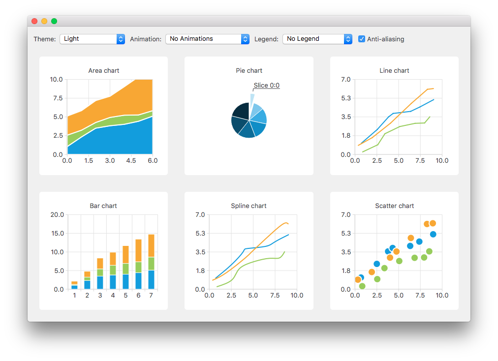
示例展示不同內置主題的外觀和感覺。
此範例展示某些被支持圖錶類型的不同內置主題的外觀和感覺。


要運行範例從 Qt Creator ,打開 歡迎 模式,然後選擇範例從 範例 。更多信息,拜訪 構建和運行範例 .
The charts of different types are generated and added to the layout separately. For example, the line chart is created as follows. The creation of other chart types is similar.
首先創建圖錶。
QChart *chart = new QChart();
chart->setTitle("Line chart");
A common set of random data is generated and placed in a list. This list is used in each chart type to add data to the series of the chart. For the line series, QLineSeries instances are created and added to the chart.
QString name("Series ");
int nameIndex = 0;
for (const DataList &list : m_dataTable) {
    QLineSeries *series = new QLineSeries(chart);
    for (const Data &data : list)
        series->append(data.first);
    series->setName(name + QString::number(nameIndex));
    nameIndex++;
    chart->addSeries(series);
}
Default axes are created for the line series. We also specify ranges for the axes based on the range of the data used for the series.
chart->createDefaultAxes();
chart->axes(Qt::Horizontal).first()->setRange(0, m_valueMax);
chart->axes(Qt::Vertical).first()->setRange(0, m_valueCount);
We also want to add more space between the labels and the y-axes. For this we specify a label format that adds space characters to the labels.
// Add space to label to add space between labels and axis
QValueAxis *axisY = qobject_cast<QValueAxis*>(chart->axes(Qt::Vertical).first());
Q_ASSERT(axisY);
axisY->setLabelFormat("%.1f  ");
Finally the line chart is added to the grid layout.
chartView = new QChartView(createLineChart());
m_ui->gridLayout->addWidget(chartView, 1, 2);
用戶可以選擇要在示例中使用的內置主題。然後,將此主題應用於布局中的所有圖錶。
QChart::ChartTheme theme = static_cast<QChart::ChartTheme>(
            m_ui->themeComboBox->itemData(m_ui->themeComboBox->currentIndex()).toInt());
chartView->chart()->setTheme(theme);
為使結果看起來更和諧,定製應用程序的背景調色闆以匹配所選主題。 QPalette::Window and QPalette::WindowText 角色的設置是基於所選主題。
QPalette pal = window()->palette();
if (theme == QChart::ChartThemeLight) {
    pal.setColor(QPalette::Window, QRgb(0xf0f0f0));
    pal.setColor(QPalette::WindowText, QRgb(0x404044));
In this example, it is also possible to see how changing animation, legend and anti-aliasing affects the appearance of the chart.
Based on the user's selection, the used animation type is set on each chart. It is possible to have no animations in the chart, or have animations for grid axis or series, or both.
QChart::AnimationOptions options(
            m_ui->animatedComboBox->itemData(m_ui->animatedComboBox->currentIndex()).toInt());
if (!m_charts.isEmpty() && m_charts.at(0)->chart()->animationOptions() != options) {
    for (QChartView *chartView : charts)
        chartView->chart()->setAnimationOptions(options);
}
The chart can be shown with a legend. The legend can be aligned to different sides of the chart.
Qt::Alignment alignment(
            m_ui->legendComboBox->itemData(m_ui->legendComboBox->currentIndex()).toInt());
if (!alignment) {
    for (QChartView *chartView : charts)
        chartView->chart()->legend()->hide();
} else {
    for (QChartView *chartView : charts) {
        chartView->chart()->legend()->setAlignment(alignment);
        chartView->chart()->legend()->show();
    }
}
The user can also see how changing anti-aliasing option changes the appearance of the chart. Anti-aliasing is updated based on the user's selection.
bool checked = m_ui->antialiasCheckBox->isChecked();
for (QChartView *chart : charts)
    chart->setRenderHint(QPainter::Antialiasing, checked);