多行文本輸入區域。 更多...
| import 語句: | import QtQuick.Controls 2.5 |
| Since: | Qt 5.7 |
| 繼承: | TextEdit |
TextArea is a multi-line text editor. TextArea extends TextEdit 采用 占位符文本 功能,並添加裝飾。

TextArea {
    placeholderText: qsTr("Enter description")
}
TextArea is not scrollable by itself. Especially on screen-size constrained platforms, it is often preferable to make entire application pages scrollable. On such a scrollable page, a non-scrollable TextArea might behave better than nested scrollable controls. Notice, however, that in such a scenario, the background decoration of the TextArea scrolls together with the rest of the scrollable content.
If you want to make a TextArea scrollable, for example, when it covers an entire application page, it can be placed inside a ScrollView .
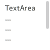
ScrollView {
    id: view
    anchors.fill: parent
    TextArea {
        text: "TextArea\n...\n...\n...\n...\n...\n...\n"
    }
}
A TextArea that is placed inside a ScrollView does the following:
By default, pressing the tab key while TextArea has active focus results in a tab character being input into the control itself. To make tab pass active focus onto another item, use the attached KeyNavigation 特性:
TextField {
    id: textField
}
TextArea {
    KeyNavigation.priority: KeyNavigation.BeforeItem
    KeyNavigation.tab: textField
}
另請參閱 TextField , 定製 TextArea ,和 輸入控件 .
|
background : Item |
此特性保持背景項。
注意: If the background item has no explicit size specified, it automatically follows the control's size. In most cases, there is no need to specify width or height for a background item.
注意: Most controls use the implicit size of the background item to calculate the implicit size of the control itself. If you replace the background item with a custom one, you should also consider providing a sensible implicit size for it (unless it is an item like Image which has its own implicit size).
另請參閱 定製 TextArea .
|
bottomInset : real |
This property holds the bottom inset for the background.
該特性在 QtQuick.Controls 2.5 (Qt 5.12) 引入。
另請參閱 Control Layout and topInset .
|
focusReason : enumeration |
此特性保持最後聚焦更改的原因。
注意: This property does not indicate whether the control has active focus , but the reason why the control either gained or lost focus.
| 常量 | 描述 |
|---|---|
Qt.MouseFocusReason
|
齣現鼠標動作。 |
Qt.TabFocusReason
|
按下 Tab 鍵。 |
Qt.BacktabFocusReason
|
發生 Backtab。輸入可能包括 Shift 或 Control 鍵;如 Shift+Tab。 |
Qt.ActiveWindowFocusReason
|
窗口係統使此窗口活動 (或不活動)。 |
Qt.PopupFocusReason
|
應用程序打開/關閉彈齣窗口,抓取/釋放鍵盤焦點。 |
Qt.ShortcutFocusReason
|
用戶鍵入標簽的好友快捷方式 |
Qt.MenuBarFocusReason
|
菜單欄獲得聚焦。 |
Qt.OtherFocusReason
|
另一原因,通常特定於應用程序。 |
另請參閱 Item::activeFocus .
|
hoverEnabled : bool |
This property determines whether the text area accepts hover events. The default value is
true
.
該特性在 QtQuick.Controls 2.1 (Qt 5.8) 引入。
另請參閱 hovered .
|
[read-only] hovered : bool |
This property holds whether the text area is hovered.
該特性在 QtQuick.Controls 2.1 (Qt 5.8) 引入。
另請參閱 hoverEnabled .
|
[read-only] implicitBackgroundHeight : real |
This property holds the implicit background height.
值等於
background ? background.implicitHeight : 0
.
該特性在 QtQuick.Controls 2.5 (Qt 5.12) 引入。
另請參閱 implicitBackgroundWidth .
|
[read-only] implicitBackgroundWidth : real |
This property holds the implicit background width.
值等於
background ? background.implicitWidth : 0
.
該特性在 QtQuick.Controls 2.5 (Qt 5.12) 引入。
另請參閱 implicitBackgroundHeight .
|
leftInset : real |
This property holds the left inset for the background.
該特性在 QtQuick.Controls 2.5 (Qt 5.12) 引入。
另請參閱 Control Layout and rightInset .
|
palette : palette |
This property holds the palette currently set for the text area.
該特性在 QtQuick.Controls 2.3 (Qt 5.10) 引入。
另請參閱 Control::palette .
|
placeholderText : string |
This property holds the short hint that is displayed in the text area before the user enters a value.
|
placeholderTextColor : color |
This property holds the color of placeholderText .
該特性在 QtQuick.Controls 2.5 (Qt 5.12) 引入。
另請參閱 placeholderText .
|
rightInset : real |
This property holds the right inset for the background.
該特性在 QtQuick.Controls 2.5 (Qt 5.12) 引入。
另請參閱 Control Layout and leftInset .
|
topInset : real |
This property holds the top inset for the background.
該特性在 QtQuick.Controls 2.5 (Qt 5.12) 引入。
另請參閱 Control Layout and bottomInset .
|
TextArea.flickable : TextArea |
This property attaches a text area to a Flickable .
另請參閱 ScrollBar , ScrollIndicator ,和 可捲動 TextArea .
|
pressAndHold ( MouseEvent event ) |
This signal is emitted when there is a long press (the delay depends on the platform plugin). The event parameter provides information about the press, including the x and y position of the press, and which button is pressed.
|
pressed ( MouseEvent event ) |
This signal is emitted when the text area is pressed by the user. The event parameter provides information about the press, including the x and y position of the press, and which button is pressed.
該信號在 QtQuick.Controls 2.1 (Qt 5.8) 引入。
另請參閱 released and pressAndHold .
|
released ( MouseEvent event ) |
This signal is emitted when the text area is released by the user. The event parameter provides information about the release, including the x and y position of the press, and which button is pressed.
該信號在 QtQuick.Controls 2.1 (Qt 5.8) 引入。
另請參閱 pressed and pressAndHold .