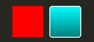
對於最基本視覺, Qt Quick 提供 Rectangle 類型來繪製矩形。這些矩形可以采用顔色或垂直漸變進行著色。 Rectangle 類型還可以繪製矩形邊框。
為在矩形外繪製自定義形狀,見 Canvas 類型或顯示預渲染圖像使用 Image 類型。
import QtQuick 2.3
Item {
    width: 320
    height: 480
    Rectangle {
        color: "#272822"
        width: 320
        height: 480
    }
    // This element displays a rectangle with a gradient and a border
    Rectangle {
        x: 160
        y: 20
        width: 100
        height: 100
        radius: 8 // This gives rounded corners to the Rectangle
        gradient: Gradient { // This sets a vertical gradient fill
            GradientStop { position: 0.0; color: "aqua" }
            GradientStop { position: 1.0; color: "teal" }
        }
        border { width: 3; color: "white" } // This sets a 3px wide black border to be drawn
    }
    // This rectangle is a plain color with no border
    Rectangle {
        x: 40
        y: 20
        width: 100
        height: 100
        color: "red"
    }
}

Qt Quick 提供 Image 類型可用於顯示圖像。 Image 類型擁有 source property whose value can be a remote or local URL, or the URL of an image file embedded in a compiled resource file.
// This element displays an image. Because the source is online, it may take some time to fetch
Image {
    x: 40
    y: 20
    width: 61
    height: 73
    source: "http://codereview.qt-project.org/static/logo_qt.png"
}
對於更復雜圖像,存在的其它類型類似 Image . BorderImage 采用柵格比例縮放繪製圖像,適於用作邊框的圖像。 AnimatedImage plays animated .gif and .mng images. AnimatedSprite and SpriteSequence play animations comprised of multiple frames stored adjacently in a non animated image format.
為顯示視頻文件和攝像頭數據,見 Qt Multimedia 模塊。
所有視覺項提供通過 Qt Quick are based on the Item type, which provides a common set of attributes for visual items, including opacity and transform attributes.
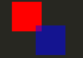
The QML object types provided by Qt Quick have built-in support for opacity . Opacity can be animated to allow smooth transitions to or from a transparent state. Visibility can also be managed with the visible property more efficiently, but at the cost of not being able to animate it.
import QtQuick 2.3
Item {
    width: 320
    height: 480
    Rectangle {
        color: "#272822"
        width: 320
        height: 480
    }
    Item {
        x: 20
        y: 270
        width: 200
        height: 200
        MouseArea {
            anchors.fill: parent
            onClicked: topRect.visible = !topRect.visible
        }
        Rectangle {
            x: 20
            y: 20
            width: 100
            height: 100
            color: "red"
        }
        Rectangle {
            id: topRect
            opacity: 0.5
            x: 100
            y: 100
            width: 100
            height: 100
            color: "blue"
        }
    }
}

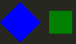
Qt Quick types have built-in support for transformations. If you wish to have your visual content rotated or scaled, you can set the Item::rotation or Item::scale property. These can also be animated.
import QtQuick 2.3
Item {
    width: 320
    height: 480
    Rectangle {
        color: "#272822"
        width: 320
        height: 480
    }
    Rectangle {
        rotation: 45 // This rotates the Rectangle by 45 degrees
        x: 20
        y: 160
        width: 100
        height: 100
        color: "blue"
    }
    Rectangle {
        scale: 0.8 // This scales the Rectangle down to 80% size
        x: 160
        y: 160
        width: 100
        height: 100
        color: "green"
    }
}

更復雜變換,見 Item::transform 特性。