The needle component is rotated around the gauge to represent the current value.
Starting from the default style, we'll add a very basic white needle:
needle: Rectangle {
    y: outerRadius * 0.15
    implicitWidth: outerRadius * 0.03
    implicitHeight: outerRadius * 0.9
    antialiasing: true
    color: "#e5e5e5"
}
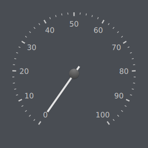
As mentioned in the documentation for
CircularGaugeStyle
,
implicitWidth
and
implicitHeight
properties need to be set. This is so that the needle can be positioned properly. We always scale items by the
outerRadius
property of the style, ensuring the control resizes gracefully.
We offset the needle vertically so that its back sits beyond the knob.
We've now changed the needle, but the default knob is still there; let's replace it. The
foreground
component defines the default knob, so we can specify our own by overriding it (note that we could also set it to
null
if we didn't want a foreground):
foreground: Item {
    Rectangle {
        width: outerRadius * 0.2
        height: width
        radius: width / 2
        color: "#e5e5e5"
        anchors.centerIn: parent
    }
}
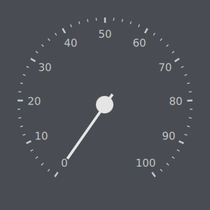
Firstly, we create a circle from the Rectangle item by setting the radius to be half the width (either width or height will work here; they are always equal in this case). We make it a child of the Item, because the foreground fills the gauge. We then center it within the Item.
We set the color of the knob to the same white that we used before.
Suppose we want to caution the user if the value displayed by the gauge goes above or below a certain range. We could present this range to the user in several ways:
styleData.value
We'll choose options 1 and 3, as they are more flexible than using an image.
Firstly, let's change the color of the three highest tickmark labels:
tickmarkLabel:  Text {
    font.pixelSize: Math.max(6, outerRadius * 0.1)
    text: styleData.value
    color: styleData.value >= 80 ? "#e34c22" : "#e5e5e5"
    antialiasing: true
}
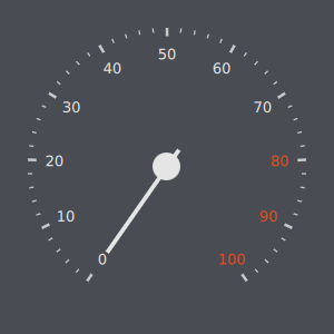
We also change the color of the rest of the labels to the same white that we used for the needle and knob.
Now let's do the same for the three highest tickmarks:
tickmark: Rectangle {
    visible: styleData.value < 80 || styleData.value % 10 == 0
    implicitWidth: outerRadius * 0.02
    antialiasing: true
    implicitHeight: outerRadius * 0.06
    color: styleData.value >= 80 ? "#e34c22" : "#e5e5e5"
}

For the minor tickmarks, we'll only show those which are not higher than
80
:
minorTickmark: Rectangle {
    visible: styleData.value < 80
    implicitWidth: outerRadius * 0.01
    antialiasing: true
    implicitHeight: outerRadius * 0.03
    color: "#e5e5e5"
}
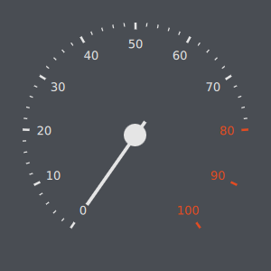
This is because we'll draw something between that range in the next section.
We'll display the range that indicates caution with an orange arc:
function degreesToRadians(degrees) {
    return degrees * (Math.PI / 180);
}
background: Canvas {
    onPaint: {
        var ctx = getContext("2d");
        ctx.reset();
        ctx.beginPath();
        ctx.strokeStyle = "#e34c22";
        ctx.lineWidth = outerRadius * 0.02;
        ctx.arc(outerRadius, outerRadius, outerRadius - ctx.lineWidth / 2,
            degreesToRadians(valueToAngle(80) - 90), degreesToRadians(valueToAngle(100) - 90));
        ctx.stroke();
    }
}
We define a function to convert degrees to radians, which are the units used by Canvas .
Next, we do the drawing of the range using Canvas. We draw an arc between
80
and
100
,使用
valueToAngle()
function provided by
CircularGaugeStyle
. Note that we subtract
90
degrees before converting to radians, as our origin is north and Canvas' is east.
The finished product:
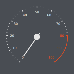
The complete code for this example is as follows:
import QtQuick 2.0
import QtQuick.Controls 1.4
import QtQuick.Controls.Styles 1.4
import QtQuick.Extras 1.4
import QtQuick.Extras.Private 1.0
Rectangle {
    width: 300
    height: 300
    color: "#494d53"
    CircularGauge {
        id: gauge
        anchors.centerIn: parent
        style: CircularGaugeStyle {
            id: style
            function degreesToRadians(degrees) {
                return degrees * (Math.PI / 180);
            }
            background: Canvas {
                onPaint: {
                    var ctx = getContext("2d");
                    ctx.reset();
                    ctx.beginPath();
                    ctx.strokeStyle = "#e34c22";
                    ctx.lineWidth = outerRadius * 0.02;
                    ctx.arc(outerRadius, outerRadius, outerRadius - ctx.lineWidth / 2,
                        degreesToRadians(valueToAngle(80) - 90), degreesToRadians(valueToAngle(100) - 90));
                    ctx.stroke();
                }
            }
            tickmark: Rectangle {
                visible: styleData.value < 80 || styleData.value % 10 == 0
                implicitWidth: outerRadius * 0.02
                antialiasing: true
                implicitHeight: outerRadius * 0.06
                color: styleData.value >= 80 ? "#e34c22" : "#e5e5e5"
            }
            minorTickmark: Rectangle {
                visible: styleData.value < 80
                implicitWidth: outerRadius * 0.01
                antialiasing: true
                implicitHeight: outerRadius * 0.03
                color: "#e5e5e5"
            }
            tickmarkLabel:  Text {
                font.pixelSize: Math.max(6, outerRadius * 0.1)
                text: styleData.value
                color: styleData.value >= 80 ? "#e34c22" : "#e5e5e5"
                antialiasing: true
            }
            needle: Rectangle {
                y: outerRadius * 0.15
                implicitWidth: outerRadius * 0.03
                implicitHeight: outerRadius * 0.9
                antialiasing: true
                color: "#e5e5e5"
            }
            foreground: Item {
                Rectangle {
                    width: outerRadius * 0.2
                    height: width
                    radius: width / 2
                    color: "#e5e5e5"
                    anchors.centerIn: parent
                }
            }
        }
    }
}